Calendar and tasks components for React
If you are using yarn:
yarn add react-tasks-calendar styled-components
Or if you are using npm:
npm i react-tasks-calendar styled-components
import Calendar from 'react-tasks-calendar';
function CalendarComponent() {
function handleSelection(date) {
alert(date);
}
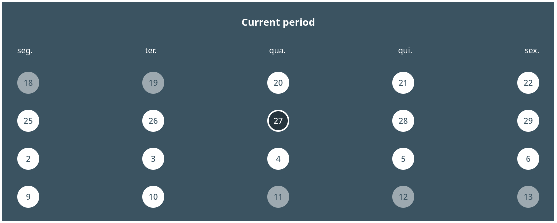
return (
<Calendar.Container onSelectionChanged={handleSelection}>
<Calendar.Header text="Current period" />
<Calendar.ColumnsContainer>
<Calendar.Column weekDay="1" />
<Calendar.Column weekDay="2" />
<Calendar.Column weekDay="3" />
<Calendar.Column weekDay="4" />
<Calendar.Column weekDay="5" />
</Calendar.ColumnsContainer>
<Calendar.ItemsContainer
startDate={new Date('2023-09-23')}
endDate={new Date('2023-10-27')}
fillEmptySlots={true}
/>
</Calendar.Container>
);
}The code above will result in someting like:
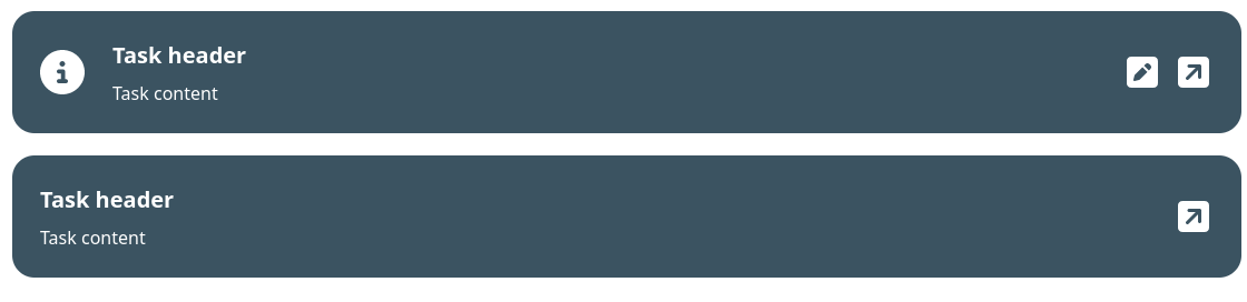
import Task, { TasksContainer } from 'react-tasks-calendar';
import { FontAwesomeIcon } from '@fortawesome/react-fontawesome';
import {
  faCircleInfo,
  faSquareArrowUpRight,
  faPenSquare
} from '@fortawesome/free-solid-svg-icons';

function TasksList() {
  return (
    <TasksContainer>
      <Task.Container
        icon={() => (
          <FontAwesomeIcon
            icon={faCircleInfo}
            color="#ffffff"
            style={{ fontSize: '2.5rem' }}
          />
        )}
      >
        <Task.Content>
          <Task.Title>Task header</Task.Title>
          <Task.Message>Task content</Task.Message>
        </Task.Content>
        <Task.Actions>
          <Task.Action
            icon={() => (
              <FontAwesomeIcon
                icon={faPenSquare}
                color="#ffffff"
                style={{ fontSize: '2rem' }}
              />
            )}
            title="edit"
            onClick={() => alert('edit task')}
          />
          <Task.Action
            icon={() => (
              <FontAwesomeIcon
                icon={faSquareArrowUpRight}
                color="#ffffff"
                style={{ fontSize: '2rem' }}
              />
            )}
            title="Open"
            onClick={() => alert('open task')}
          />
        </Task.Actions>
      </Task.Container>
      <Task.Container>
        <Task.Content>
          <Task.Title>Task header</Task.Title>
          <Task.Message>Task content</Task.Message>
        </Task.Content>
        <Task.Actions>
          <Task.Action
            icon={() => (
              <FontAwesomeIcon
                icon={faSquareArrowUpRight}
                color="#ffffff"
                style={{ fontSize: '2rem' }}
              />
            )}
            title="Open"
            onClick={() => alert('open task')}
          />
        </Task.Actions>
      </Task.Container>
    </TasksContainer>
  );
}
The code above will result in someting like:
| Parameter |
Type |
Description |
| children |
ReactNode |
A node of components to be rendered inside the calendar |
|
initialSelectedDate (optional) |
Date |
The initial date to be selected on the calendar |
|
onSelectionChanged (optional) |
(selectedDate: Date | null) => void |
A callback to be called every time the selected date changes |
| Parameter |
Type |
Description |
| text |
string |
A string to be rendered on the header |
| Parameter |
Type |
Description |
| children |
ReactNode |
A ReactNode composed of Calendar.Column
|
| Parameter |
Type |
Description |
| weekDay |
CalendarLabelsIndex |
The index of the week day the column corresponds |
|
renderText (optional) |
(weekDay: CalendarLabelsIndex) => string | ReactElement |
A function that renders the label of a column |
type CalendarLabelsIndex = '0' | '1' | '2' | '3' | '4' | '5' | '6';
| Parameter |
Type |
Description |
| startDate |
Date |
The start of the range of dates to be displayed |
| endDate |
Date |
The end of the range of dates to be displayed |
|
fillEmptySlots (optional) |
boolean |
Defines if the calendar will render dates outside of the defined |
|
renderItem (optional) |
(itemData: CalendarItemProps, key: number | string) => ReactElement |
A function responsible for rendering the items within the calendar |
| Parameter |
Type |
Description |
| itemDate |
Date |
The date of the item |
| disabled |
boolean |
Defines if the user can interact with the item |
| status |
'normal' | 'pending' | 'alert' | 'done' | 'hidden' |
The status of the item. This change the style according the status |
| renderText |
(date: Date) => string | ReactElement |
A function responsible for rendering the item text |
| Parameter |
Type |
Description |
| children |
ReactNode |
The tasks to be rendered on the list |
| Parameter |
Type |
Description |
| children |
ReactNode |
A node of components to be rendered inside the task component |
|
icon (optional) |
ElementType |
A icon element to be rendered on the left corner of the task |
| Parameter |
Type |
Description |
| children |
ReactNode |
A node of components to be rendered as the task content |
| Parameter |
Type |
Description |
| children |
ReactNode |
The content to be rendered inside the title of the task |
| Parameter |
Type |
Description |
| children |
ReactNode |
The content to be rendered inside the message of the task |
| Parameter |
Type |
Description |
| children |
ReactNode |
The actions of the task |
This component also inherits from ButtonHTMLAttributes<HTMLButtonElement>
| Parameter |
Type |
Description |
| icon |
ElementType |
A icon to bee rendered inside the action button |


