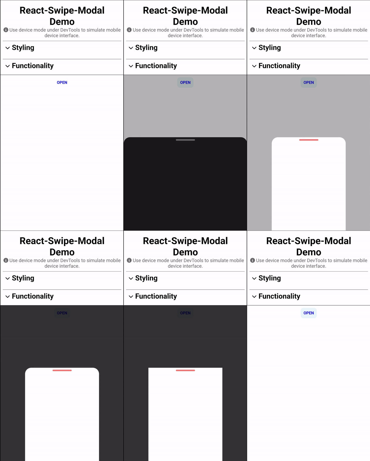
React-Swipe-Modal
🌀 A swipeable modal for the browser, just like on your smartphone.
Features
- Swipe or tap to close
- Completely customizable appearance
- Different closing triggers and behaviours
- Display a react component inside the modal
-
onShowandonClosehooks
Demo
Try it out right here!
Installation
npm i react-swipe-modal
Usage
import { useRef } from 'react';
import SwipeModal, { SwipeModalRef } from 'react-swipe-modal';

const App = () => {
    const modalRef = useRef<SwipeModalRef>(null);

    const showModal = () => modalRef.current?.show();

    return (
        <SwipeModal ref={modalRef}>
            Put anything inside here!
        </SwipeModal>
    );
};
Props
| Name | Type | Default value | Description |
|---|---|---|---|
children |
ReactNode\ReactNode[] | required | The content to be rendered inside the modal. |
| Styling | |||
animationDuration |
number | 300 | The duration of the modal's opening and closing animation in milliseconds. |
backdropOpacity |
number | 0.3 | The opacity of the modal's backdrop. |
barColor |
string | 'dimgrey' | The color of the bar at the top of the modal. |
borderRadius |
string | '1.2rem' | The border radius of the modal. |
hideBar |
boolean | false | Set to true to hide the bar at the top of the modal. |
maxWidth |
string | '100vw' | The maximum width of the modal. |
modalColor |
string | 'black' | The background color of the modal. |
| Functionality | |||
closeTrigger |
'swipe'|'height' | 'swipe' | The trigger to close the modal.'swipe' means that modal will close when modal was swiped down faster than closeTriggerSpeed.'height' means that modal will close when height of modal is less than closeTriggerPercentage. |
closeTriggerPercentage |
number | 50 | The height in percent that triggers the modal to close when using the closeTrigger 'height'. |
closeTriggerSpeed |
number | 500 | The swipe speed in px/s that triggers the modal to close when using the closeTrigger 'swipe'. |
disableSwipe |
boolean | false | Set to true if you don't want to allow swiping. |
swipeOnlyFromBar |
boolean | false | Set to true if you want to allow swiping only from the bar. |
| Additional Styling | |||
backdropStyle |
ViewStyle|ViewStyle[] | Additional styles to be applied to the backdrop. | |
barStyle |
ViewStyle|ViewStyle[] | Additional styles to be applied to the modal. | |
modalStyle |
ViewStyle|ViewStyle[] | Additional styles to be applied to the modals. | |
| Callbacks | |||
onShow |
() => void | A callback function that will be triggered when the modal is shown. | |
onHide |
() => void | A callback function that will be triggered when the modal is closed. |
Public Methods
| Name | Description |
|---|---|
show() |
Shows the modal. |
close() |
Closes the modal. |
Contribute
Show your ❤️ and support by giving a ⭐. Any suggestions are welcome!
You can find more from me on my homepage manuelpickl.com.
License
Licensed under MIT


