react-static-timeline
An interactive customizable timeline for React
Intro
A creative way to display your personal timeline on your webpage.
Install
npm install --save react-static-timelineUsage
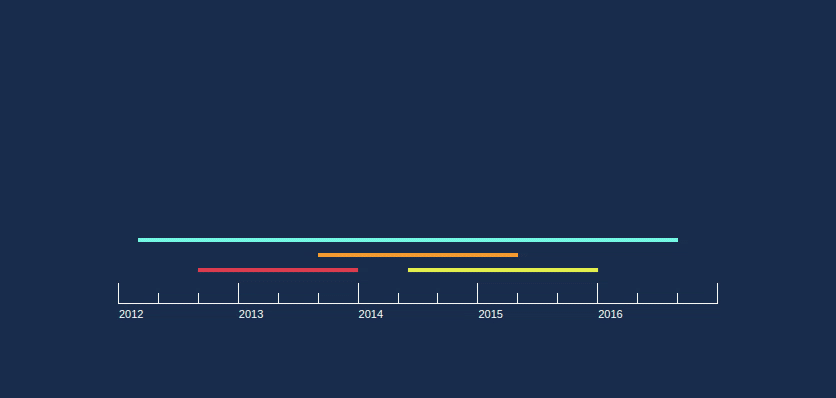
const items = title: 'Employment1' summary: 'Did some cool stuff' start: year: 2012 month: 0 end: year: 2013 month: 4 title: 'Employment2' summary: 'Did some even cooler stuff' start: year: 2013 month: 5 end: year: 2015 month: 12 title: 'Graduate School' summary: 'Learned some super useful things' start: year: 2012 month: 2 end: year: 2016 month: 8 { return <div> <Timeline items=items /> </div> }The Timeline component will fill the width of its container, and its height stretches to contain both the timeline and the popup bubble
Note: use
month: 0to represent the beginning of January andmonth: 12to represent the end of December.
API
Timeline
-
props.items- array | required | array of item objects in the following format to be displayed on the timeline:title: string // optionalsummary: string // optionalstart: year: number month: number // requiredend: year: number month: number // required -
props.isInteractive- boolean | optional | (defaulttrue) | determines if the timeline is hoverable. If false, there will be no highlighting of items or popup. -
props.onItemDisplay- function | optional | callback function which is executed when the popup is displayed with the item. The function is called as follows:propswhere itemId is the index of the selected item in the provided
itemsarray. leftPct is the distance from the left side of the the Timeline's container to the left side of the item line, as a percentage of the container's width. rightPct is the distance from the left side of the the Timeline's container to the right side of the item line, as a percentage of the container's width. Color is the color of the item line that was hovered. leftPct and rightPct is explained visually here: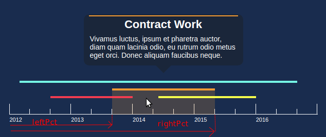
-
props.onMouseLeave- function | optional | callback function which is executed when the users cursor leaves the Timeline component (must leave the popup as well). -
props.popupEnabled- boolean | optional | (defaulttrue) | When true, the popup will show when the user hovers over items. -
props.customPopupContent- element | optional | A JSX element to be displayed in the popup instead of the default content. The popup bubble style will remain the same. To make a completely custom popup, see the section "Completely custom popup" below. -
props.verticalGap- number | optional | (default15) | The vertical gap (in px) between each 'level' of items on the timeline. -
props.timelineColor- string | optional | (default'black') | The color of the timeline ruler and years displayed below it. The string value can be any CSS color value including hex, rgb, rgba, etc. -
props.popupBackgroundColor- string | optional | (default'rgba(22, 22, 22, 0.4)') | The color of the popup background. The string value can be any CSS color value including hex, rgb, rgba, etc. -
props.popupDelay- number | optional | (default100) | The transition delay (in ms) for the popups to change. -
props.popupWidth- number | optional | (default400) | The width of the popup (in px) -
props.lineThickness- number | optional | (default5) | The thickness of the colored lines representing the items on the timeline. -
props.style- object | optional | Any JSX styling that you wish to apply to the outermost div of the Timeline component. Examples include: { fontFamily: "sans-serif", width: '50%' }
Custom popup content
Using the customPopupContent prop, you can change what shows up inside the popup. An example is as follows:
const hoveredId setHoveredId = const onItemDisplay = { } const item = hoveredId >= 0 ? timelineItemshoveredId : {}const content = <div> <h1> itemtitle </h1> <p className='summary'> itemsummary </p> <p className='technologies'> itemtechnologiesUsed </p> </div> return <div> <Timeline items=items customPopupContent=content /> </div>Completely custom popup
If you don't want to use the default popup altogether, set props.popupEnabled to false. Then, using the props.onItemDisplay callback, you can do whatever you want. The function provides the leftPct and rightPct which you can use to position something within the container, directly above/below the item that was hovered.
Example here:
{ const items = start:year:2010 month:0 end:year:2010 month: 6 logo: babybel start:year:2011 month:0 end:year:2011 month:12 logo: starbucks const hoveredId setHoveredId = const midpoint setMidpoint = const displayLogo = { } const item = itemshoveredId return <div style= position: 'relative' width: '600px' height: '200px' > hoveredId >= 0 && <img src=itemlogo style= position: 'absolute' top: '50px' left: `%` transform: 'translateX(-50%)' height: '50px' width: '50px' /> <Timeline items=items onItemDisplay=displayLogo popupEnabled=false /> </div> }