react-simple
simple style only components for the web & native
install
yarn add react-simple
usage
import simple from "react-simple";

const Button = simple("button", {
    padding: 10,
});
// <Button>click</Button>


// extend existing components
const RedButtonWithPadding = simple(Button, {
    backgroundColor: "red",
});


// reuse styles for different component types
const LinkWithPadding = simple(Button.create("a"), {
    textDecoration: "none",
});
// <LinkWithPadding href="/link">link</LinkWithPadding>


// simple style toggles
const Button = simple("button", {
    padding: 10,
}, {
    rounded: {
        borderRadius: 5,
    },
});
// <Button rounded>click</Button>


// can extend 3rd party commponents too
import {Link} from "react-router";

const RedLink = simple(Link, {
    backgroundColor: "red",
});
// <Link to="/hello">Hello</Link>
here's some example code using it
The css-in-js engine is glamor which means following features:
- automatic vendor prefixes
- pseudo :classes/::elements
- media queries
- css animations
- server side rendering
- and more: checkout the glamor docs
glamor cssfunction can be imported with import {css} from "react-simple" when needed
react-native
To use in React Native import simple from react-simple/native. Anything can be passed
as styles what can be passed to StyleSheet.create().
import {View} from "react-native";
import simple from "react-simple/native";

const Box = simple(View, {
    flex: 1,
    border: "1px solid black",
});
style attribute
To put styles in the style attribute import simple from react-simple/inline
import simple from "react-simple/inline";

const Box = simple("div", {
    padding: 10,
    border: "1px solid black",
});
Generally this should not be used but there is one important use case: HTML Emails.
To render a HTML template use ReactDOMServer
import ReactDOMServer from "react-dom/server";
const html = ReactDOMServer.renderToStaticMarkup(<Box>hello email</Box>);
babel plugin
This is totally optional!
By default components created using simple do not get proper component names
which means they won't get very helpful names in React Developer Tools.
This can be mitigated using the bundled react-simple/babel Babel plugin which infers
the component names from the variable declarations.
The use it add react-simple/babel to your .babelrc
{
    "presets": ["es2015", "react"],
    "plugins": [
        "react-simple/babel"
    ]
}
In practice this means that instead of
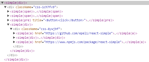
you will get
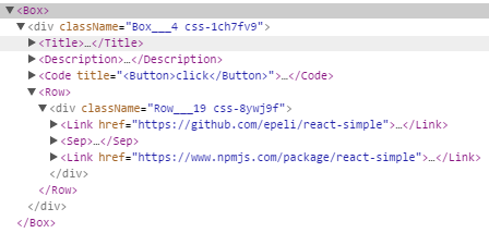
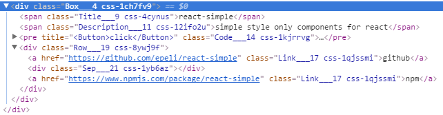
it will also add class names corresponding the component names so even without the React specfic devtools you will get better insights
You can see it in action at https://epeli.github.io/react-simple/
Source code is under demo/
This feature is powered by babel-plugin-display-name-custom.