|

|
An authentic modal sheet for ReactJs - Bringing the ()iOS experience to the web
| ⭐️ Easy integration | 🛠️ Configurable | ⚡️ Zero Dependencies |
|---|
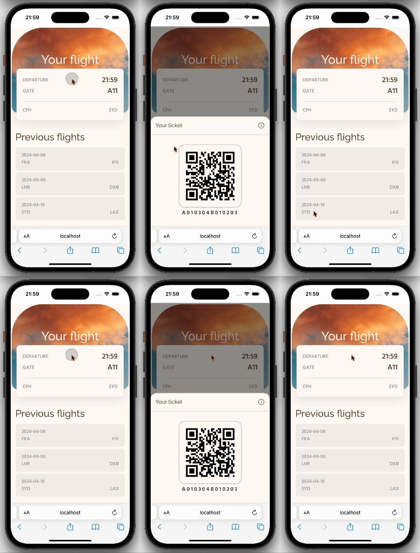
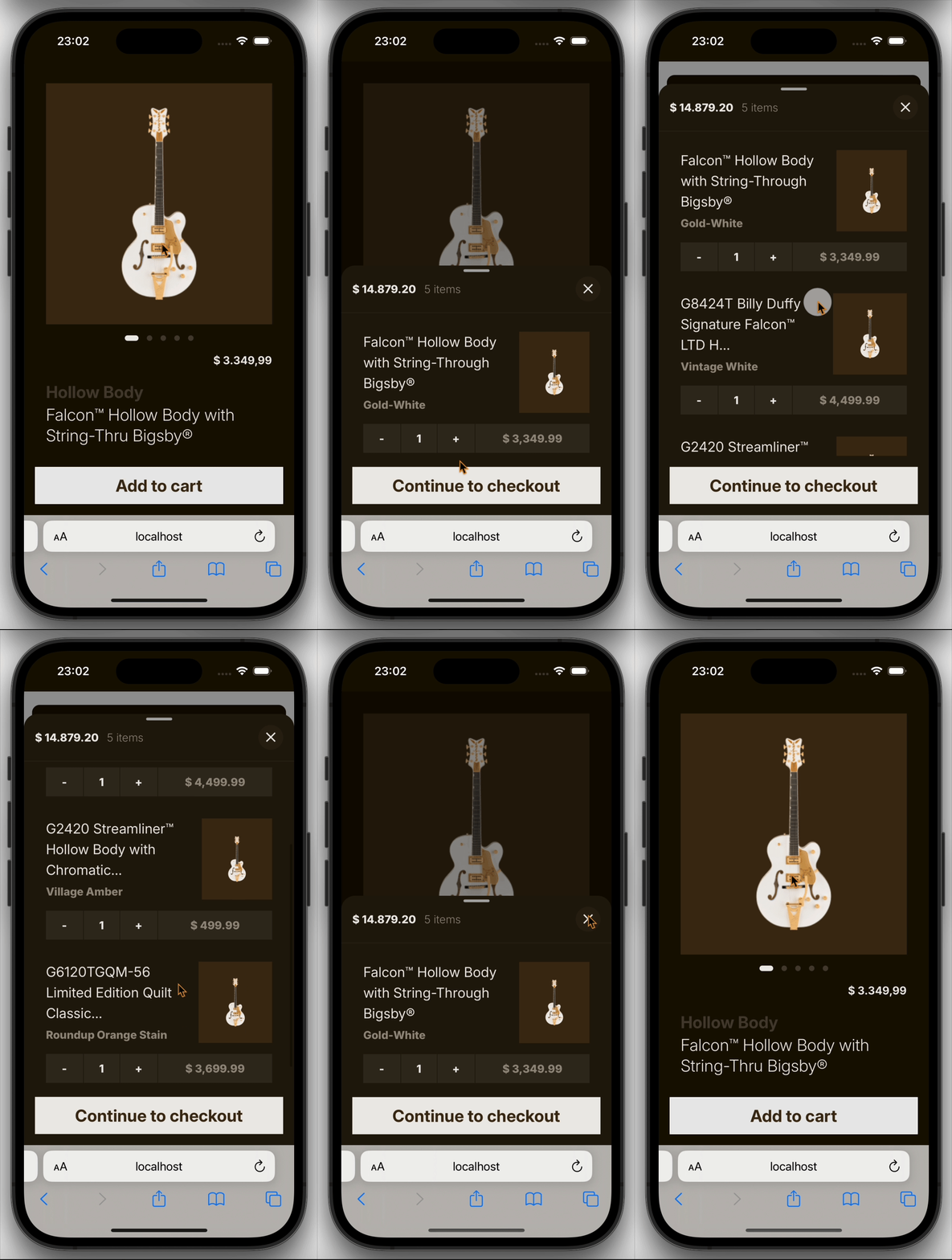
A ReactJs library for displaying a sheet modal - A type of modal that is displayed from the bottom of the viewport and helps the user perform a scoped task that is closely related to their current context.
React Sheet Modal was created to give web users an equal experience to that of Apples' modal sheet, while also being easy to implement and use. The library uses vanilla CSS. And since the transitions for the sheet are fully calculated through javascript, it does not require any additional npm-dependencies do be added.
If you find the component useful, consider starring the project on GitHub!
Install the component using npm:
npm i react-sheet-modalThe Sheet.tsx component is similarily structured to its SwiftUI counterpart and is easily implemented with ones project.
In its simplest form the sheet takes in two properties. isPresented - A boolean, whether the sheet is displayed. And onClose - A callback function for closing the sheet. To these properties you pass a state variable that sets whether to show or hide the sheet.
const [isSheetOpen, setIsSheetOpen] = useState(false);

function openSheet() {
  setIsSheetOpen(true);
}
function closeSheet() {
  setIsSheetOpen(false);
}

return (
  <div>
    <button onClick={openSheet}>Open sheet</button>
    <Sheet isPresented={isSheetOpen} onClose={closeSheet} />
  </div>
);The sheet is displayed as a blank modal. What content is displayed inside of it is fully in your controll.
For example, to add a simple button that closes the sheet could look like the following:
const [isSheetOpen, setIsSheetOpen] = useState(false);

function openSheet() {
  setIsSheetOpen(true);
}
function closeSheet() {
  setIsSheetOpen(false);
}

return (
  <div>
    <button onClick={openSheet}>Open sheet</button>
    <Sheet isPresented={isSheetOpen} onClose={closeSheet}>
      <button type="button" onClick={() => setIsSheetOpen(false)}>
        Close me
      </button>
    </Sheet>
  </div>
);Use the available properties to customize the look and behaviour of the sheet.
Determines whether the sheet is displayed
Callback function that is called when the sheet is closed
Sets the available snapping points for the sheet
Determines whether to show a grabber at the top of the sheet
When included, adds the effect of scaling the backdrop when the sheet is open
If true, allows interaction with the background when the sheet is open
If true, prevents the sheet from closing while the sheet is resized
Add a custom styling class to the sheet
Overwrite the style attribute of the sheet
Content to be displayed inside the sheet.
The sheet has a default styling that is designed to mimic the look and feel of the Apple (IOS) modal sheet and follows the Human Interface Guidlines. To overwrite this design, you can update the css variables or add your own className or style attributes to the sheet.
Use the CSS variables to change specific style attributes of the sheet.
In your own css or stylesheet include any of the below variables as a :root style variable.
:root {
  --sheet-inner-padding: 1rem;
  --sheet-base-border-radius: 1.25rem;
  --sheet-base-bg-color: rgb(247, 247, 247);
}
💡 The values in the above code snippet are the default set values for the sheet.
Overwrite the padding of the sheet.
--sheet-inner-padding: <size-unit>;Overwrite the background color of the sheet.
--sheet-base-bg-color: <color-unit>;Overwrite the border radius of the sheet
--sheet-base-border-radius: <size-unit>;Use class names to overwirte the style behaviour with your own classes.
The following css class styles the sheet pink with a larger border radius:
.my-pink-sheet {
  background-color: #ffc0cb; /* hexadecimal for pink*/
  border-radius: 24px;
}
Add the classNames prop to your sheet component:
<Sheet isPresented={isSheetOpen} onClose={closeSheet} classNames="my-pink-sheet" />Use style attrutes to overwirte the style behaviour with your own style objects.
💡 Note- It is not possible to overwrite the styling for the sheet overlay with the style prop
The following css class styles the sheet pink with a larger border radius:
const myPinkSheet {
  backgroundColor: '#ffc0cb;' // hexadecimal for pink
  borderRadius: '24px';
}
Add the style prop to your sheet component with your style object:
<Sheet isPresented={isSheetOpen} onClose={closeSheet} style={myPinkSheet} />


