React Settings Panel
React Settings Pannel is a customizable React component that allows you to create your own settings panel.
Features
- Switches
- Dropdown
- Input
- Text Area
- Radio Buttons
- Checkboxes
Installation
React-Settings-Panel needs React and Mobx dependensies
Install the package and include it to your project
$ npm install react-settings-panel |or| $ yarn add react-settings-panelUsage
-
##### Basic usage
consolelog{return<SettingsPanel color='#728ad8' onSubmit=thishandleSubmit><Toolbar /><Group><Switch name='mySwitch' title='Switch One'/><Input name='myTextField' title='InputField'/><TextArea name='myTextArea' title='Text Area One'/><CheckboxGroup name='myCheckbox' title='Checkbox One'><Checkbox value='A' /><Checkbox value='B' /><Checkbox value='C' /></CheckboxGroup></Group><Group><Selection title="Selection" name='mySelection' ><Option value='a' /><Option value='b' /><Option value='c' /></Selection><RadioGroup title="Radio Group" name='myRadio'><Radio value='A' /><Radio value='B' /><Radio value='C' /></RadioGroup></Group></SettingsPanel>}##### Output:
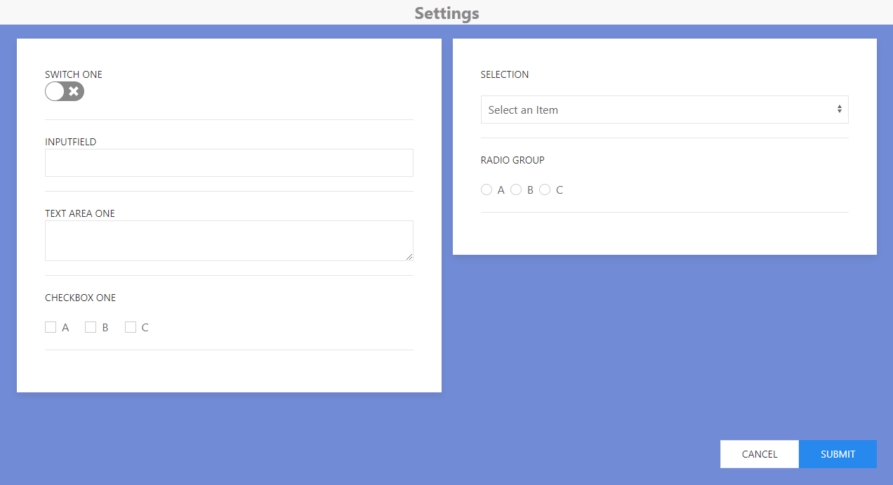
-
##### Components
-
#### Input Input component adds a text field to your panel. It doesn't require a parent and can be a solo component
props: [name, title]
-
#### TextArea TextArea component adds a Text Area box to your panel. It doesn't require a parent and can be a solo component
props: [name, title]
-
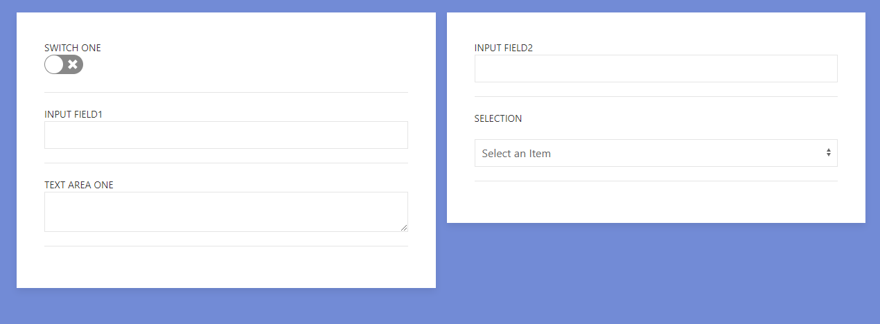
#### Group Group component acts as a parent to other settings components to seperate each group of settings to its own column. The colums are responsive as well.
Output:
 props: [none]
 -
#### Switch Switch component adds a clickable and mobile-touch enabled switch to your settings. It doesn't require a parent and can be a solo component.
props: [name, title]
-
#### Checkbox Checkbox component adds a checkbox button to your settings. Checkbox requires to be wrapped in the parent for it to work. Value prop is both used for display name and key value name in data.
props: [name, title, value]
-
#### Selection Selection is a parent component that acts as a dropdown. Dropdown requires Option components for values to select from. This is similar to Checkbox and Radio groups.
props: [name, title, value]
-
#### Radio Radio component adds a radio button to your settings. Radio requires to be wrapped in the parent for it to work. Value prop is both used for display name and key value name in data.
props: [name, title, value]
-
#### SettingsPanel SettingsPanel component is the main parent layout component to handle all the settings. You have unique props to change the color and handle the data you will get fromt he settings. onSubmit is a function call that passes data from settings when the submit button is clicked.
handleSubmit = (data) => console.log(data)...>...props: [color, onSubmit]
-
#### Toolbar Toolbar is a component in working development. As of right now it displays a navbar on top with the title settings. In the future this will be customizable with added props, buttons and other functionalities. Output:

-
Note
All components must be child of parent component All components have an 'onChange' prop name prop acts as a unique key for your data. You should keep your names unique.
Tech
- React - A JavaScript library for building user interfaces
- UIKit - A lightweight and modular front-end framework.
- node.js - evented I/O for the backend
- webpack - A bundler for javascript and friends.
- MobX - Simple, scalable state management.
React-Settings-Panel is open source with a React-Settings-Panel on GitHub. @yamoshotto
Development
Run:
$ npm start |or| $ yarn startTodos
- Write MORE Tests
- Add Night Mode
License
MIT