React component to generate a customizable timeline that displays time ranges to scale
- Time ranges are represented to-scale
- Configurable colors and positions
- Supports fully custom renderers
npm install --save react-scaled-timeline
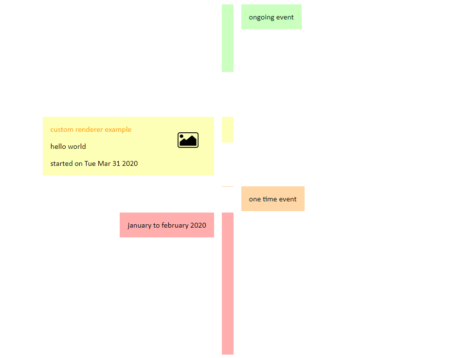
The following example snippet will create what is shown in the example screenshot.
import ScaledTimeline from 'react-scaled-timeline';

const exampleData = [
  {
    data: 'january to february 2020',
    dateRange: {
      start: Date.UTC(2020, 0, 1),
      end: Date.UTC(2020, 1, 31),
    },
  },
  {
    data: 'one time event',
    dateRange: {
      start: Date.UTC(2020, 2, 13),
    },
  },
  {
    data: {
      myTitle: 'custom renderer example',
      someOtherCustomField: 'hello world',
    },
    dateRange: {
      start: Date.UTC(2020, 3),
      end: Date.UTC(2020, 3, 12),
    },
    renderer: (dataEntry) => (
      <div style={{ margin: '1rem', width: '20rem', borderRadius: '1rem' }}>
        <span style={{ color: 'orange' }}>{dataEntry.data.myTitle}</span>
        <img
          src="https://cdn.onlinewebfonts.com/svg/img_148071.png"
          alt="some pic"
          style={{ float: 'right', margin: '1rem', height: '2rem' }}
        />
        <p>{dataEntry.data.someOtherCustomField}</p>
        <p>{`started on ${new Date(dataEntry.dateRange.start).toDateString()}`}</p>
      </div>
    ),
  },
  {
    data: 'ongoing event',
    dateRange: {
      start: new Date(2020, 4),
      end: new Date(),
    },
  },
];

ReactDOM.render(
  <ScaledTimeline
    entryPosition="alternate"
    timelineData={exampleData}
  />,
  document.getElementById('root'),
);This is the component that creates the scaled timeline.
| Name | Type | Description | Default Value |
|---|---|---|---|
| timelineData REQUIRED | array | array of TimelineData objects | N/A |
| className | string | Additional css class name(s) of the timeline container | N/A |
| displayMode | string | global setting to show event cards inside or outside of the timeline (`inline', 'popout') | 'inline' |
| colorCycle | array | array of colors for the timeline segments to cycle through | ['#ffadad','#ffd6a5','#fdffb6','#caffbf','#9bf6ff','a0c4ff','bdb2ff','ffc6ff','fffffc'] |
| entryOffset | string |
popout display mode only - space between the event cards and their respective bars on the timeline |
'1rem' |
| entryPosition | string |
popout display mode only - global setting which side of the timeline event cards will be placed (left, right, top, bottom, alternate) - 'alternate' will switch between left/right for a vertical orientation, and top/bottom for a horizontal orientation |
'alternate' |
| entryRenderer | function | optional custom default renderer for the event cards | N/A |
| orientation | string | orientation of the timeline (vertical, horizontal, vertical-reversed, horizontal-reversed) | 'vertical' |
| reverseAlternation | bool |
popout display mode and 'alternate' entryPosition only - will start with the opposite alternation |
false |
| scaleType | string | specify the scaling of the timeline (linear, logarithmic*) |
'linear' |
*The logarithmic scaleType is not yet implemented.
Each event object in the ScaledTimeline's timelineData must have a minimum of the following fields:
| Name | Type | Description |
|---|---|---|
| data REQUIRED | object | your data object |
| dateRange REQUIRED | object | must contain at least a start, which can be a Date object or number; can also contain an optional end property, which if left out, will represent this as an instant in time rather than a time span, making the bar 1 pixel wide |
| entryOffset | string | if specified, will override the global entryOffset for this specific entry |
| renderer | function | if specified, will override the global entryRenderer for this specific entry |
ISC