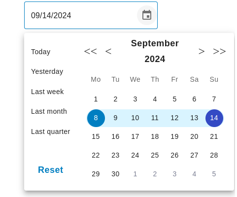
A customizable date range picker component built on top of MUI Date Pickers.
See Demo in stackblitz
<iframe src="https://stackblitz.com/edit/vitejs-vite-zrmeum?embed=1&file=src%2Findex.css"></iframe>To install the package, use npm:
npm install react-quick-date-range-pickerImport the DateRangePicker component and use it in your application:
import DateRangePicker from 'react-quick-date-range-picker';

// ...

<DateRangePicker
  value={null} // Initial date range (optional)
  onChange={(value) => console.log(value)} // Callback for date range changes
  // Other props (see below)
/>| Prop | Type | Description | Default Value |
|---|---|---|---|
value |
DateRange |
Initial date range. | null |
onChange |
(value: DateRange) => void |
Callback function called when the date range changes. | null |
...restProps |
'' | Other props passed to the underlying MUI DatePicker component. | - |
react-quick-date-range-picker supports all MUI date picker props : https://mui.com/x/api/date-pickers/date-picker/
You can customize the date range picker by passing props to the DateRangePicker component or by modifying the component's internal implementation. For example, you can customize the appearance, behavior, and functionality of the date picker using MUI's styling system and customization options.
Here is an example of how to use and customize the date picker:
import DateRangePicker from 'react-quick-date-range-picker';
import { useState } from 'react';

const MyDateRangePicker = () => {
  const [selectedDates, setSelectedDates] = useState<DateRange | null>(null);

  const handleDateRangeChange = (value: DateRange | null) => {
    setSelectedDates(value);
  };

  return (
    <DateRangePicker
      value={selectedDates}
      onChange={handleDateRangeChange}
      // Customize the date picker appearance
      sx={{
        '& .MuiDatePicker-root': {
          // Your custom styles
        },
      }}
    />
  );
};Contributions are welcome! Please feel free to submit pull requests or issues.
This project is licensed under the MIT License.
