ReactJS progress meter/indicator

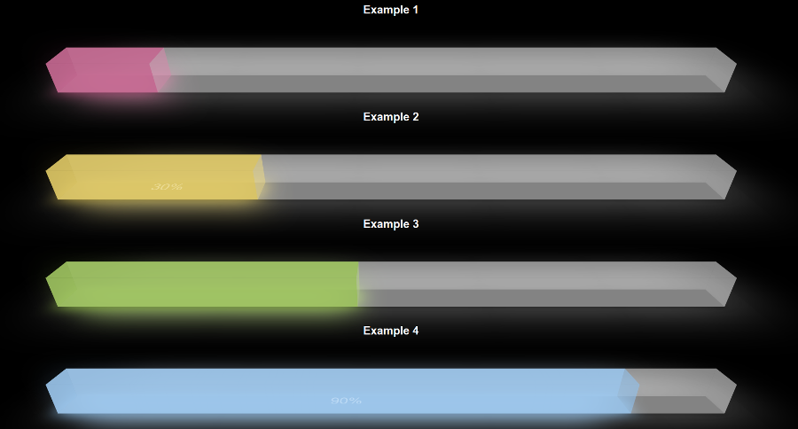
React Js UI component 3D progress meter, progress indicator, progress bar. Light colored component, which indicates progress of some web process in your react application. Works with React 16.x.x versions.
Demo
https://www.devzonetech.com/demo/react-progress-meter/
Installation
npm install react-progress-meter --save
Usage
You must update periodically the value of "currentProgress" prop to show the progress of your process.
import ReactProgressMeter from 'react-progress-meter' Component { ; thisstate = myProgress: 25 } { return <div> ... <ReactProgressMeter = = = ="cyan" ="80%" /> </div> }Component Props
| Prop | Default | Values | Description |
|---|---|---|---|
| currentProgress | 75 | Numbers: [0..100] | Via this prop you can show the current progress of your process in the indicator as colored bar. |
| show | true | Boolean: true or false | Show or hide the component. |
| showPercent | false | Boolean: true or false | Show percent of the current progress as text in the progress meter. |
| color | cyan | String: "red", "yellow", "lime", "cyan", "white", "navy" | Color of your progress bar. |
| width | 100% | String: percent or px. Examples: "100%" or "400px" | Width of progress meter component. |
License
This project is licensed under the MIT License - see the LICENSE file for details