React-Pattern-Lock
Android's pattern lock
- Supports multiple sizes. eg : 2x2, 3x3, 4x4 -- 15x15.
- Supports touch screens.
- Many options to customize the input.
Installation
npm install react-pattern-lock
How to use
import React, { Component } from "react";
import PatternLock          from "react-pattern-lock";

// in you render method
<PatternLock
	width={ 300 }
	pointSize={ 15 }
	size={ 3 }
	path={ this.state.path }
	onChange={ (pattern) => {
		this.setState({ path : pattern });
	}}
	onFinish={() => {
		// check if the pattern is correct
	}}
/>
Props
| Prop | Type | Default | Definition |
|---|---|---|---|
| size | Number | 3 | The size of the pattern input. |
| width | Number, String | "100%" | The width of the pattern wrapper. |
| disabled | Boolean | false | Disables the pattern input. |
| invisible | Boolean | false | Makes the lines that connect the points invisible. |
| noPop | Boolean | false | Disables the pop animation when a point gets activated. |
| onChange | Function | (path: number[]) => void | A Function (the first argument is the drawn path). |
| path | number[] | [] | The drawn path. |
| allowJumping | Boolean | false | Setting this to true would disable the auto activation on points that are in the middle of 2 already activated points (see details below). |
| allowOverlapping | Boolean | false | Allows you to select the same point multiple times (Doesn't show the pop animation on the second time). |
| pointSize | Number | 10 | The size of the pattern points (used for width and height) in pixels. |
| pointActiveSize | Number | 30 | The size (in pixels) of the active area of the pattern points. |
| connectorThickness | Number | 2 | The thickness (in pixels) of the lines that connect the points. |
| connectorRoundedCorners | Boolean | false | Setting this to true makes the connector edges rounded. |
| className | String | "" | Any css classes that you might want to send to the wrapper. |
| success | Boolean | false | Will add "success" class to the wrapper, it will also make the points and the connectors green |
| error | Boolean | false | Will add "error" class to the wrapper, it will also make the points and the connectors red |
| style | Object | {} | Any css styles that you might want to send to the wrapper. |
Pattern Representation
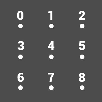
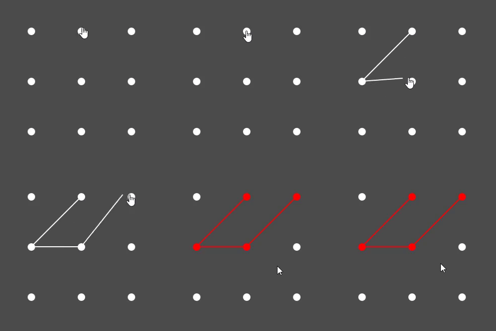
A pattern path is represented as an array of numbers.
for example :
in a 3x3 pattern
the points are numbered starting from 0 top left, and ending in 8 bottom right.
So for example :
This would result in an array like this [1, 3, 4, 0].
Detailed Props
size Number default : 3
The size of the pattern input
- 3 is 3x3 (9 points in total).
- 4 is 4x4 (16 points in total).
- etc.
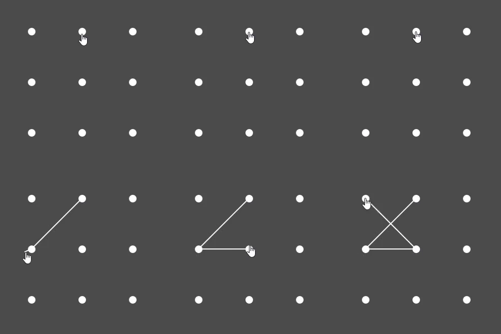
allowJumping Boolean default : false
Setting this property to true would allow you to connect 2 points that have unselected points between them (diagonally, vertically or horizontally) without the points in the middle being auto selected for you (see image below).
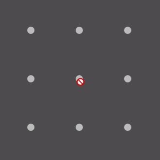
disabled Boolean default : false
Makes the pattern input disabled (turns gray and user input is disabled).
invisible Boolean default : false
Hides the lines that connect the pattern points.
noPop Boolean default : false
Disables the pop animation when a point gets activated.
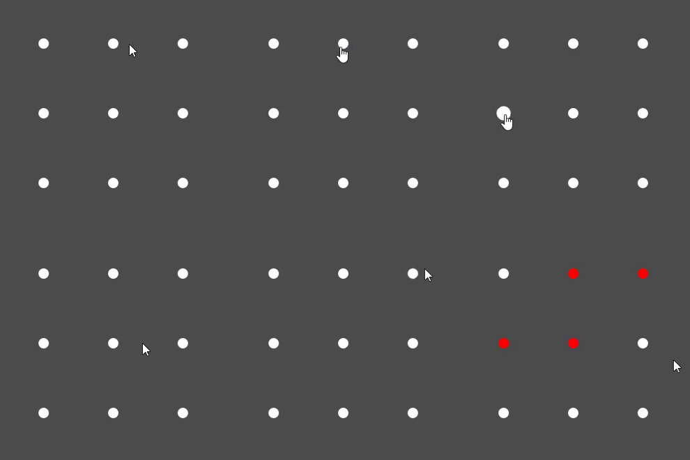
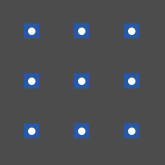
pointActiveSize Number default : 30
The active area of each of the points.
When the cursor enters this area the point will be activated.
Activate areas are indicated by the blue squares.
Extra
You can override the default colors for (disabled, success, error) using css Check the codepen example for more info
License
MIT Licensed. Copyright (c) WinterCore 2019.


