react-otp-component
A fully customizable, one-time password input component for the web built with React.
Installation
To install the latest stable version:
npm install --save react-otp-component
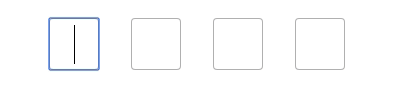
Basic usage:
;; state = otp: '' ; { this; } { return <div> <OtpComponent completeOtpEntered=thisonOtpChange /> </div> ; }API
| Name |
Type | Required | Default | Description |
|---|---|---|---|---|
| size | number | false | 6 | Number of OTP inputs to be rendered. |
| completeOtpEntered | function | true | console.log | Returns OTP code typed in inputs. |
| autofocus | boolean | false | true | It specifies that an element should automatically get focus when the page loads. |
| border | String | false | 2px solid #00d09c | Change border colour of the input box. |
| width | String / Number | false | 35px | Change the width of the otp input box |
| width | String / Number | false | 40px | Change the height of the otp input box |