react-native-app-intro-slider
Easy-to-use yet very configurable app introduction slider/swiper
npm i react-native-app-intro-slider --save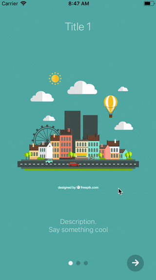 |
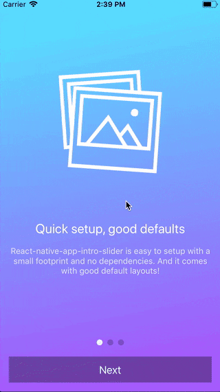 |
Table of contents
Usage
Basic example
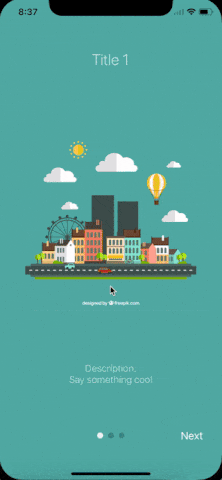
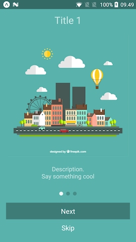
| No configuration | showSkipButton |
bottomButton and showSkipButton |
|---|---|---|
 |
 |
 |
;;; const styles = StyleSheet; const slides = key: 'somethun' title: 'Title 1' text: 'Description.\nSay something cool' image: imageStyle: stylesimage backgroundColor: '#59b2ab' key: 'somethun-dos' title: 'Title 2' text: 'Other cool stuff' image: imageStyle: stylesimage backgroundColor: '#febe29' key: 'somethun1' title: 'Rocket guy' text: 'I\'m already out of descriptions\n\nLorem ipsum bla bla bla' image: imageStyle: stylesimage backgroundColor: '#22bcb5' ; Component { // User finished the introduction. Show "real" app } { return <AppIntroSlider slides=slides onDone=this_onDone /> ; }Configuring buttons
;;;; const styles = StyleSheet; // slides = [...] Component { return <View style=stylesbuttonCircle> <Ionicons name="md-arrow-round-forward" color="rgba(255, 255, 255, .9)" size=24 style= backgroundColor: 'transparent' /> </View> ; } { return <View style=stylesbuttonCircle> <Ionicons name="md-checkmark" color="rgba(255, 255, 255, .9)" size=24 style= backgroundColor: 'transparent' /> </View> ; } { return <AppIntroSlider slides=slides renderDoneButton=this_renderDoneButton renderNextButton=this_renderNextButton /> ; }Custom slide layout
;;;;; const styles = StyleSheet; const slides = key: 'somethun' title: 'Quick setup, good defaults' text: 'React-native-app-intro-slider is easy to setup with a small footprint and no dependencies. And it comes with good default layouts!' icon: 'ios-images-outline' colors: '#63E2FF' '#B066FE' key: 'somethun1' title: 'Super customizable' text: 'The component is also super customizable, so you can adapt it to cover your needs and wants.' icon: 'ios-options-outline' colors: '#A3A1FF' '#3A3897' key: 'somethun2' title: 'No need to buy me beer' text: 'Usage is all free' icon: 'ios-beer-outline' colors: '#29ABE2' '#4F00BC' ; Component <LinearGradient style=stylesmainContent paddingTop: propstopSpacer paddingBottom: propsbottomSpacer colors=propscolors start=x: 0 y: 1 end=x: 1 y: 1 > <Ionicons style= backgroundColor: 'transparent' name=propsicon size=200 color="white" /> <View> <Text style=stylestitle>propstitle</Text> <Text style=stylestext>propstext</Text> </View> </LinearGradient> ; { return <AppIntroSlider slides=slides renderItem=this_renderItem bottomButton /> ; }Here a custom renderItem is supplied and the bottomButton-props has been set to true. Notice how the setup of slides has been configured to support icons and gradient backgrounds.
Props and options
Configure looks
| Name | Type | Default | Description |
|---|---|---|---|
| skipLabel | string |
Skip |
Custom label for Skip button |
| doneLabel | string |
Done |
Custom label for Done button |
| nextLabel | string |
Next |
Custom label for Next button |
| bottomButton | boolean |
false |
Enable to show a full-width button under pagination |
| dotColor | string |
'rgba(0, 0, 0, .2)' | Color of inactive pagination dots |
| activeDotColor | string |
'rgba(255, 255, 255, .9)' | Color of active pagination dot |
| renderNextButton | function |
renders a Text-component | Use to supply your own next button |
| renderDoneButton | function |
renders a Text-component | Use to supply your own done button |
| renderItem | function |
renders DefaultSlide |
Function returning a slide. The function is passed the slide object as wells as { topSpacer: Number, bottomSpacer: Number }. These show the "safe-space" where other UI is not interfering - take a look at DefaultSlide.js too see how they are set up. |
Configure behavior
| Name | Type | Default | Description |
|---|---|---|---|
| slides | object |
No default, required | An array of slide-objects |
| showSkipButton | boolean |
false |
Enable to show a skip button to the left of pagination dots. When bottomButton == true the skip button is a small text under the full-width next button |
| onSlideChange | function |
void |
Called when user goes to next slide. Function called with arguments index: number, lastIndex: number |
| onDone | function |
void |
Called when user ends the introduction by pressing the done button |
| onSkip | function |
void |
Called when user presses the skip button |
slide object
Each slide object should contain at least a unique key. If you use the default layouts your object should furthermore contain:
| Name | Type | Note |
|---|---|---|
| title | string |
The title |
| text | string |
Main text of slide |
| image | Image-source prop |
Slide image |
| imageStyle | Style-prop |
Styling for the image (e.g. size) |
| backgroundColor | string |
Slide background color |
If you use a custom renderItem-method you can design your slide objects as you see fit.
Example
You can run the example Expo-app by cloning the repo:
git clone https://github.com/Jacse/react-native-app-intro-slider.gitcd react-native-app-intro-slider/Exampleyarnyarn start