简介
react-native-tcharts-nj是基于@react-native-community/art的图表组件库,完全跨平台
组件列表
安装
$ npm install react-native-tcharts-nj --save
$ npm install @react-native-community/art --save
Linking module @react-native-community/art
Mostly automatic linking
For react-native >= 0.60 ReactNativeART should be autolinked and no additional action is required.
For react-native < 0.60 you need to link ReactNative ART:
react-native link @react-native-community/artManual linking
Manually linking the library for iOS
Open project.xcodeproj in Xcode
Drag RNCSlider.xcodeproj to your project on Xcode (usually under the Libraries group on Xcode):
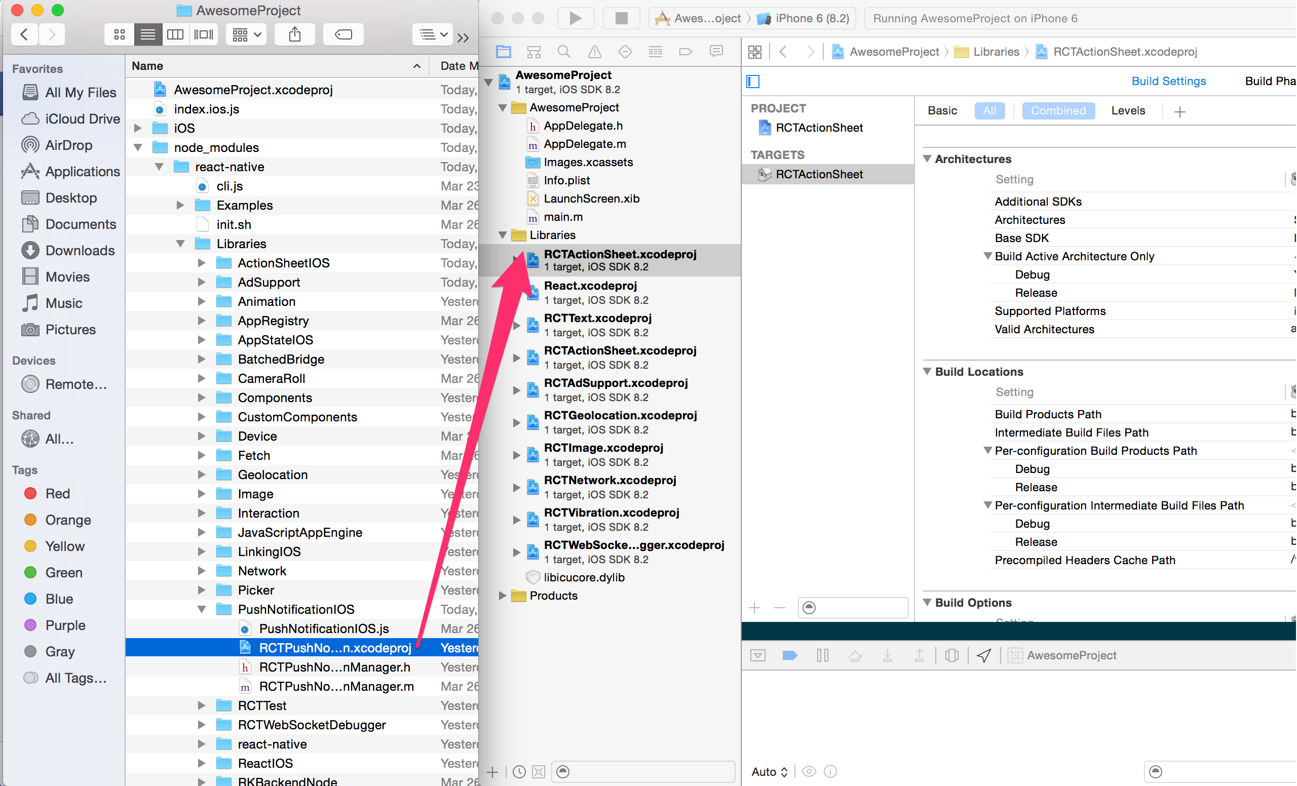
Link libART.a binary with libraries
Click on your main project file (the one that represents the .xcodeproj) select Build Phases and drag the static library from the Products folder inside the Library you are importing to Link Binary With Libraries (or use the + sign and choose library from the list):

Manually linking the library for Android
android/settings.gradle
include ':react-native-art'
project(':react-native-art').projectDir = new File(rootProject.projectDir, '../node_modules/@react-native-community/art/android')
android/app/build.gradle
dependencies {
   ...
   implementation project(':react-native-art')
}
android/app/src/main/.../MainApplication.java
On top, where imports are:
import com.reactnativecommunity.art.ARTPackage;Add the ARTPackage class to your list of exported packages.
@Override
protected List<ReactPackage> getPackages() {
    return Arrays.asList(
            new MainReactPackage(),
            new ARTPackage()
    );
}
Migrating from the core react-native module
To migrate to this module you need to follow all the installation instructions above and change your imports from:
import {ART} from 'react-native';
const {Surface, Shape} = ART;
to:
import {Surface, Shape} from '@react-native-community/art';使用
import {Rect, Polygon, Circle, Ellipse, Radar, Pie, Line, Bar, Scatter, Funnel} from 'react-native-tcharts'
Class Demo extends Component{
    render{
        return (<View>
            <Rect style={} width={} height={} option={} />
            <Polygon style={} width={} height={} option={} />
            <Circle style={} width={} height={} option={} />
            <Ellipse style={} width={} height={} option={} />
            <Radar style={} width={} height={} option={} />
            <Pie style={} width={} height={} option={} />
            <Line style={} width={} height={} option={} />
            <Bar style={} width={} height={} option={} />
            <Scatter style={} width={} height={} option={} />
            <Funnel style={} width={} height={} option={} />
        </View>)
    }
}
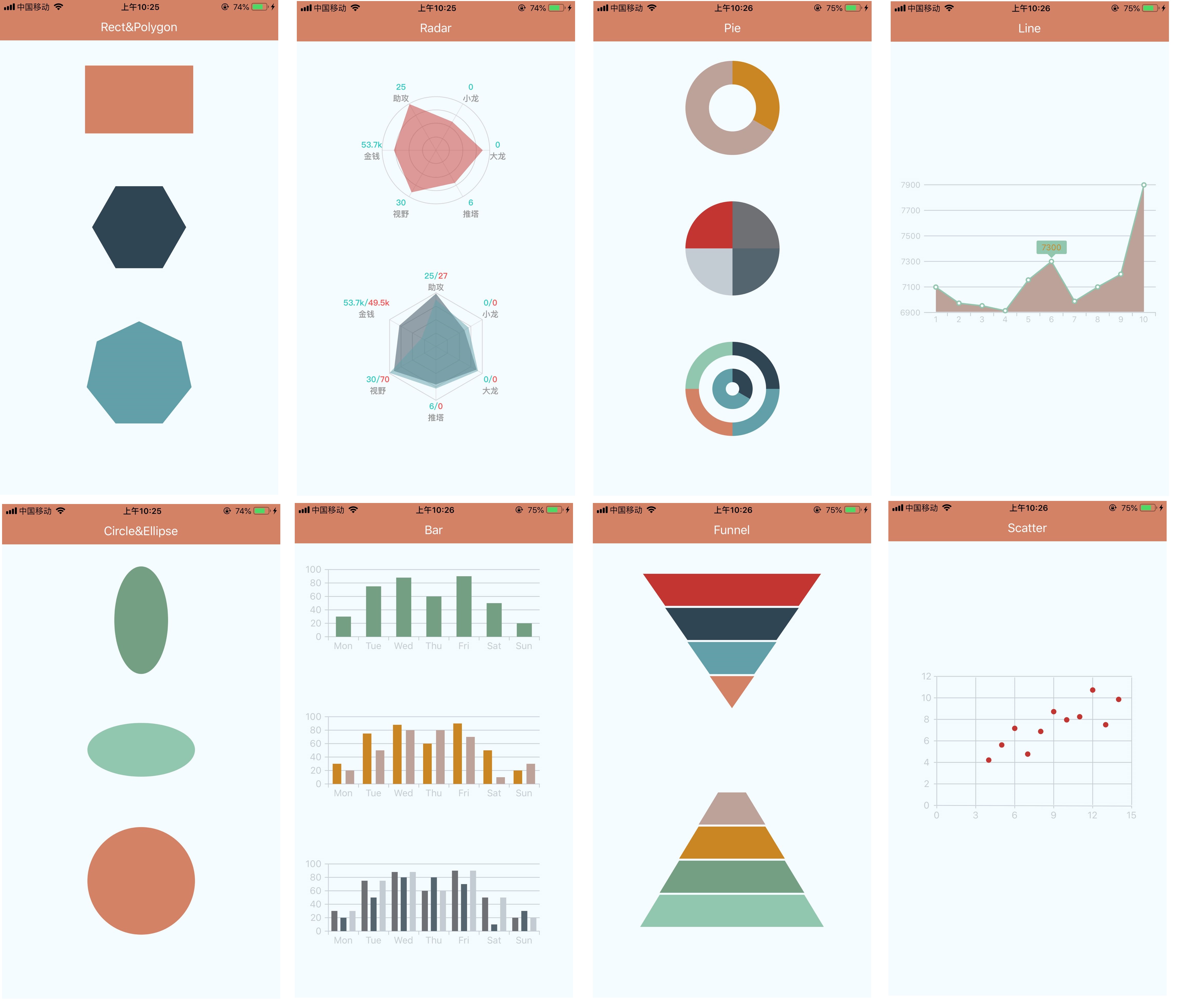
图例
通用属性
- style(object):同react native 组件style,会直接透传到组件容器元素上.
- width (number): 组件宽度,不传默认手机屏幕宽度.
- height (number): 组件高度,不传默认200
- option (object): 组件配置项,详情请点击各组件查看文档或直接查看example目录下对应的示例.
组件参数
1.Rect
- option
| Props | Type | Required | Description |
|---|---|---|---|
| width | Number | No | 正方形/长方形宽度 |
| height | Number | No | 正方形/长方形高度 |
| strokeWidth | Number | No | 边框宽度 |
| stroke | Color | No | 边框色值 |
| fill | Color | No | 填充色 |
- demo
const option = {
    strokeWidth: 0,
    stroke: '#fff',
    fill: '#000',
    width: 160,
    height: 100
};
2.Polygon
- option
| Props | Type | Required | Description |
|---|---|---|---|
| width | Number | No | 多边形宽 |
| height | Number | No | 多边形高 |
| strokeWidth | Number | No | 边框宽度 |
| stroke | Color | No | 边框颜色 |
| fill | Color | No | 填充色 |
| lineNumber | Number | No | 多边形边的个数 |
| startAngle | Number | No | 起始角度,默认x轴正向,正值为逆时针方向 |
- demo
const option = {
    radius: 70,
    startAngle: 0,
    lineNumber: 6,
    fill: '#fff',
    strokeWidth: 0,
    stroke: '#000'
};
3.Circle
- option
| Props | Type | Required | Description |
|---|---|---|---|
| strokeWidth | Number | No | 边框宽度 |
| stroke | Color | No | 边框颜色 |
| fill | Color | No | 填充色 |
| r | Number | No | 半径 |
- demo
const option = {
    r: 80,
    fill: '#fff',
    strokeWidth: 2,
    stroke: '#000'
}
4.Ellipse
- option
| Props | Type | Required | Description |
|---|---|---|---|
| strokeWidth | Number | No | 边框宽度 |
| stroke | Color | No | 边框颜色 |
| fill | Color | No | 填充色 |
| rx | Number | No | 短边半径 |
| ry | Number | No | 长边半径 |
- demo
const option = {
    rx: 40,
    ry: 80,
    fill: '#fff',
    strokeWidth: 2,
    stroke: '#000'
}
5.Radar
- option
| Props | Type | Required | Description |
|---|---|---|---|
| r | Number | No | 雷达图半径 |
| splitNumber | Number | No | 雷达图轴线数量 |
| shape | String | No | 雷达图形状[polygon/circle],默认polygon |
| startAngle | Number | No | 雷达图起始角度,默认x轴正向,正值为逆时针旋转 |
| indicator | Array | No | 轴线文案,最大值,文案颜色,数组长度即为轴线数量 |
| axisLine | Object | No | 轴线配置,是否显示以及轴线样式 |
| rich | Object | No | 轴线文案定制化设置,包括多颜色以及换行 |
| series | Array | No | 雷达图数据 |
- demo
const option = {
    r: 80,
    splitNumber: 5,
	shape: 'polygon',
	startAngle: 0,
	indicator: [{
		text: '{a:v1}{b:v2}{c:v3}',
		max: 100,
        min: 0,
		color: '#000'
	}, {
		text: '{a:v1}{b:v2}{c:v3}',
		max: 100,
        min: 0,
		color: '#000'
	}, {
		text: '{a:v1}{b:v2}{c:v3}',
		max: 100,
        min: 0,
		color: '#000'
	}, {
		text: '{a:v1}{b:v2}{c:v3}',
		max: 100,
        min: 0,
		color: '#000'
	}],
	axisLine: {
		show: true,
		lineStyle: {
			color: '#000'
		}
	},
	rich: {
        a: {
            color: '#2dcbc3',
            fontSize: 12,
            textAlign: 'center',
            textAlignVertical: 'center',
            fontFamily: "PingFangSC-Medium",
            fontWeight: 'bold'
        },
        b: {
            color: '#f55353',
            fontSize: 12,
            textAlign: 'center',
            textAlignVertical: 'center',
            fontFamily: "PingFangSC-Medium",
            fontWeight: 'bold'
        },
        c: {
            color: "#999999",
            fontSize: 12,
            textAlign: 'center',
            textAlignVertical: 'center',
            fontFamily: "PingFangSC-Medium",
            fontWeight: 'bold'
        }
	},
	series: [{
		data: [20, 50, 80, 100],
		itemStyle: {
            color: '#000'
        },
		lineStyle: {
            color: '#000'
        },
		areaStyle: {
            color: '#000'
        }
	}]
}
6.Pie
- option
| Props | Type | Required | Description |
|---|---|---|---|
| color | Array | No | 饼图颜色 |
| series | Array | No | 饼图数据 |
- demo
const option2 = {
    title: {},
    legend: {},
    color: ['#000', '#001', '#002', '#003'],
    series:[{
        name: '',
        type: 'pie',
        radius: [60,80], //饼图半径暂支持数字
        data: [10,10, 10, 10], //饼图占用数据
    },{
        name: '',
        type: 'pie',
        radius: [20,40],
        data: [10,20],
    }]
}
7.Line
- option
| Props | Type | Required | Description |
|---|---|---|---|
| xAxis | Object | No | x轴信息 |
| yAxis | Object | No | y轴信息 |
| series | Array | No | 折线图数据 |
- demo
const option = {
    xAxis: {
        name: 'test',
        nameStyle: {
            color: '#000',
            fontSize: 12
        },
        lineStyle: {
            color: '#999'
        },
        textStyle: {
            color: '#999',
            fontSize: 12
        },
        gridLine: {
            lineStyle: {
                color: '#999'
            }
        },
        axisTick: {
            show: true,
            lineStyle: {
                color: '#999'
            }
        },
        min: 0,
        max: 100,
        interval: 20,
        data: [1, 2, 3, 4, 5, 6, 7, 8, 9, 10]
    },
    yAxis: {
        name: '',
        nameStyle: {
            color: '#aaa',
            fontSize: 12
        },
        lineStyle: {
            color: '#999'
        },
        textStyle: {
            color: '#999',
            fontSize: 12
        },
        gridLine: {
            lineStyle: {
                color: '#999'
            }
        },
        axisTick: {
            show: true,
            lineStyle: {
                color: '#aaa'
            }
        },
        interval: 200,
        min: 6900,
        max: 7900,
        data: []
    },
    series: [{
        data: [7099, 6973, 6953, 6914, 7155, 7300, 6988, 7100, 7200, 7899],
        pointer: {
            itemStyle: {
                color: '#aaa',
                fill: '#fff'
            },
            radius: 3
        },
        tip: {
            itemStyle: {
                backgroundColor: '#aaa',
                color: '#aaa',
                fontSize: 12
            }
        },
        lineStyle: {
            color: '#aaa',
            fill: '#aaa'
        }
    }]
}
8.Bar
- option
| Props | Type | Required | Description |
|---|---|---|---|
| xAxis | Object | No | x轴信息 |
| yAxis | Object | No | y轴信息 |
| series | Array | No | 柱状图数据 |
- demo
const option = {
    xAxis: {
        name: '',
        lineStyle: {//轴线相关配置
            color: '#000'
        },
        axisTick: {//刻度相关配置
            show: true,
            lineStyle: {
                color: '#000'
            }
        },
        textStyle: {
            color: '#000'
        },
        min: 0,
        max: 100,
        interval: 20,
        data: ['Mon', 'Tue', 'Wed', 'Thu', 'Fri', 'Sat', 'Sun']
    },
    yAxis: {
        name: '',
        lineStyle: {
            color: '#000'
        },
        axisTick: {
            show: true,
            lineStyle: {
                color: '#000'
            }
        },
        textStyle: {
            color: '#000'
        },
        gridLine: {
            show: true,
            lineStyle: {
                color: '#000'
            }
        },
        min: 0,
        max: 100,
        interval: 20
    },
    series: [{
        data: [30, 75, 88, 60, 90, 50, 20],
        itemStyle: {
            color: '#666',
            opacity: 1
        }
    }, {
        data: [20, 50, 80, 80, 70, 10, 30],
        itemStyle: {
            color: '#666',
            opacity: 1
        }
    }]
};
9.Scatter
- option
| Props | Type | Required | Description |
|---|---|---|---|
| xAxis | Object | No | x轴信息 |
| yAxis | Object | No | y轴信息 |
| series | Array | No | 散点图数据 |
- demo
const option = {
    xAxis: {
        lineStyle: {
            color: '#222'
        },
        textStyle: {
            color: '#222',
            font: 10
        },
        gridLine: {
            isShow: true,
            lineStyle: {
                color: '#222'
            }
        },
        min: 0,
        max: 100,
        interval: 20,
        data: [0,3,6,9,12,15]
    },
    yAxis: {
        lineStyle: {
            color: '#222'
        },
        textStyle: {
            color: '#222',
            font: 10
        },
        gridLine: {
            isShow: true,
            lineStyle: {
                color: '#222'
            }
        },
        min: 0,
        max: 100,
        interval: 20,
        data: [0,2,4,6,8,10,12]
    },
    series: [{
        data: [
            [10.0, 8.04],
            [8.0, 6.95],
            [13.0, 7.58],
            [9.0, 8.81],
            [11.0, 8.33],
            [14.0, 9.96],
            [6.0, 7.24],
            [4.0, 4.26],
            [12.0, 10.84],
            [7.0, 4.82],
            [5.0, 5.68]
        ],
        radius: 4,
        itemStyle: {
            color: '#333',
            opacity: 1
        }
    }]
};
10.Funnel
- option
| Props | Type | Required | Description |
|---|---|---|---|
| color | Array | No | 漏斗图颜色数组 |
| series | Array | No | 漏斗图数据 |
- demo
const option = {
    title: '漏斗图',
    legend: {},
    color: ['#000', '#111', '#222', '#333'],
    series: [{
        name: '漏斗图',
        type: 'funnel',
        min: 0,
        max: 100, //设置漏斗的最小和最大值
        minSize: '0%', //漏斗的最小和最大尺寸
        maxSize: '80%',
        height: 200,
        gap: 3, //漏斗间隔
        funnelAlign: 'center', //对齐方式
        sort: 'descending',//漏斗顺序[descending|ascending]
        label: {
            show: true,
            fontSize: 12,
            color: '#fff'//用来显示标注字体样式的
        },
        data: [{
            value: 20,
            name: '一季度'
        }, {
            value: 40,
            name: '一季度'
        }, {
            value: 60,
            name: '二季度'
        }, {
            value: 80,
            name: '三季度'
        }]
    }]
}
License
react-native-tcharts-nj is released under the MIT license.