React Native Super Grid
Responsive Grid View for React Native.
Getting Started
This library export two components - FlatGrid (similar to FlatList) and SectionGrid (similar to SectionList). Both components render a Grid layout that adapts itself to various screen resolutions.
Instead of passing an itemPerRow argument, you pass itemDimension and each item will be rendered with a dimension size equal to or more than (to fill the screen) the given dimension.
Internally, these components use the native FlatList and SectionList.
Version 3.x, please refer v3 branch for documentation
Version 2.x and older, please refer v2 branch for documentation
v3 to v4 Migration
- Rename FlatList's
itemsprop todata. - v4 is based on React hooks, and requires React Native version >
0.59. - Methods called on SectionList/FlatList refs can be called directly now (because of forwardRef). i.e Instead of
ref.current.sectionList.scrollToLocation, useref.current.scrollToLocation.
Installing
You can install the package via npm.
npm install react-native-super-grid
Usage (FlatGrid)
import { FlatGrid } from 'react-native-super-grid';<FlatGrid
itemDimension={130}
data={[1,2,3,4,5,6]}
renderItem={({ item }) => (<Text>{item}</Text>)}
/>Usage (SectionGrid)
import { SectionGrid } from 'react-native-super-grid';<SectionGrid
itemDimension={130}
sections={[
{
title: 'Numbers',
data: [1,2,3,4,5,6],
},
{
title: 'Alphabets',
data: ['A', 'B', 'C', 'D', 'E'],
},
]}
renderItem={({ item }) => (<Text>{item}</Text>)}
renderSectionHeader={({ section }) => (
<Text style={{ fontSize: 20 }}>{section.title}</Text>
)}
/>Properties
| Property | Type | Default Value | Description |
|---|---|---|---|
| renderItem | Function | Function to render each object. Should return a react native component. Same signature as that of FlatList/SectionList's renderItem (with an additional key rowIndex). |
|
| data (for FlatGrid) sections (for SectionGrid) | Array | Data to be rendered. renderItem will be called with each item in this array. Same signature as that of FlatList/SectionList. | |
| itemDimension | Number | 120 | Minimum width or height for each item in pixels (virtual). |
| fixed | Boolean | false | If true, the exact itemDimension will be used and won't be adjusted to fit the screen. |
| spacing | Number | 10 | Spacing between each item. |
| style | FlatList styles (Object) | Styles for the container. Styles for an item should be applied inside renderItem. Note: If you set adjustGridToStyles to true then padding added in this prop will be used to adjust the total dimensions of the grid to reflect the padding in this style object. |
|
| additionalRowStyle | styles (Object) | Additional styles for rows (rows render multiple items within), apart from the generated ones. | |
| itemContainerStyle | styles (Object) | Style for item's container. Not needed for most cases. | |
| staticDimension | Number | Specifies a static width or height for the container. If not passed, maxDimension will be used. |
|
| maxDimension | Number | Specifies a maximum width or height for the container. If not passed, full width/height of the screen will be used. Note: If you set adjustGridToStyles to true then you can alternatively use the contentContainerStyle prop and set maxWidth or maxHeight. |
|
| horizontal | boolean | false | If true, the grid will be scrolling horizontally. If you want your item to fill the height when using a horizontal grid, you should give it a height of '100%'. This prop doesn't affect the SectionGrid, which only scrolls vertically. |
| onLayout | Function | Optional callback ran by the internal FlatList or SectionList's onLayout function, thus invoked on mount and layout changes. |
|
| listKey | String | A unique identifier for the Grid. This key is necessary if you are nesting multiple FlatGrid/SectionGrid inside another Grid (or any VirtualizedList). | |
| keyExtractor | Function | A function (item, rowItemIndex) => {String} that should return a unique key for the item passed. |
|
| invertedRow | boolean | Reverses the direction of row items. It can be used with the inverted property. |
|
| maxItemsPerRow | number | Specifies the maximum number of items to render per row | |
| contentContainerStyle | styles (Object) | This is the regular FlatList/SectionList prop. If you set adjustGridToStyles to true and specify maxWidth or maxHeight it will be used the same as maxDimension. In addition, padding added here will be used to adjust the total dimensions of the grid to reflect the padding in this style object. |
|
| adjustGridToStyles | boolean | Set to true when you want the library to automatically adjust the total dimensions of the grid based on style and contentContainerStyle props |
|
| customFlatList (for FlatGrid) | ElementType | Replaces FlatList in FlatGrid with ElementType. E.g. Animated.FlatList
|
|
| customSectionList (for SectionGrid) | ElementType | Replaces SectionList in SectionGrid with ElementType. E.g. Animated.SectionList
|
|
| onItemsPerRowChange | Function | A callback (itemsPerRow: number) => void that is called when number of items per row is determined. |
All additional props you pass will be passed on to the internal FlatList/SectionList. This means you can make use of various props and methods like ListHeaderComponent, onEndReached, onRefresh...etc. While these are not tested for compatibility, most of them should work as expected.
In SectionGrid, section argument in methods like renderSectionHeader, renderSectionFooter, ItemSeparatorComponent will slightly different from the actual section you passed. The data key in the section will be the grouped versions of items (items that go in one row), and the original list of items can be found in originalData key. All other keys will remain intact.
FlatGrid Example
import React from 'react';
import { StyleSheet, View, Text } from 'react-native';
import { FlatGrid } from 'react-native-super-grid';

export default function Example() {
  const [items, setItems] = React.useState([
    { name: 'TURQUOISE', code: '#1abc9c' },
    { name: 'EMERALD', code: '#2ecc71' },
    { name: 'PETER RIVER', code: '#3498db' },
    { name: 'AMETHYST', code: '#9b59b6' },
    { name: 'WET ASPHALT', code: '#34495e' },
    { name: 'GREEN SEA', code: '#16a085' },
    { name: 'NEPHRITIS', code: '#27ae60' },
    { name: 'BELIZE HOLE', code: '#2980b9' },
    { name: 'WISTERIA', code: '#8e44ad' },
    { name: 'MIDNIGHT BLUE', code: '#2c3e50' },
    { name: 'SUN FLOWER', code: '#f1c40f' },
    { name: 'CARROT', code: '#e67e22' },
    { name: 'ALIZARIN', code: '#e74c3c' },
    { name: 'CLOUDS', code: '#ecf0f1' },
    { name: 'CONCRETE', code: '#95a5a6' },
    { name: 'ORANGE', code: '#f39c12' },
    { name: 'PUMPKIN', code: '#d35400' },
    { name: 'POMEGRANATE', code: '#c0392b' },
    { name: 'SILVER', code: '#bdc3c7' },
    { name: 'ASBESTOS', code: '#7f8c8d' },
  ]);

  return (
    <FlatGrid
      itemDimension={130}
      data={items}
      style={styles.gridView}
      // staticDimension={300}
      // fixed
      spacing={10}
      renderItem={({ item }) => (
        <View style={[styles.itemContainer, { backgroundColor: item.code }]}>
          <Text style={styles.itemName}>{item.name}</Text>
          <Text style={styles.itemCode}>{item.code}</Text>
        </View>
      )}
    />
  );
}

const styles = StyleSheet.create({
  gridView: {
    marginTop: 10,
    flex: 1,
  },
  itemContainer: {
    justifyContent: 'flex-end',
    borderRadius: 5,
    padding: 10,
    height: 150,
  },
  itemName: {
    fontSize: 16,
    color: '#fff',
    fontWeight: '600',
  },
  itemCode: {
    fontWeight: '600',
    fontSize: 12,
    color: '#fff',
  },
});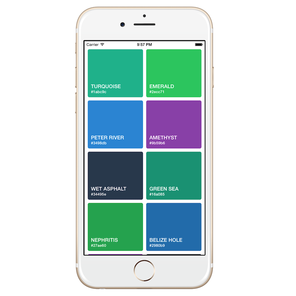 |
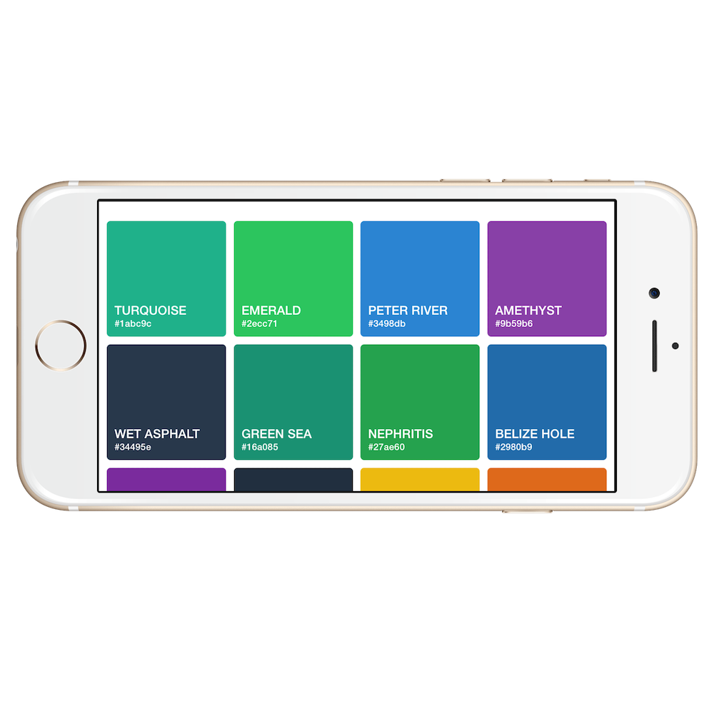 |
|---|---|
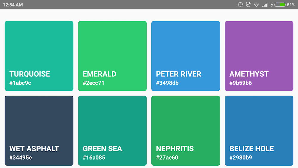
| iPhone6 Portrait | iPhone6 Landscape |
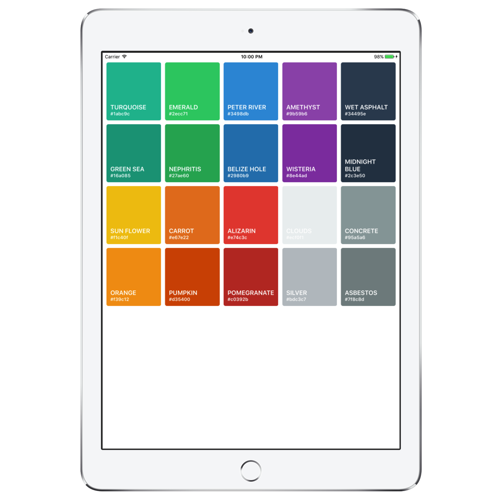 |
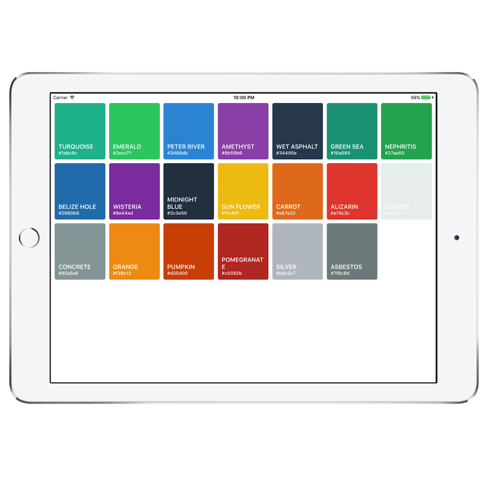 |
|---|---|
| iPad Air 2 Portrait | iPad Air 2 Landscape |
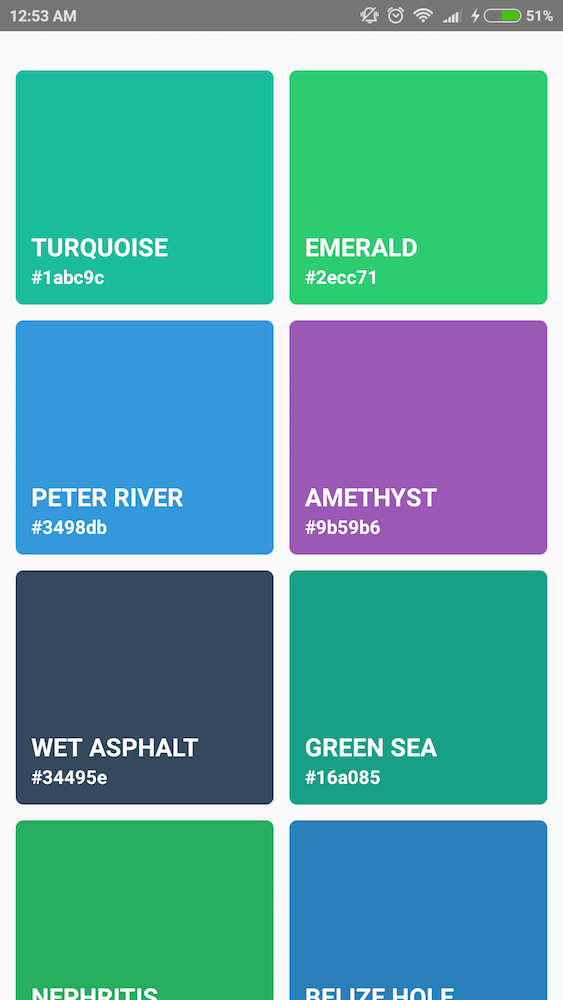 |
 |
|---|---|
| Android Portrait | Android Landscape |
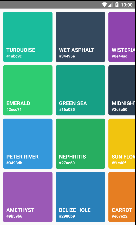 |
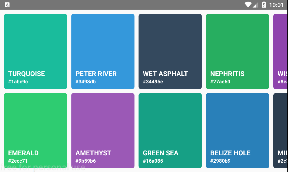 |
|---|---|
| Android Horizontal Portrait | Android Horizontal Landscape |
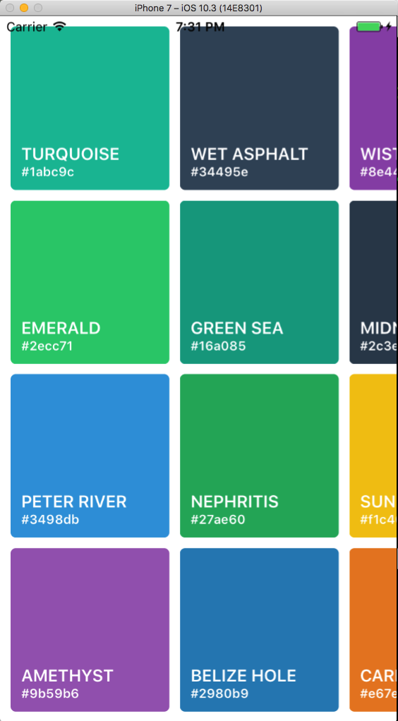 |
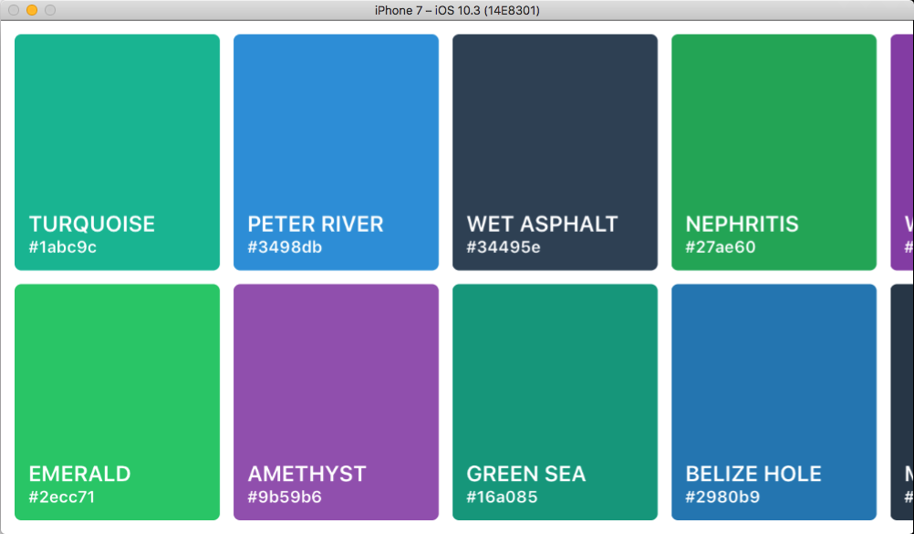 |
|---|---|
| iPhone Horizontal Portrait | iPhone Horizontal Landscape |
SectionGrid Example
import React, { Component } from 'react';
import { StyleSheet, View, Text } from 'react-native';
import { SectionGrid } from 'react-native-super-grid';

export default function Example() {
  const [items, setItems] = React.useState([
    { name: 'TURQUOISE', code: '#1abc9c' },
    { name: 'EMERALD', code: '#2ecc71' },
    { name: 'PETER RIVER', code: '#3498db' },
    { name: 'AMETHYST', code: '#9b59b6' },
    { name: 'WET ASPHALT', code: '#34495e' },
    { name: 'GREEN SEA', code: '#16a085' },
    { name: 'NEPHRITIS', code: '#27ae60' },
    { name: 'BELIZE HOLE', code: '#2980b9' },
    { name: 'WISTERIA', code: '#8e44ad' },
    { name: 'MIDNIGHT BLUE', code: '#2c3e50' },
    { name: 'SUN FLOWER', code: '#f1c40f' },
    { name: 'CARROT', code: '#e67e22' },
    { name: 'ALIZARIN', code: '#e74c3c' },
    { name: 'CLOUDS', code: '#ecf0f1' },
    { name: 'CONCRETE', code: '#95a5a6' },
    { name: 'ORANGE', code: '#f39c12' },
    { name: 'PUMPKIN', code: '#d35400' },
    { name: 'POMEGRANATE', code: '#c0392b' },
    { name: 'SILVER', code: '#bdc3c7' },
    { name: 'ASBESTOS', code: '#7f8c8d' },
  ]);

  return (
    <SectionGrid
      itemDimension={90}
      // staticDimension={300}
      // fixed
      // spacing={20}
      sections={[
        {
          title: 'Title1',
          data: items.slice(0, 6),
        },
        {
          title: 'Title2',
          data: items.slice(6, 12),
        },
        {
          title: 'Title3',
          data: items.slice(12, 20),
        },
      ]}
      style={styles.gridView}
      renderItem={({ item, section, index }) => (
        <View style={[styles.itemContainer, { backgroundColor: item.code }]}>
          <Text style={styles.itemName}>{item.name}</Text>
          <Text style={styles.itemCode}>{item.code}</Text>
        </View>
      )}
      renderSectionHeader={({ section }) => (
        <Text style={styles.sectionHeader}>{section.title}</Text>
      )}
    />
  );
}

const styles = StyleSheet.create({
  gridView: {
    marginTop: 20,
    flex: 1,
  },
  itemContainer: {
    justifyContent: 'flex-end',
    borderRadius: 5,
    padding: 10,
    height: 150,
  },
  itemName: {
    fontSize: 16,
    color: '#fff',
    fontWeight: '600',
  },
  itemCode: {
    fontWeight: '600',
    fontSize: 12,
    color: '#fff',
  },
  sectionHeader: {
    flex: 1,
    fontSize: 15,
    fontWeight: '600',
    alignItems: 'center',
    backgroundColor: '#636e72',
    color: 'white',
    padding: 10,
  },
});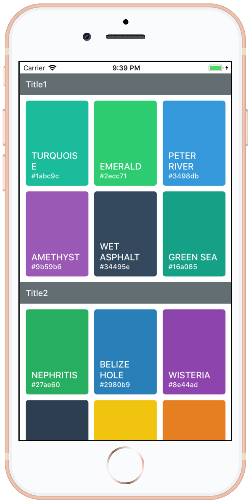 |
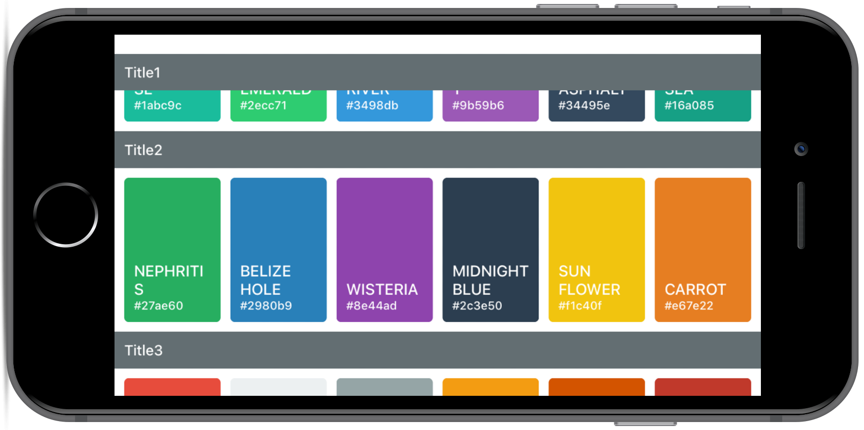 |
|---|---|
| iPhone SectionGrid Portrait | iPhone6 Landscape |
License
This project is licensed under the MIT License - see the LICENSE.md file for details.
Changelog
[4.6.0] - 2022-09-12
- Add onItemsPerRowChange @wjaykim
[4.5.1] - 2022-09-08
- Fix SectionGrid renderItem types @wjaykim
[4.5.0] - 2022-08-23
- Add ability to add custom interfaces @Ryanjso
[4.4.3] - 2022-08-03
- Update type defs to handle
refattribute @leezumstein
[4.4.2] - 2022-07-06
- Fix itemIndex in keyExtractor
[4.4.1] - 2022-07-06
- Fix SectionGrid types (title) @LightenedLimited
[4.4.0] - 2022-04-30
- Introduce
adjustGridToStylesprop @levic92
[4.3.0] - 2022-04-23
- Add maxItemsPerRow option @levic92
[4.2.0] - 2021-05-27
- Add invertedRow option @JeffGuKang
[4.1.2] - 2021-05-27
- Fix prop-type for styles @siarheipashkevich
[4.1.1] - 2021-02-03
- Update type definition @henrymoulton
[4.1.0] - 2021-01-16
- Add additionalRowStyle prop @sanghavan
[4.0.3] - 2020-07-14
- Remove ViewPropTypes @miracle2k
[4.0.2] - 2020-06-05
- Fix type definition of v4 FlatList
[4.0.1] - 2020-06-05
- Remove accidental console.log @ianmartorell
[4.0.0] - 2020-05-23
- Improve SectionList performance by using hooks @IsaaX
- Improve FlatList performance by using hooks
- Add maxDimension prop @ianmartorell
[3.2.0] - 2020-04-03
- Add keyExtractor prop @sammarks
[3.1.2] - 2019-09-27
- Security updates in packages @dependabot
[3.1.1] - 2019-09-27
- Fix type definitions @JulienKode
[3.1.0] - 2019-09-16
- Support overriding of renderItem in SectionList @paldepind
[3.0.9] - 2019-08-16
- Improve type definitions @Grohden
[3.0.8] - 2019-07-16
- Fix type definitions @Grohden
[3.0.7] - 2019-06-29
- Add listKey prop @josemiguelo
[3.0.6] - 2019-05-18
- Fix type definitions @zhigang1992
[3.0.5] - 2019-05-04
- Fix type definitions @zhigang1992
[3.0.4] - 2019-04-16
- Fix type definitions @hisankaran
[3.0.3] - 2019-02-25
- Fix type definitions @jgbernalp
[3.0.2] - 2019-02-20
- Fix calculation bug where itemsPerRow became zero (#81).
[3.0.1] - 2019-02-02
- Fix in section key passed to various SectionGrid props.
[3.0.0] - 2019-01-20
- Rename components, FlatList renderItem signature, Performance improvements.
[2.4.3] - 2018-07-22
- Fix deep copying issue in SectionGrid @andersonaddo
[2.4.2] - 2018-07-21
- Add itemContainerStyle prop @KseniaSecurity
[2.4.1] - 2018-07-07
- Add onLayout prop @ataillefer
[2.4] - 2018-05-11
- renderItem index fix @andersonaddo
[2.3.2] - 2018-05-23
- Typescript support for SuperGridSectionList @Anccerson
[2.3.0] - 2018-03-17
Added
- Add SuperGridSectionList @andersonaddo
[2.1.0] - 2018-03-17
Added
- Use FlatList instead of ListView
- Fix spacing issues
[2.0.2] - 2018-01-11
Added
- Allow dynamic update of itemDimension
[2.0.1] - 2017-12-13
Added
- Fixed render empty section headers Warning. @mannycolon
[2.0.0] - 2017-12-02
Added
- Add ability to have a horizontal grid. @Sh3rawi
[1.1.0] - 2017-11-03 (Target React Native 0.49+)
Added
- Replace view.propTypes to ViewPropTypes for 0.49+. @caudaganesh
[1.0.4] - 2017-10-09
Added
- Optional staticWidth prop @thejettdurham.
- Use prop-types package instead of deprecated react's PropTypes.
[1.0.3] - 2017-06-06
Added
- Pass row index to renderItem @heaversm.
Acknowledgments
Colors in the example from https://flatuicolors.com/.
Screenshot Mockup generated from https://mockuphone.com.


