fix 显示组件时根据默认时间重新赋值
 [
[ ](https://www.npmjs.com/
package/react-native-select-picker)
](https://www.npmjs.com/
package/react-native-select-picker)

react-native-select-picker
A useful select picker, help you finish you app fast.
Demo
Install
npm install react-native-select-picker --save
Usage
import {SelectPicker, DatePicker} from 'react-native-select-picker';
import React, { Component } from 'react';
import {
StyleSheet,
Text,
View,
TouchableOpacity
} from 'react-native';
export default class App extends Component<{}> {
constructor (props) {
super(props);
this.state = {
date: {},
picker: ''
}
}
componentDidMount () {
this.DatePicker.show();
}
valChange = (item, index) => {
console.log('值改变', item, index);
this.setState({
picker: item
})
}
dateValChange = (year,month, day, hour, minute) => {
console.log({year,month, day, hour, minute});
var dateObj = {year,month, day, hour, minute};
this.setState({
date:dateObj
});
}
render() {
var {date, picker} = this.state;
console.log(this.state, 111);
var date = JSON.stringify(date);
return (
<View style={styles.container}>
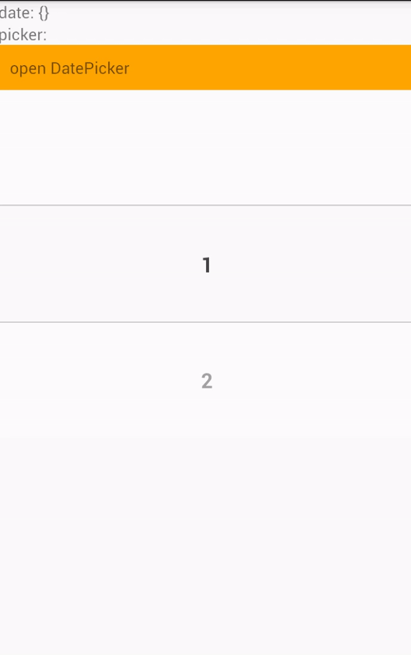
<Text>
date: {date}
</Text>
<Text>
picker: {picker}
</Text>
<TouchableOpacity style={{backgroundColor: 'orange', padding: 10}} onPress={() => this.DatePicker.show()}>
<Text>open DatePicker</Text>
</TouchableOpacity>
<SelectPicker
onValueChange={this.valChange}
/>
<DatePicker ref={(ref) => this.DatePicker = ref}
ok= {this.dateValChange}
/>
</View>
);
}
}
const styles = StyleSheet.create({
container: {
flex: 1
},
welcome: {
fontSize: 20,
textAlign: 'center',
margin: 10,
},
instructions: {
textAlign: 'center',
color: '#333333',
marginBottom: 5,
},
});
SelectPicker Config
Just a select picker.
| prop | type | defaut | description |
|---|---|---|---|
| wrapHeight | Number | 300 | The height of picker container |
| wrapWidth | Number or null | null | The width of picker container, if the value is 'null', the wrapWidth is the parent's width, if the parent is root element, the wrapWidth is screen width |
| itemHeigh | Number | 100 | The height of item heiht, which can be selett |
| fontColor | String | '#444’ | Font color |
| borderStyle | Object | {} | Border style |
| maskercolor | String | 'rgba(255, 255, 255, 0.5)' | The mask color of SelectPicker |
| data | Array | [1,2,3,4,5,6,7] | the picker list items |
| onValueChange | Function | function (item, index) | When select picker value change, this function will be call |
DatePicker Config
A date picker.
| prop | type | defaut | description |
|---|---|---|---|
| defaultTime | Date Object | new Date() | The default DateTime |
| title | String | '选择时间' | topBar text |
| titleStyle | Object | {} | --- |
| okText | String | '确定' | the right button text |
| okTextStyle | Object | {} | ---- |
| okBtnBgColor | String | 'rgba(255, 255, 255, 0.5)' | ---- |
| cancelText | String | '取消' | the left button text |
| cancelTextStyle | Object | {} | ---- |
| cancelBtnBgColor | String | 'rgba(255, 255, 255, 0.5)' | ---- |
| ok | Function | function (year, month, day, ,hour, minute) {} | When click ok button, this function will be call. |
| cancel | Function | function () {} | When click cancel button, DatePicker will be hidden. and you can do some thing in this function |
| customTopBar | Component Function | function (ok, cancel) {return null;} | You can custom topBar use this prop, return a React Component, args 'ok' and 'cancel' are function ,just like props 'ok' and 'cancel' |
DatePicker Methods
show()
you use this method to open DatePicker.
Example
componentDidMount () {
   this.DatePicker.show();
}

<DatePicker ref={(ref) => this.DatePicker = ref}
  ok= {this.dateValChange}
/>
Final
Good Luck!
:)
License
MIT