
✨ A customizable, interactive scroll indicator for React Native. Tap or drag to scroll, with animated thumb and auto-hide behavior.
- 🧭 Drag or tap the scroll track to jump to content
- 💡 Auto-hide logic with optional persistent mode
- 📏 Dynamic thumb height based on content size
- 🎨 Customizable colors, shadows, sizes
- 🔄 Inverted list support for chat-style interfaces
- ⚡ Optimized performance with native animations
- 🎯 Callback functions for haptic feedback and interaction handling
- ✅ Supports
FlatList,ScrollView,SectionList,DraggableFlatList, etc.
Try out the scroll track interactively on Expo Snack: 👉 Open in Snack
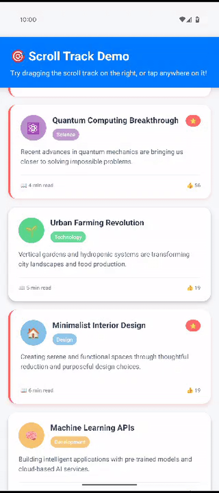
Normal Scrolling The scroll indicator syncs with native scrolling to reflect your current position. |
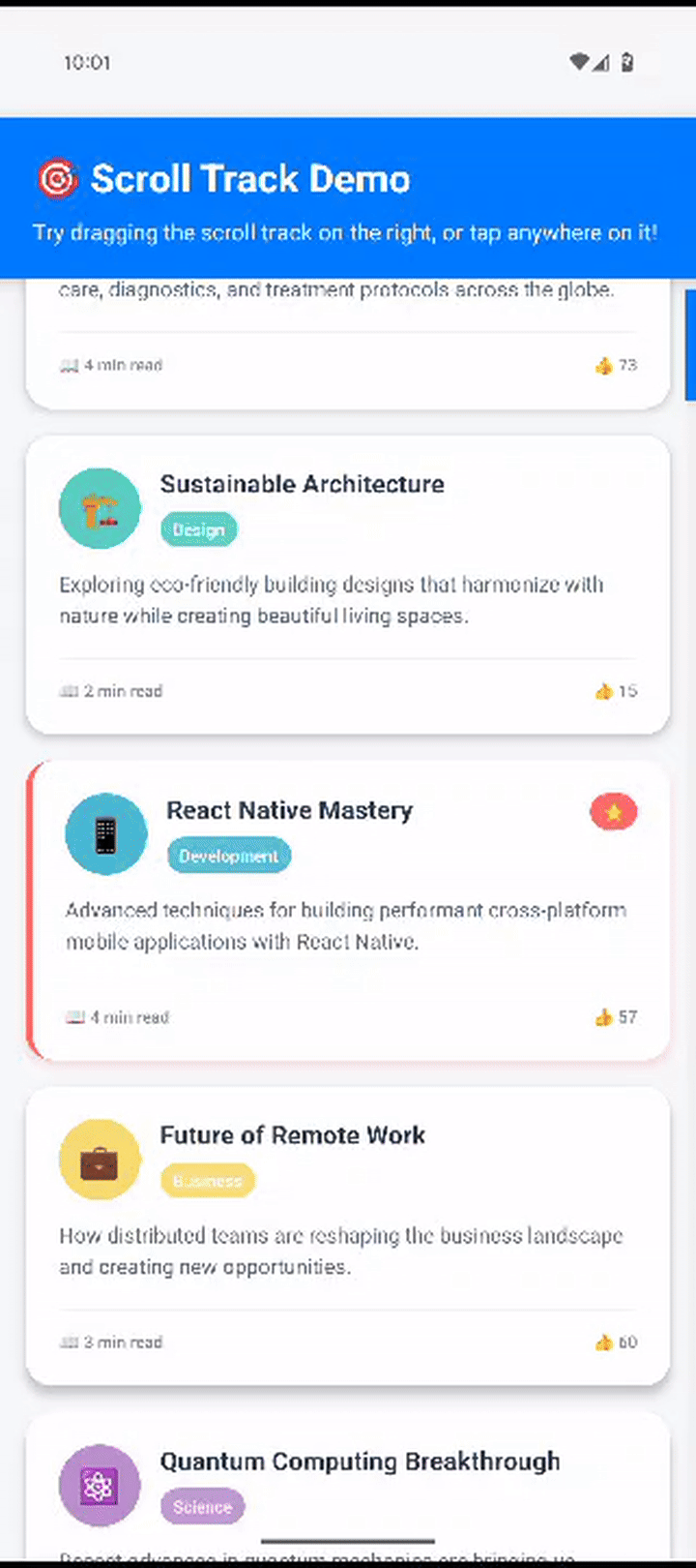
Tap to Jump Tap anywhere on the scroll track to instantly jump to that section of your content. |

Drag to Scroll Drag the thumb up and down to smoothly scroll through your content. |
npm install react-native-scroll-tracknpm install react-native-reanimated react-native-gesture-handlerFor React Native 0.60+, you need to complete the installation of the peer dependencies:
Follow the installation guide: https://docs.swmansion.com/react-native-reanimated/docs/fundamentals/installation
Follow the installation guide: https://docs.swmansion.com/react-native-gesture-handler/docs/installation
Important: Make sure react-native-reanimated/plugin is the last plugin in your babel.config.js.
Critical: You must wrap your app (or at least the component using ScrollableContainer) with GestureHandlerRootView from react-native-gesture-handler. Without this, you'll get the error:
PanGestureHandler must be used as a descendant of GestureHandlerRootView
import { GestureHandlerRootView } from 'react-native-gesture-handler';

export default function App() {
  return (
    <GestureHandlerRootView style={{ flex: 1 }}>
      {/* Your app content */}
      <YourComponent />
    </GestureHandlerRootView>
  );
}
Or if you're using Expo Router:
import { GestureHandlerRootView } from 'react-native-gesture-handler';

export default function RootLayout() {
  return (
        <GestureHandlerRootView style={{ flex: 1 }}>
            <Stack>
                <Stack.Screen name="index" options={{ headerShown: false }} />
            </Stack>
            <StatusBar style="dark" />
        </GestureHandlerRootView>
  );
}import { ScrollableContainer } from 'react-native-scroll-track';
const MyScreen = () => {
return (
<ScrollableContainer
scrollTrackStyling={{ thumbColor: '#AA00FF', alwaysVisible: false }}
>
{({
scrollRef,
onScroll,
onLayout,
onContentSizeChange,
scrollEventThrottle,
showsVerticalScrollIndicator,
}) => (
<FlatList
ref={scrollRef}
onScroll={onScroll}
onLayout={onLayout}
onContentSizeChange={onContentSizeChange}
scrollEventThrottle={scrollEventThrottle}
showsVerticalScrollIndicator={showsVerticalScrollIndicator}
data={myData}
renderItem={renderItem}
/>
)}
</ScrollableContainer>
);
};<ScrollableContainer
scrollTrackStyling={{
thumbColor: '#007AFF',
trackColor: '#E5E5E5',
trackWidth: 12,
thumbShadow: {
color: '#000000',
opacity: 0.2,
radius: 4,
offset: { width: 0, height: 2 },
},
alwaysVisible: false,
}}
>
{/* Your scrollable content */}
</ScrollableContainer><ScrollableContainer inverted={true}>
{({ scrollRef, onScroll, inverted, ...props }) => (
<FlatList
ref={scrollRef}
onScroll={onScroll}
inverted={inverted}
{...props}
data={messages}
renderItem={renderMessage}
/>
)}
</ScrollableContainer><ScrollableContainer
scrollTrackStyling={{ thumbColor: '#007AFF' }}
onPressStart={() => {
console.log('User started interacting with scroll track');
// Handle press start - called for both taps and drag start
}}
onPressEnd={() => {
console.log('User ended dragging the scroll track');
// Handle drag end - only called when drag gesture ends
}}
>
{({ scrollRef, onScroll, ...props }) => (
<FlatList
ref={scrollRef}
onScroll={onScroll}
{...props}
data={myData}
renderItem={renderItem}
/>
)}
</ScrollableContainer>The onPressStart and onPressEnd callbacks are perfect for implementing haptic feedback to provide tactile responses when users interact with the scroll track. You can use packages like react-native-haptic-feedback to add native haptic responses:
import ReactNativeHapticFeedback from "react-native-haptic-feedback";
import { Platform, Vibration } from "react-native";

// Optional: Configure haptic feedback options
const hapticOptions = {
  enableVibrateFallback: true,
  ignoreAndroidSystemSettings: false,
};

// Custom vibration patterns for Android
const ANDROID_VIBRATION_PATTERNS: Record<HapticType, number[]> = {
    impactLight: [0, 5], // 5ms vibration - extremely subtle
    impactMedium: [0, 10], // 10ms vibration - very light
    impactHeavy: [0, 20], // 20ms vibration - medium
    notificationSuccess: [0, 20, 50, 20], // Success pattern
    notificationWarning: [0, 30, 50, 30], // Warning pattern
    notificationError: [0, 40, 50, 40], // Error pattern
    selection: [0, 5], // Selection - extra light
};

// Define haptic types for different interactions
export type HapticType =
    | "impactLight" // Light tap, for subtle UI interactions
    | "impactMedium" // Medium tap, for more significant actions
    | "impactHeavy" // Strong tap, for important or destructive actions
    | "notificationSuccess" // Success notification pattern
    | "notificationWarning" // Warning notification pattern
    | "notificationError" // Error notification pattern
    | "selection"; // Selection feedback pattern

/**
 * Triggers haptic feedback using native APIs when available
 * @param type The type of haptic feedback to trigger
 * @param options Optional configuration for the haptic feedback
 */
export const triggerHapticFeedback = (
    type: HapticType = "impactLight",
    options = hapticOptions
) => {
    try {
        if (Platform.OS === "android") {
            // Use custom vibration patterns for Android
            const pattern = ANDROID_VIBRATION_PATTERNS[type];
            Vibration.vibrate(pattern, false);
        } else {
            // Use standard haptic feedback for iOS
            ReactNativeHapticFeedback.trigger(type, {
                ...options,
                ignoreAndroidSystemSettings: false,
            });
        }
    } catch (error) {
        console.warn("Haptic feedback not available:", error);
    }
};

// Helper functions for common haptic patterns
export const HapticFeedback = {
    light: () => triggerHapticFeedback("impactLight"),
    medium: () => triggerHapticFeedback("impactMedium"),
    heavy: () => triggerHapticFeedback("impactHeavy"),
    success: () => triggerHapticFeedback("notificationSuccess"),
    warning: () => triggerHapticFeedback("notificationWarning"),
    error: () => triggerHapticFeedback("notificationError"),
    selection: () => triggerHapticFeedback("selection"),
};

<ScrollableContainer
  scrollTrackStyling={{ thumbColor: '#007AFF' }}
  onPressStart={() => {
    // Trigger haptic feedback when user starts interacting
    triggerHapticFeedback('impactLight');
  }}
  onPressEnd={() => {
    // Trigger different haptic feedback when drag ends
    triggerHapticFeedback('impactMedium')
  }}
>
  {({ scrollRef, onScroll, ...props }) => (
    <FlatList
      ref={scrollRef}
      onScroll={onScroll}
      {...props}
      data={myData}
      renderItem={renderItem}
    />
  )}
</ScrollableContainer>
Installation:
npm install react-native-haptic-feedbackNote: Haptic feedback requires additional platform-specific setup. Follow the installation guide for react-native-haptic-feedback to ensure proper functionality across iOS and Android.
<ScrollableContainer
  scrollTrackStyling={{
    thumbColor: '#007AFF',
    trackColor: '#E5E5E5',
    trackWidth: 12,
    thumbShadow: {
      color: '#000000',
      opacity: 0.2,
      radius: 4,
      offset: { width: 0, height: 2 },
    },
    alwaysVisible: false,
  }}
>
  {({ scrollRef, onScroll, onLayout, onContentSizeChange, ...props }) => (
    <ScrollView
      ref={scrollRef}
      onScroll={onScroll}
      onLayout={onLayout}
      onContentSizeChange={onContentSizeChange}
      {...props}
    >
      {/* Your content */}
    </ScrollView>
  )}
</ScrollableContainer><ScrollableContainer>
{({ scrollRef, onScroll, ...props }) => (
<SectionList
ref={scrollRef}
onScroll={onScroll}
{...props}
sections={sections}
renderItem={renderItem}
renderSectionHeader={renderSectionHeader}
/>
)}
</ScrollableContainer>| Prop | Type | Required | Description |
|---|---|---|---|
children |
function |
✅ Yes | Render function that receives scroll props |
style |
any |
❌ No | Style object for the container |
inverted |
boolean |
❌ No | Whether the list is inverted (useful for FlatList with inverted={true}) |
scrollTrackStyling |
object |
❌ No | Styling configuration for the scroll track (see below) |
onPressStart |
function |
❌ No | Callback fired when a press (tap or drag) starts on the scroll track |
onPressEnd |
function |
❌ No | Callback fired when a drag ends on the scroll track |
When inverted is set to true, the scroll track behavior is flipped:
- Tapping at the bottom of the track scrolls to the beginning of the content (position 0)
- Tapping at the top of the track scrolls to the end of the content
- The thumb position is also inverted to match this behavior
This is useful when working with inverted FlatLists or when you want the scroll track to behave in the opposite direction from the default.
Note: The inverted prop has currently only been tested with FlatLists. Behavior with other scrollable components may vary.
<ScrollableContainer
  inverted={true}
  scrollTrackStyling={{
    thumbColor: '#AA00FF'
  }}
>
  {/* Your FlatList with inverted={true} */}
</ScrollableContainer>Customize the scrollbar's appearance and behavior. All properties are optional.
| Prop | Type | Required | Description |
|---|---|---|---|
thumbColor |
string |
❌ No | Color of the draggable thumb |
trackColor |
string |
❌ No | Color of the scrollbar track |
trackVisible |
boolean |
❌ No | Whether the track background is visible |
alwaysVisible |
boolean |
❌ No | Prevents the scrollbar from fading out |
trackWidth |
number |
❌ No | Width of the track |
thumbHeight |
number |
❌ No | Minimum height of the thumb |
thumbShadow |
object |
❌ No | Shadow configuration for the thumb |
| Prop | Type | Description |
|---|---|---|
color |
string |
Shadow color |
opacity |
number |
Shadow opacity (0-1) |
radius |
number |
Shadow blur radius |
offset |
object |
Shadow offset {width, height}
|
<ScrollableContainer
  scrollTrackStyling={{
    thumbColor: '#C7C7CC',
    trackColor: 'transparent',
    trackWidth: 8,
    thumbShadow: {
      color: '#000000',
      opacity: 0.1,
      radius: 2,
      offset: { width: 0, height: 1 },
    },
  }}
>
  {/* Your content */}
</ScrollableContainer><ScrollableContainer
scrollTrackStyling={{
thumbColor: '#2196F3',
trackColor: '#E0E0E0',
trackWidth: 12,
thumbShadow: {
color: '#2196F3',
opacity: 0.3,
radius: 6,
offset: { width: 0, height: 2 },
},
alwaysVisible: true,
}}
>
{/* Your content */}
</ScrollableContainer>The component is optimized for performance with:
- Native animations using
react-native-reanimated - Efficient gesture handling with
react-native-gesture-handler - Minimal re-renders through memoization
- Smooth scrolling with throttled updates
- React Native: 0.60+
- Expo: SDK 49+
- iOS: 10.0+
- Android: API 21+
- ✅
FlatList - ✅
SectionList - ✅
VirtualizedList - ✅
ScrollView - ✅
DraggableFlatList(react-native-draggable-flatlist) - ✅ Any component that exposes
scrollToOffsetorscrollTomethods
Make sure you've wrapped your app with GestureHandlerRootView as shown in the setup section.
Check that your content height is greater than the container height. The scroll track only appears when content is scrollable.
Ensure react-native-reanimated/plugin is the last plugin in your babel.config.js.
The package includes TypeScript definitions. Make sure your TypeScript version is compatible with React Native.
- Ensure you've installed
react-native-haptic-feedbackcorrectly - Check that haptic feedback is enabled in device settings
- Test on a physical device (haptic feedback doesn't work in simulators)
Contributions are welcome! Please feel free to submit a Pull Request.
- Clone the repository
- Install dependencies:
npm install - Run the example:
npm run example
Please use the GitHub Issues page for bug reports and feature requests.
This project is licensed under the MIT License - see the LICENSE file for details.
If you like this package, please consider:
- ⭐ Starring the repository on GitHub
- 📦 Sharing the package with your React Native community
Built with ❤️ for the React Native community