react-native-popup
This is a combination of the popup box confirmation react-native components for Android and Ios,you can customize the style and parameters for the component
Brief
- A react-native picker/selector component for both Android & iOS.
Features
- Pure JS.
- Pop up box and confirm the box together .
- Custom pop-up box
- Compatible with both iOS and Android.
- Highly customizable.(You can change the style you want)
- Controllable with API by code. (show/hide/valueChange)
- Flexible change of content
Usage
install
npm install react-native-popup-master --savecode
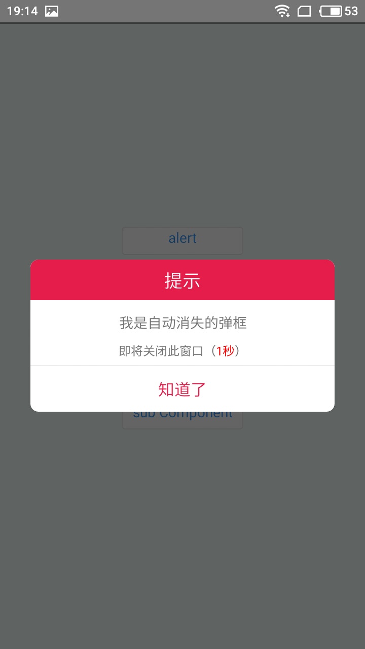
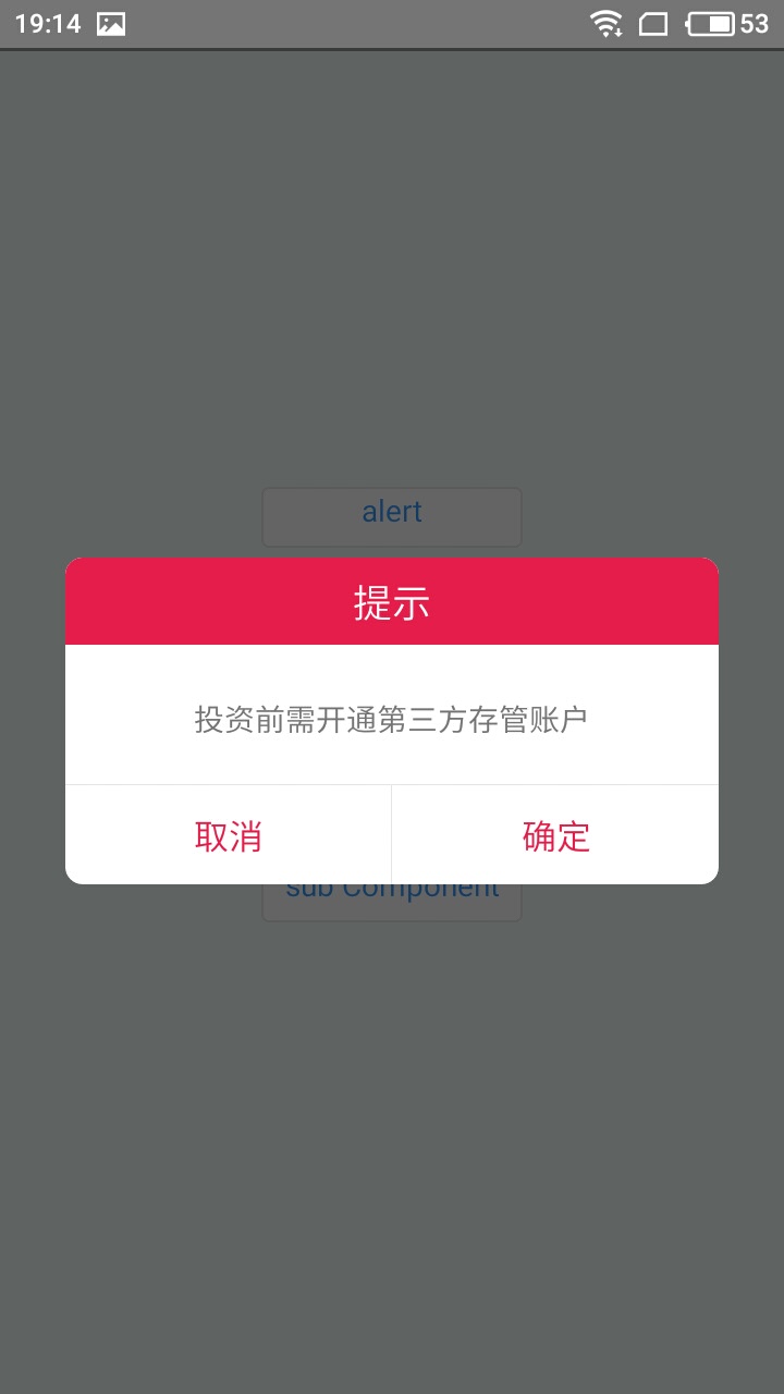
;;; //yourself components,it's not necessary; { superprops; } { let options= tHide:true /*不显示头部标题*/ msg: '我是自定义内容我是自定义内容我是自定义内容我是自定义内容我是自定义内容' buttons: txt:'确定' thisrefsdAlert } { let options= msg:'投资前需开通第三方存管账户' buttons: txt:'取消' txt:'确定' thisrefsdConfirm } { let options= msg: '我是自动消失的弹框' clickScreen: false duration: 5 buttons: txt:'知道了' thisrefsautoFadeOut } { let options= title:'购买' msg:'这里是说明文字' width:320 height:200 buttons: txt:'暂不投资' onpress:thiscancels txt:'立即投资' txtStyle:color:'#ff0000' txt:'其他按钮' thisrefsdcustomConfirm } { thisrefsdokAlert } { let options= animationType:'none' title:'组件标题' msg: '自定义组件内容,你也可以添加按钮等' height: 240 thisrefssubPopup } { return <View style=stylescontainer> <TouchableHighlight style=stylesbtnView underlayColor='transparent' onPress=thisfunAlert> <Text style=stylesbtnText>alert</Text> </TouchableHighlight> <TouchableHighlight style=stylesbtnView underlayColor='transparent' onPress=thisfunConfirm> <Text style=stylesbtnText>confirm</Text> </TouchableHighlight> <TouchableHighlight style=stylesbtnView underlayColor='transparent' onPress=thisfunAutoFadeOut> <Text style=stylesbtnText>autoFadeOut</Text> </TouchableHighlight> <TouchableHighlight style=stylesbtnView underlayColor='transparent' onPress=thisfuncustomConfirm> <Text style=stylesbtnText>customconfirm</Text> </TouchableHighlight> <TouchableHighlight style=stylesbtnView underlayColor='transparent' onPress=thisfunAutofade> <Text style=stylesbtnText>sub Component</Text> </TouchableHighlight> <Popup ref="dAlert" type='alert' /> <Popup ref="dConfirm" type='confirm' /> <Popup ref="autoFadeOut" type='autoFadeOut' /> <Popup ref="dokAlert" /> <Popup ref="dcustomConfirm" /> <Popup ref="subPopup" components=<SubPopup onclick=thishide/> /> </View> ; } { thisrefssubPopup; } const styles = StyleSheet;Demo
Customization options
- 'animateType': Change pop up block display animation ('fade','normal','slide') - The animationType prop controls how the modal animates. - slide: slides in from the bottom -fade: fades into view -none: appears without an animation
- 'tHide':(true|false) show or hide header
- 'title': Custom header text
- 'msg':show message ---string
- 'duration': the time of auto disappear ---number
- 'headStyle': Change the style of the dialogs header
- 'width': Change the width of the dialogs
- 'height':Change the height of the dialogs
- 'clickScreen': (true|false) Transparent area can click
- 'buttons':Button group object
buttons: txt:'button text' ---string btnStyle:backgroundColor:'transparent' button style---object txtStyle:color:'#ff6600' button text style ---object onpress:thiscancels button click event ---Props
- 'components': Custom middle context component
Methods
| Method | Description |
|---|---|
show(options) |
Show dialogs ( use the react-native Modal component to always be at the top) |
hide() |
Hide dialogs |