react-native-pin-input-component
This is a cross-platform, lightweight, customizable PIN input component for React Native
Features:
- Customizable style to normal, focus or blur Cell style
- Pass component to cell as props
- Easy to customize
- Compatible with most react native version
Installation
#npm npm i react-native-pin-input-componentUse
...; { return <View> ... <PinInput autoFocus value=value onPress= {} onChangeText= { this; } /> ... </View> }Examples
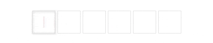
Default style
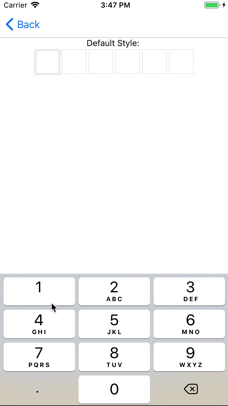
<PinInput autoFocus value=value onPress= {} onChangeText= { this; }/>;Visible Selection
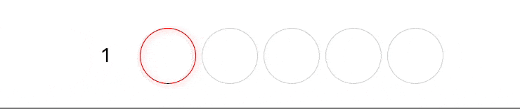
<PinInput value=value onPress= {} onChangeText= { this; } visibleSelection/>;Customizable style
const styles = StyleSheet; { return ... <PinInput value=value onChangeText= { this; } cellNormalStyle=stylesnormal cellFocusStyle=stylesfocus cellBlurStyle=stylesblur />; ... ;}...Default Password
 ```js
...
{
his.setState({value: text});
}}
/>
...
```
#Animated when change text password
```js
...
{
his.setState({value: text});
}}
/>
...
```
#Animated when change text password
 ```js
...
{
his.setState({value: text});
}}
cellAnimatedOnChangeText={scale => {
Animated.timing(scale, {
oValue: 1,
uration: 250,
}).start();
return scale.interpolate({
inputRange: [0, 0.5, 1],
outputRange: [1, 1.5, 1],
});
}}
/>
...
```
# Available props
|Name|Type|Required|Default|Description|
|----|----|--------|-------------------------------------------------------------------------------|---------------------------|
|value|String|yes||The value to show for the input|
|length|Number|no|6|Number of charater for the pin input|
|autoFocus|Boolean|no|false|If true, focuses the pin input|
|onChangeText|Function|yes||Same onChangeText function of TextInput|
|visibleSelection|Boolean|no|false|If true, visible selection|
|selectionColor|String|no|'red'|Color string of selection when `visibleSelection=true`|
|cellNormalStyle|Style Object|no|`{width: 40,height: 40,borderWidth: 0.5,borderColor: '#D5D5D5',justifyContent: 'center',alignItems: 'center',margin: 2,}`|Normal style object of cell|
|cellFocusStyle|Style Object|no|`{width: 40, height: 40, borderWidth: 0.5, borderColor: '#D5D5D5', justifyContent: 'center', alignItems: 'center', margin: 2, ...Platform.select({ ios: { shadowOffset: { width: 0, height: 1 }, shadowRadius: 2, shadowOpacity: 0.5, }, android: { elevation: 4, }, }),}`| Focus style object of cell|
|cellBlurStyle|Style Object|no|`{width: 40, height: 40, justifyContent: 'center', alignItems: 'center', margin: 2,}`|Blur style object of cell|
|CellView|React Native Component|no||React Native Component pass to PinInput as props, you can set your component if you want|
|FocusView|React Native Component|no||Component display when cell focuses, you pass your component if you want|
|BlurView|React Native Component|no||Component display when cell focuses, you pass your component if you want|
```js
...
{
his.setState({value: text});
}}
cellAnimatedOnChangeText={scale => {
Animated.timing(scale, {
oValue: 1,
uration: 250,
}).start();
return scale.interpolate({
inputRange: [0, 0.5, 1],
outputRange: [1, 1.5, 1],
});
}}
/>
...
```
# Available props
|Name|Type|Required|Default|Description|
|----|----|--------|-------------------------------------------------------------------------------|---------------------------|
|value|String|yes||The value to show for the input|
|length|Number|no|6|Number of charater for the pin input|
|autoFocus|Boolean|no|false|If true, focuses the pin input|
|onChangeText|Function|yes||Same onChangeText function of TextInput|
|visibleSelection|Boolean|no|false|If true, visible selection|
|selectionColor|String|no|'red'|Color string of selection when `visibleSelection=true`|
|cellNormalStyle|Style Object|no|`{width: 40,height: 40,borderWidth: 0.5,borderColor: '#D5D5D5',justifyContent: 'center',alignItems: 'center',margin: 2,}`|Normal style object of cell|
|cellFocusStyle|Style Object|no|`{width: 40, height: 40, borderWidth: 0.5, borderColor: '#D5D5D5', justifyContent: 'center', alignItems: 'center', margin: 2, ...Platform.select({ ios: { shadowOffset: { width: 0, height: 1 }, shadowRadius: 2, shadowOpacity: 0.5, }, android: { elevation: 4, }, }),}`| Focus style object of cell|
|cellBlurStyle|Style Object|no|`{width: 40, height: 40, justifyContent: 'center', alignItems: 'center', margin: 2,}`|Blur style object of cell|
|CellView|React Native Component|no||React Native Component pass to PinInput as props, you can set your component if you want|
|FocusView|React Native Component|no||Component display when cell focuses, you pass your component if you want|
|BlurView|React Native Component|no||Component display when cell focuses, you pass your component if you want|