react-native-multi-switch
A multiple switch widget for react-native
install
$ npm i -s react-native-multi-switch
or
$ yarn add react-native-multi-switch
No linking is needed
Usage
Note: these examples use native-base's icon component, but you can use any other component.
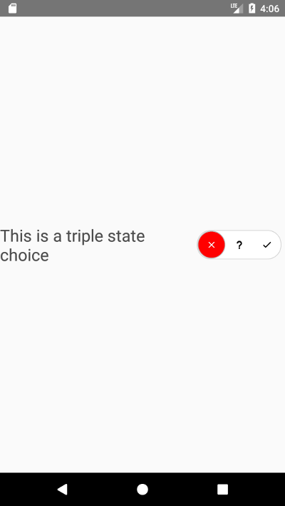
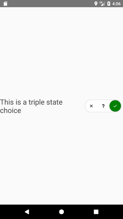
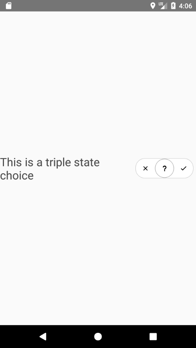
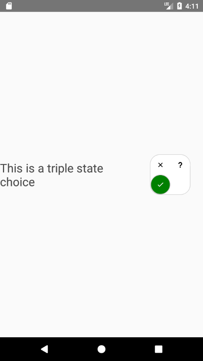
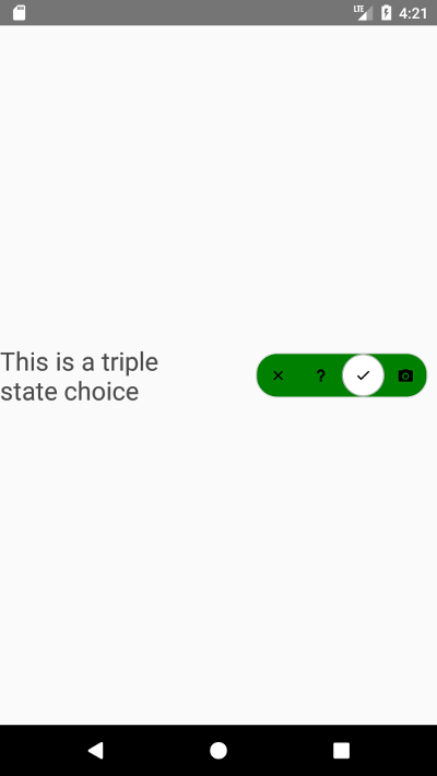
import React from 'react'import View Text from 'react-native' import MultiSwitch from "react-native-multi-switch";import Icon from "native-base" import _ from 'lodash'; Component { return <View => <View => <Text =>"This is a triple state choice"</Text> </View> <View => <MultiSwitch = = = = => <Icon ="md-close" =/> <Icon ="md-help" =/> <Icon ="md-checkmark" =/> </MultiSwitch> </View> </View> }Props
| Name | Type | Description |
|---|---|---|
| choiceSize | Number | The size of the touchable wrapper for each choice (square) |
| active | Number | index of the initialy selected choice, can be -1 if no initial selection is desired |
| layout | {horizontal: Number, vertical: Number} | used to determine overall container's aspect. Vertical is the number or row and horizontal is the number of column, if one of them equals -1, then the container will be flat in that direction. if both are -1,horizontal takes precedence |
| neverActivate | [Number,...] | A list of children's indexes which cannot be selected |
| onActivate | (Number) => {} | Callback called when one of the choices is selected, argument is child index |
| activeContainerStyle | [{styleProp: "value"} or stylesheet] | an array of styles object or stylesheets to be applied to children's touchable container when they are selected, each item is mapped to the corresponding child |
| inactiveContainerStyle | [{styleProp: "value"} or stylesheet] | an array of styles object or stylesheets to be applied to children's touchable container when they are NOT selected, each item is mapped to the corresponding child |
| activeItemStyle | [{styleProp: "value"} or stylesheet] | an array of styles object or stylesheets to be applied to children's component when they are selected, each item is mapped to the corresponding child |
| inactiveItemStyle | [{styleProp: "value"} or stylesheet] | an array of styles object or stylesheets to be applied to children's component when they are NOT selected, each item is mapped to the corresponding child |
| containerStyles | [{styleProp: "value"} or stylesheet] | an array of styles object or stylesheets to be applied to the overall containing view, the item selected correspond to the actively selected child. |
Recipes
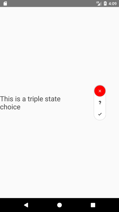
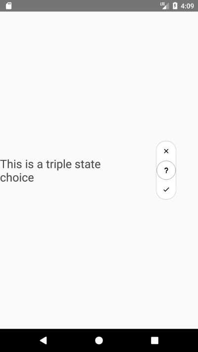
Vertical
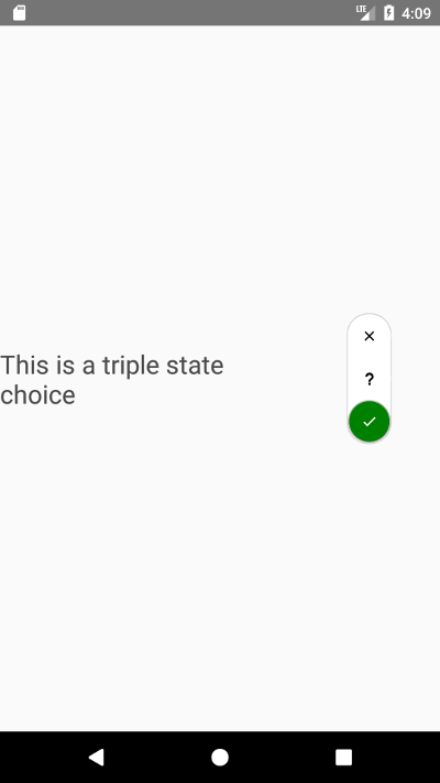
<MultiSwitch choiceSize=40 activeItemStyle=color: 'white' color: 'black' color: 'white' layout=vertical: -1 horizontal: 0 containerStyles=_ active=1> <Icon name="md-close" style=fontSize: 15/> <Icon name="md-help" style=fontSize: 15/> <Icon name="md-checkmark" style=fontSize: 15/> </MultiSwitch>Other layout

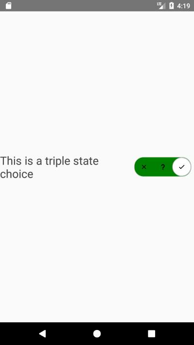
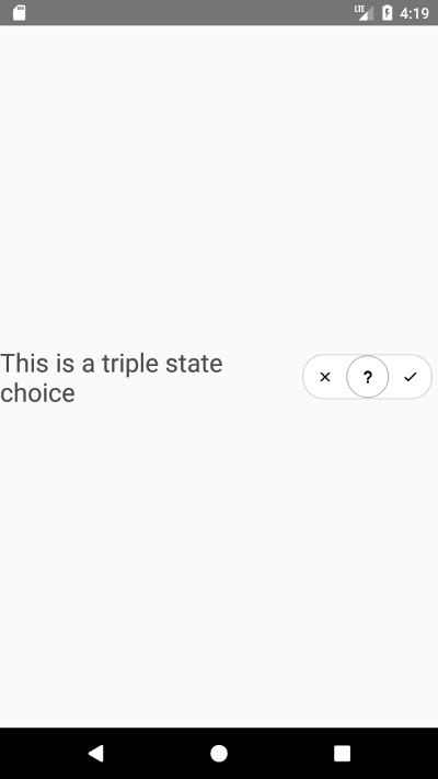
<MultiSwitch choiceSize=40 activeItemStyle=color: 'white' color: 'black' color: 'white' layout=vertical: 2 horizontal: 2 containerStyles=_ active=1> <Icon name="md-close" style=fontSize: 15/> <Icon name="md-help" style=fontSize: 15/> <Icon name="md-checkmark" style=fontSize: 15/> </MultiSwitch>Making the background color change
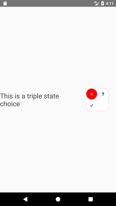
<MultiSwitch choiceSize=40 activeItemStyle=color: 'white' color: 'black' color: 'white' layout=vertical: 0 horizontal: -1 containerStyles= backgroundColor: 'red' borderRadius: 20 borderWidth: 1 borderColor: "lightgrey" justifyContent: 'space-between' backgroundColor: 'white' borderRadius: 20 borderWidth: 1 borderColor: "lightgrey" justifyContent: 'space-between' backgroundColor: 'green' borderRadius: 20 borderWidth: 1 borderColor: "lightgrey" justifyContent: 'space-between' activeContainerStyle= backgroundColor: 'white' borderRadius: 100 borderWidth: 1 borderColor: 'rgb(180, 180, 180)' backgroundColor: 'white' borderRadius: 100 borderWidth: 1 borderColor: 'rgb(180, 180, 180)' backgroundColor: 'white' borderRadius: 100 borderWidth: 1 borderColor: 'rgb(180, 180, 180)' inactiveContainerStyle= borderRadius: 100 borderRadius: 100 borderRadius: 100 activeItemStyle=color: 'black' color: 'black' color: 'black' inactiveItemStyle=color: 'black' color: 'black' color: 'black' active=1> <Icon name="md-close" style=fontSize: 15/> <Icon name="md-help" style=fontSize: 15/> <Icon name="md-checkmark" style=fontSize: 15/> </MultiSwitch>More options
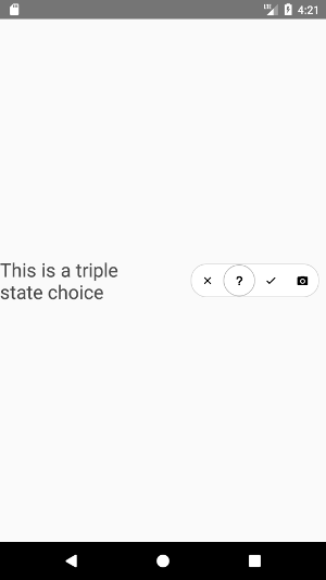
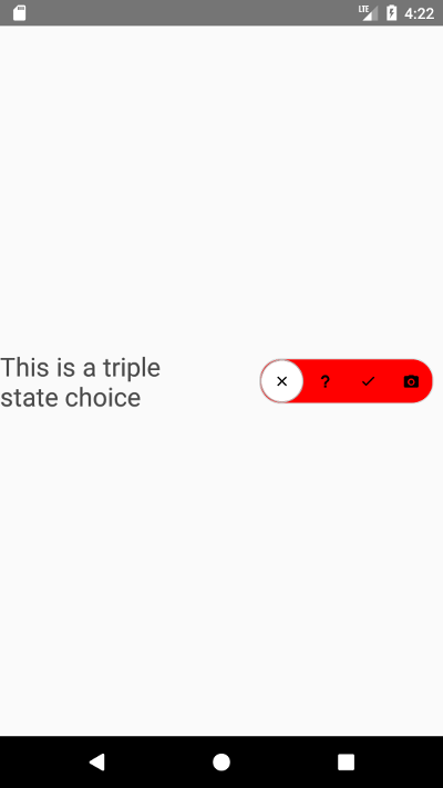
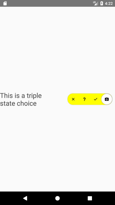
<MultiSwitch choiceSize=40 activeItemStyle=color: 'white' color: 'black' color: 'white' layout=vertical: 0 horizontal: -1 containerStyles= backgroundColor: 'red' borderRadius: 20 borderWidth: 1 borderColor: "lightgrey" justifyContent: 'space-between' backgroundColor: 'white' borderRadius: 20 borderWidth: 1 borderColor: "lightgrey" justifyContent: 'space-between' backgroundColor: 'green' borderRadius: 20 borderWidth: 1 borderColor: "lightgrey" justifyContent: 'space-between' backgroundColor: 'yellow' borderRadius: 20 borderWidth: 1 borderColor: "lightgrey" justifyContent: 'space-between' activeContainerStyle= backgroundColor: 'white' borderRadius: 100 borderWidth: 1 borderColor: 'rgb(180, 180, 180)' backgroundColor: 'white' borderRadius: 100 borderWidth: 1 borderColor: 'rgb(180, 180, 180)' backgroundColor: 'white' borderRadius: 100 borderWidth: 1 borderColor: 'rgb(180, 180, 180)' backgroundColor: 'white' borderRadius: 100 borderWidth: 1 borderColor: 'rgb(180, 180, 180)' inactiveContainerStyle= borderRadius: 100 borderRadius: 100 borderRadius: 100 borderRadius: 100 activeItemStyle=color: 'black' color: 'black' color: 'black' color: 'black' inactiveItemStyle=color: 'black' color: 'black' color: 'black' color: 'black' active=1> <Icon name="md-close" style=fontSize: 15/> <Icon name="md-help" style=fontSize: 15/> <Icon name="md-checkmark" style=fontSize: 15/> <Icon name="md-camera" style=fontSize: 15/> </MultiSwitch>