react-native-modal-wrapper 
Wrapper component that extends the react native Modal component, adding overlay clickable behavior and allowing swipe in and out in all directions
Install
npm install react-native-modal-wrapper --save
Central modal box example
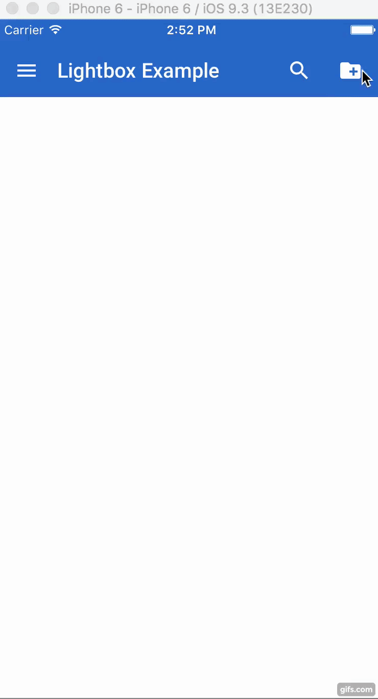
<ModalWrapper = = => <Text>New project</Text> <TextField = ="Project name" = = /> <View> <MDButton ="CANCEL" ="regular" = = /> <MDButton ="CREATE" ="primary" = = /> </View></ModalWrapper>Bottom contextual menu example
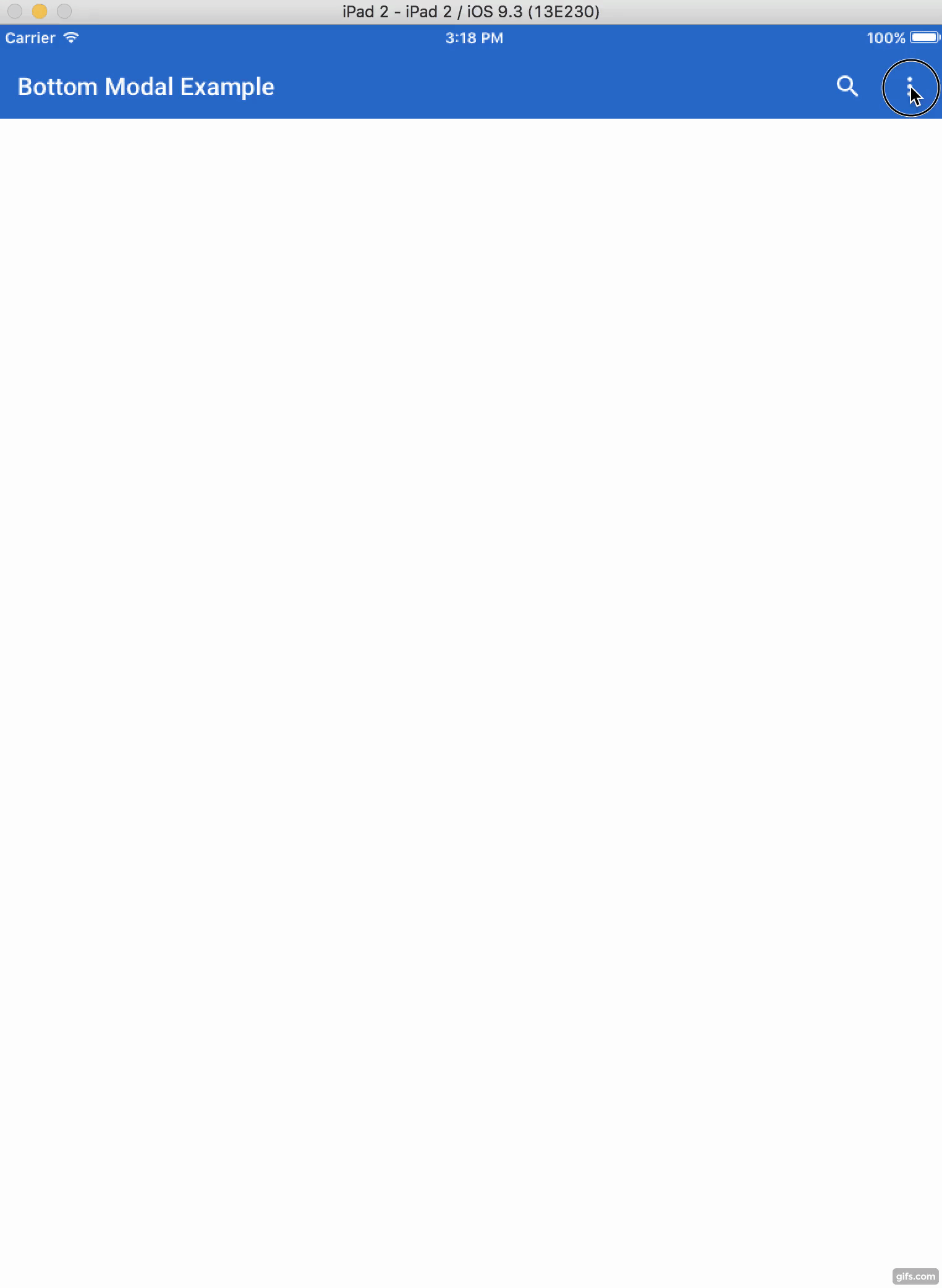
<ModalWrapper = = = => thiscontextMenuActions</ModalWrapper>Right contextual menu example
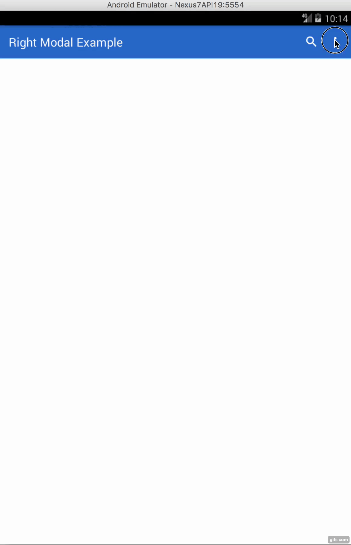
<ModalWrapper = = ="right" = => <FilterByTag = => </FilterByTag></ModalWrapper>Modal without overlay example
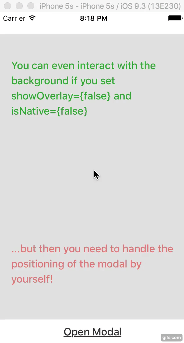
<View = => /* Page Content */ <ModalWrapper = = ='left' = = = => <View => <Text =>Modal without overlay</Text> </View> </ModalWrapper></View>Properties
This component supports all the properties of the original react native modal component https://facebook.github.io/react-native/docs/modal.html, plus the following:
| Prop | Default | Type | Description |
|---|---|---|---|
| animateOnMount | false | bool |
Determine whether or not animate the modal if it's visible when it mounts. |
| animationDuration | 300 | number |
Duration of the animation. |
| position | bottom | string |
Position where the sliding animation of the modal should start. Accepted values: "top", "bottom", "left", "right". |
| containerStyle | - | any |
Container styles used for positioning the modal with flexbox (default: alignItems: 'center', flex: 1, justifyContent: 'center'). See the examples. |
| isNative | true | bool |
Determine the usage of the react native modal component or a simple view wrapper instead. It can be set to false to overcome some react native modal limitations (for example to have more than one modal open at the same time). |
| onAnimateClose | () => null | func |
Callback executed after the modal is closed. |
| onAnimateOpen | () => null | func |
Callback executed after the modal is open. |
| overlayStyle | - | any |
Styles used to define the overlay backgroundColor (default: "#000") and opacity (default: 0.5). |
| overlayTestID | - | string |
testID prop for the overlay element. |
| screenHeight | computed screen height | number |
Allow the user to manually set the right screen height to adjust the keyboardSpacer due to an issue on iPad in react native https://github.com/facebook/react-native/issues/7340. |
| shouldAnimateOnOverlayPress | true | bool |
Determine whether or not animate the modal closing down when the overlay is pressed. |
| shouldAnimateOnRequestClose | false | bool |
Determine whether or not animate the modal closing down when the onRequestClose callback is executed. |
| shouldCloseOnOverlayPress | true | bool |
Determine whether or not allow the modal closing down if the overlay is pressed. |
| showOverlay | true | bool |
Determine whether or not showing the overlay. In combination with isNative={false} it is possible to interact with the background of the application when the modal is still open. |
| style | - | any |
Styles of the modal (default: backgroundColor: '#fff', justifyContent: 'center'). |
Note: this component sets some properties of the underlying native modal component to allow sliding flexibility in each direction and the clickable overlay behavior, therefore we suggest not to change those. However, you can set to 0 the animationDuration prop to avoid the component sliding logic from top, bottom, left or right and therefore turning on the react native modal animationType prop, disabled by default. Here the list of the react native modal properties set by default:
| Prop | Default | Type | Description |
|---|---|---|---|
| animationType | "none" | string |
The react native modal has limited animation customization, therefore the animation logic is done externally using position and animationDuration. |
| transparent | true | bool |
We want to have the overlay by default. |