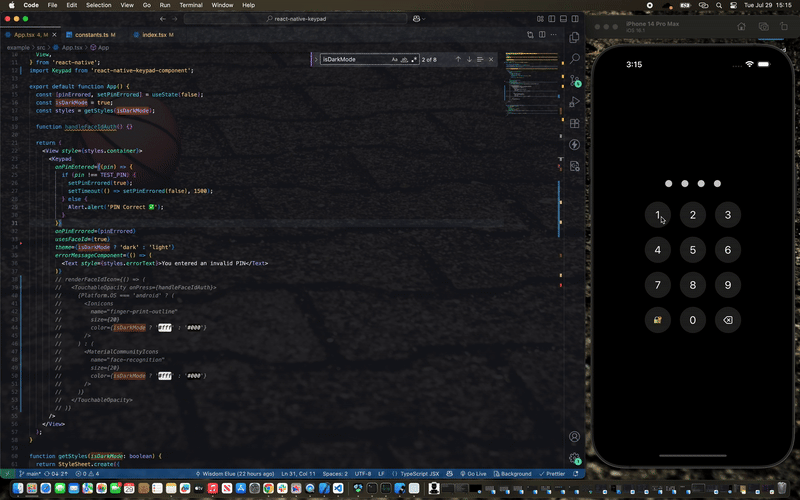
A customizable and animated keypad component for React Native applications, perfect for PIN entry, passcode screens, and secure input scenarios.
Watch demo video here: Demo Video
- ✨ Smooth animations with React Native Reanimated
- 🎨 Customizable themes (light/dark)
- 🔧 Highly configurable styling
- 🎯 TypeScript support
- 📏 Adjustable PIN length
- 🚫 Built-in error handling with shake animation
npm install react-native-keypad-componentyarn add react-native-keypad-componentbun add react-native-keypad-componentnpx expo install react-native-keypad-componentThis package requires the following peer dependencies:
yarn add react-native-reanimated
yarn add react-native-gesture-handler
Make sure to follow the React Native Reanimated installation guide for proper setup.
For quick scaffolding, you can also use the React Native Keypad Component CLI to add the source code directly to your project. This makes it even easier than it already is to customize the component to fit your exact needs.
npx rn-keypad-cli@latestimport React from 'react';
import Keypad from 'react-native-keypad-component';
export default function App() {
const handlePinEntered = (pin) => {
console.log('PIN entered:', pin);
// Handle PIN validation here
};
return <Keypad onPinEntered={handlePinEntered} pinLength={4} />;
}import React, { useState } from 'react';
import { View, Text } from 'react-native';
import Keypad from 'react-native-keypad-component';
export default function SecureScreen() {
const [hasError, setHasError] = useState(false);
const handlePinEntered = (pin) => {
// your PIN validation logic here
if (pin === '1234') {
setHasError(false);
// Navigate to secure area
} else {
setHasError(true);
setTimeout(() => setHasError(false), 3000);
}
};
const renderFaceIdIcon = () => <Text style={{ fontSize: 24 }}>👆</Text>;
const renderErrorMessage = () => (
<Text style={{ color: 'red', marginBottom: 10 }}>
Incorrect PIN. Please try again.
</Text>
);
return (
<View style={{ flex: 1, justifyContent: 'center', padding: 20 }}>
<Keypad
onPinEntered={handlePinEntered}
onPinErrored={hasError}
errorMessageComponent={renderErrorMessage}
pinLength={6}
theme="dark"
usesFaceId={true}
renderFaceIdIcon={renderFaceIdIcon}
keypadRadius={12}
gridGap={15}
dotColor="#007AFF"
keypadColor="#2C2C2E"
textColor="#FFFFFF"
/>
</View>
);
}| Prop | Type | Required | Default | Description |
|---|---|---|---|---|
onPinEntered |
(pin: string) => void |
✅ | - | Callback function called when PIN entry is complete |
onPinErrored |
boolean |
❌ | false |
Triggers error state and shake animation |
errorMessageComponent |
() => ReactNode |
❌ | undefined |
Custom component to display error messages |
pinLength |
number |
❌ | 4 |
Number of digits in the PIN |
style |
ViewStyle |
❌ | undefined |
Custom styles for the main container |
buttonStyle |
ViewStyle |
❌ | undefined |
Custom styles for keypad buttons |
buttonTextStyle |
TextStyle |
❌ | undefined |
Custom styles for button text |
keypadTextSize |
number |
❌ | 24 |
Font size for keypad button text |
disableKeypadBackground |
boolean |
❌ | false |
Removes background color from buttons |
usesFaceId |
boolean |
❌ | false |
Enables Face ID/Touch ID button |
keypadRadius |
number |
❌ | 30 |
Border radius for kaypad buttons and dots |
theme |
'light' | 'dark' |
❌ | 'light' |
Overall theme of the keypad |
keypadColor |
string |
❌ | '#f2f2f7' |
Button background color |
textColor |
string |
❌ | '#000000' |
Text color of keypad |
dotColor |
string |
❌ | '#000000' |
Filled dot color |
emptyDotColor |
string |
❌ | '#d1d1d6' |
Empty dot color |
dotWidth |
number |
❌ | 16 |
Width of PIN dot |
dotHeight |
number |
❌ | 16 |
Height of PIN dot |
gridGap |
number |
❌ | 10 |
Gap between keypad buttons |
renderFaceIdIcon |
() => ReactNode |
❌ | undefined |
Custom Face ID/Touch ID icon component |
applyBackgroundToFaceIdButton |
boolean |
❌ | true |
Applies button background to Face ID button |
The keypad supports both light and dark themes out of the box. You can customize colors for each theme:
The keypad includes several built-in animations:
- Dot Animation: Dots scale when PIN digits are entered/removed
-
Shake Animation: Triggered when
onPinErroredis true - Error Message: Smooth zoom in/out transitions
- Layout Transitions: Smooth transitions when error messages appear/disappear
To display errors and trigger the shake animation:
const [hasError, setHasError] = useState(false);

const handlePinEntered = (pin) => {
  if (isValidPin(pin)) {
    setHasError(false);
    // Handle success
  } else {
    setHasError(true);
    // Clear error after some time
    setTimeout(() => setHasError(false), 3000);
  }
};

<Keypad
  onPinEntered={handlePinEntered}
  onPinErrored={hasError}
  errorMessageComponent={() => (
    <Text style={{ color: 'red' }}>Invalid PIN</Text>
  )}
/>;Enable Face ID or Touch ID button:
const renderFaceIdIcon = () => (
  <Icon name="face-id" size={24} color="#007AFF" />
);

<Keypad
  usesFaceId={true}
  renderFaceIdIcon={renderFaceIdIcon}
  applyBackgroundToFaceIdButton={true}
  onPinEntered={handlePinEntered}
/>;<Keypad
onPinEntered={handlePin}
disableKeypadBackground={true}
pinLength={6}
emptyDotColor="transparent"
style={{ backgroundColor: 'transparent' }}
/>// Example usage with dark mode support
import { useTheme } from 'your-theme-provider'; // Replace with your theme hook
const isDarkMode = useTheme();
<Keypad
onPinEntered={handlePin}
theme={isDarkMode ? 'dark' : 'light'}
keypadColor={isDarkMode ? '#FF6B6B' : '#FDD835'}
textColor={isDarkMode ? '#FFFFFF' : '#000000'}
activeDotColor={isDarkMode ? '#4ECDC4' : '#1976D2'}
emptyDotColor={isDarkMode ? '#95A5A6' : '#BDBDBD'}
keypadRadius={20}
gridGap={20}
/>;See the contributing guide to learn how to contribute to the repository and the development workflow.
MIT