React Native Increment Decrement UI
A simple view that increment and decrement integer value
It has following functionalities:
- Initial value set (default 0)
- MIN - MAX value set, and once MIN - MAX value reach disable control
- Increment and Decrement value by specific integer value (default 1)
- Handle increment and decrement specific controls click event
- Disable specific control
- Swipe controls
- Custom style apply for root view, controls and specific control too
- Add vector icons for controls
Example
Installation
if you have already install react-native-elements and react-native-vector-icons
npm install react-native-increment-decrement-ui
if you don't have already install react-native-elements and react-native-vector-icons
npm install react-native-increment-decrement-ui react-native-elements react-native-vector-icons --save
If you face any difficulties or error refer react-native-elements and react-native-vector-icons this links
Usage
Import
import IncrementDecrementView from 'react-native-increment-decrement-ui'
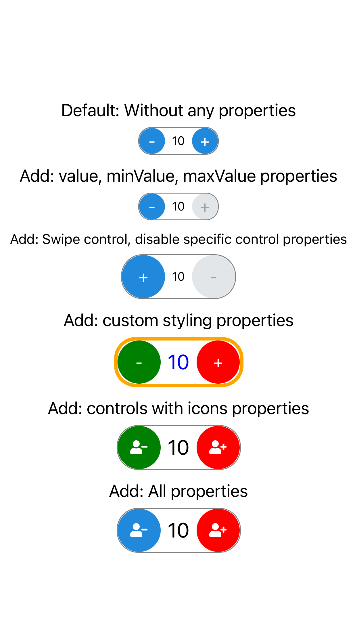
Default: Without any properties
<IncrementDecrementView />
Add: value, minValue, maxValue properties
<IncrementDecrementView
    value={0}
    minValue={-10}
    maxValue={10}
/>
Add: Swipe control, disable specific control properties
<IncrementDecrementView
    buttonSize={50}
    decrementDisable={true}
    isSwipeControl={true}
/>
Add: custom styling properties
<IncrementDecrementView
    buttonSize={50}
    style={{
        borderColor: 'orange',
        borderWidth: 4
    }}
    valueStyle={{
        fontSize: 24,
        color: 'blue'
    }}
    incrementStyle={{
        backgroundColor: 'red'
    }}
    decrementStyle={{
        backgroundColor: 'green'
    }}
/>
Add: controls with icons properties
- For icon you need to import react-native-vector-icons
import Icon from 'react-native-vector-icons/FontAwesome5';

<IncrementDecrementView
    buttonSize={50}
    valueStyle={{
        fontSize: 24
    }}
    incrementStyle={{
        backgroundColor: 'red'
    }}
    decrementStyle={{
        backgroundColor: 'green'
    }}
    decrementIcon={
        <Icon name="user-minus" size={16} color="#FFF" />
    }
    incrementIcon={
        <Icon name="user-plus" size={16} color="#FFF" />
    }
/>
Add: All properties
<IncrementDecrementView
    value={this.state.value}
    incrementDecrementBy={5}
    minValue={-50}
    maxValue={50}
    buttonSize={50}
    incrementTapHandler={() => {
        this.setState({ value: this.state.value + 5 })
    }}
    decrementTapHandler={() => {
        this.setState({ value: this.state.value - 5 })
    }}
    incrementStyle={{
        backgroundColor: 'red'
    }}
    valueStyle={{
        fontSize: 24
    }}
    decrementIcon={
        <Icon name="user-minus" size={16} color="#FFF" />
    }
    incrementIcon={
        <Icon name="user-plus" size={16} color="#FFF" />
    }
/>
PROPS
| Name | Type | Description |
|---|---|---|
| value |
number (default 0) |
value for initial set number |
| minValue |
number (default ∞ infinite) |
set minimum value |
| maxValue |
number (default ∞ infinite) |
set maximum value |
| buttonSize |
number (default 44) |
set increment & decrement control size |
| incrementDisable |
bool (default false) |
disable increment control |
| decrementDisable |
bool (default false) |
disable decrement control |
| isSwipeControl |
bool (default false) |
swipe increment & decrement control positions |
| incrementDecrementBy |
number (default 1) |
increment or decrement by specific value |
| style | object |
set style of the root view |
| valueStyle | object |
customizing the style of the text view |
| buttonStyle | object |
customizing style for both increment & decrement control view |
| incrementStyle | object |
customizing the style of the increment control view |
| decrementStyle | object |
customizing the style of the decrement control view |
| incrementTapHandler | function |
custom increment control click handle |
| decrementTapHandler | function |
custom decrement control click handle |
| incrementIcon | object |
set icon instead of '+' in increment control |
| decrementIcon | object |
set icon instead of '-' in decrement control |