React Native ImageEdit
This React Native component ImageEdit allows you to edit images inline for cropping. This component will provide you all the measurements you need for cropping so you can finish up with the cropping from a server or from other sources.
Updates
V1.1.1
- Specify source type from uri query string [type, ext, extension, image, fm]. ex:
https://source.unsplash.com/daily?type=imageLook below for more examples.
V1.1.0
- Video Support
- Improvements
- Bug Fixes
- New prop:
scaled
V1.0.2
- Fixed
resolveAssetSourceimport. - Added 2 new props
saveButtonTextandcancelButtonText.
V1.0.1
- Fixed
componentWillReceivePropsdeprecation.
Installation
npm install react-native-imageedit --save
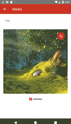
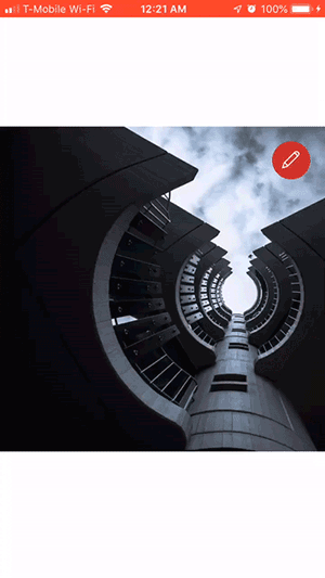
Screenshots
Simple Usage
Import
import ImageEdit from 'react-native-imageedit'Render
//Simple <ImageEdit ="https://source.unsplash.com/daily" /// =/> //Local Image <ImageEdit = =/> //Image object <ImageEdit = // = // = =/> //OR for custom buttons <ImageEdit = = ="https://source.unsplash.com/daily" // => <TouchableOpacity => <Text>Custom Button</Text> </TouchableOpacity></ImageEdit> //Initial scaling and positioning <ImageEdit = = = // =/> If the source uri doesn't have an extension, and we can't figure out what the type is, you'll have to add a query string to the uri to specify what the image type is or otherwise the source will be considered as a video. Note all unsplash urls are considered as images. Example:
https://source.unsplash.com/daily?image=jpeg
https://source.unsplash.com/daily?type=image
https://source.unsplash.com/daily?extension=jpg
https://source.unsplash.com/daily?ext=jpg
https://source.unsplash.com/daily?fm=png
Props
| Prop | Type | Description |
|---|---|---|
| width | Number | Crop area width. Default: window width |
| height | Number | Crop area height. Default: window width |
| image | Object, String | Image object or uri string. Required |
| editing | Bool | Editing mode. Default: false |
| cropIn | Bool | Allow to crop smaller that the crop area. Default: false |
| showEditButton | Bool | Show edit button. Default: true |
| showSaveButtons | Bool | Show save buttons. Default: true |
| saveButtonText | String | Save button text. Default: Save |
| cancelButtonText | String | Cancel button text. Default: Cancel |
| showGrids | Bool | Show grids while editing. Default: true |
| containerStyle | Object | Component container style |
| areaStyle | Object | Crop area container style |
| gridStyle | Object | Grid line style |
| gridColor | Object | Grid line color |
| buttonsColor | String | Buttons color |
| onEdit | Func | Edit button onPress callback |
| onSave | Func | Save button onPress callback. Will pass cropping info object as argument |
| onCancel | Func | Cancel button onPress callback |
| scaled | Bool | If true, Image Object size and position x ,and y will initially be kept. This is used to pre position or pre scale the image or video. Default: false |
Methods
| Method | Description |
|---|---|
| enable() | Switch to editing mode |
| disable() | Disable editing mode |
| getInfo() | Returns cropping info object |
Cropping Info Object
area: width: 500 height: 400 image: uri: "https://source.unsplash.com/daily" width: 800 height: 650 x: -100 y: -55 You will need this data for image cropping from a server or other methods. Hopefully in the future we will be able to crop the images right from this component.