React Native Donut Chart
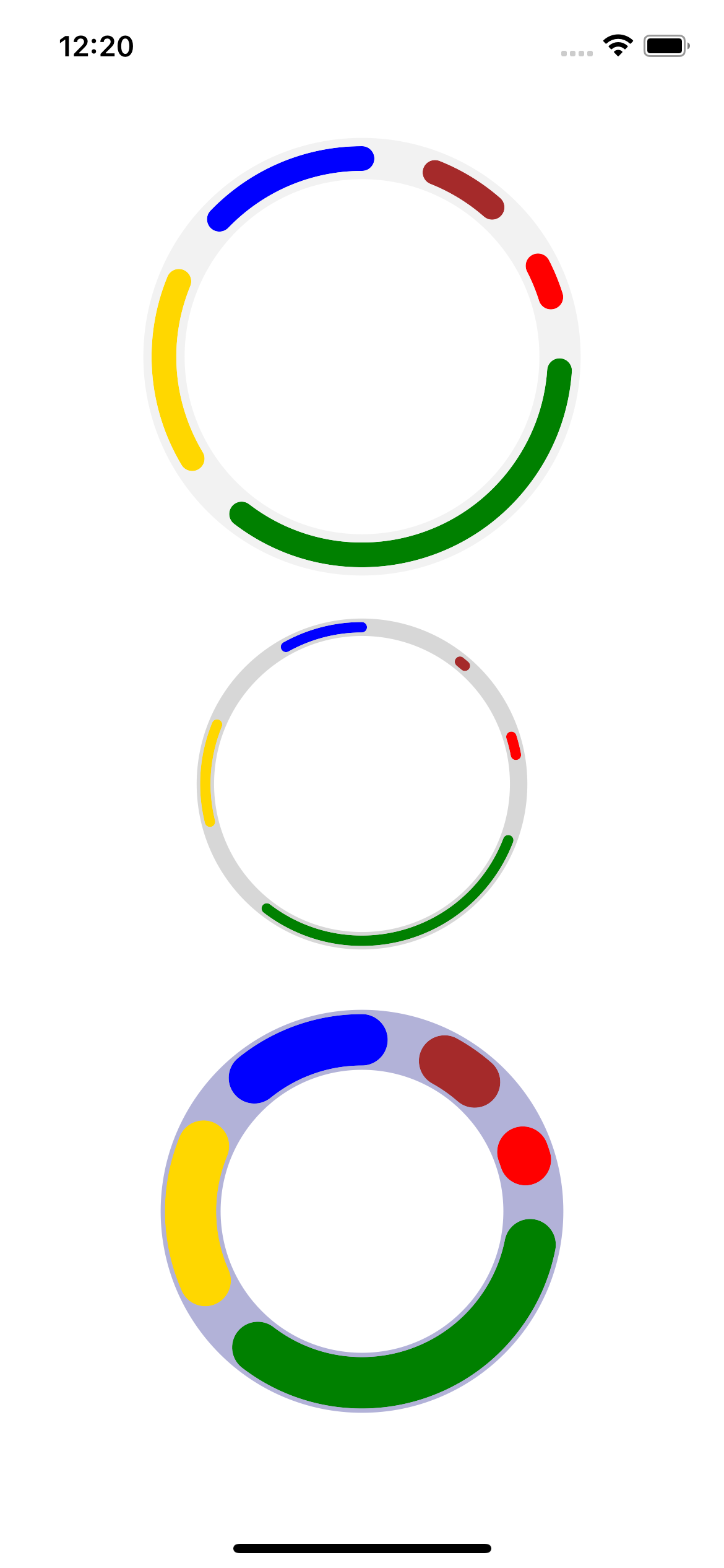
This is a simple donut chart that accepts a data object like the following:
const data = [
  {
    value: 1,
    color: 'brown',
  },
  {
    value: 2,
    color: 'red',
  }, {
    value: 3,
    color: 'green',
  }, {
    value: 4,
    color: 'gold',
  }, {
    value: 5,
    color: 'blue',
  },
]

// ...
Then
import {Donut} from 'react-native-dinut-chart';

<Donut data={data}/>
Props:
| Key | Description | Type | Required | Default |
|---|---|---|---|---|
| data | chart data | Array of objects | True | |
| radius | Radius of the donut chart | number | false | 80 |
| fill | The chart fill color can be RGBA | string | false | transparent |
| strokeWidth | The stroke width of the sections | number | false | 10 |
| strokeLinejoin | The shape of the end of the strokes | string | false | round |
| gap | The gap / distance between the sections | number | false | 3 |
| bgStrokeColor | The background stroke for the chart | string | false | green |
| bgStrokeOpacity | The background stroke opacity | string | false | .1 |
| bgStrokePadding | The additional thickness of the bg stroke | number | false | 0 |
#Note:
This was a fast and quick hack to check the feasibility, more options can and will become available and a lot of improvements can be made.
Contributors are welcomed, please open an issue, explain what you want to do and after approved make your PR.
Here is a screenshot of the randomized sample data:

