
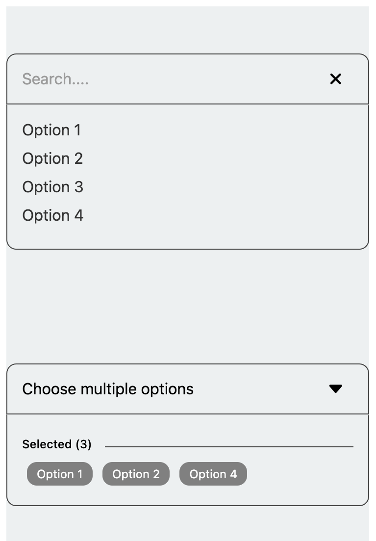
A customizable React Native dropdown/select component supporting single and multiple selection modes, with features like search, select all, and flexible styling options for seamless integration

npm i react-native-custom-selectyarn add react-native-custom-selectUsage
import { useState } from 'react';
import { Text, SafeAreaView, StyleSheet } from 'react-native';
import { SelectList, MultipleSelect } from 'react-native-custom-select';

export default function App() {
  const [selectedValue, setSelectedValue] = useState('');
  const [selectedValues, setSelectedValues] = useState([]);

  const data = [
    { key: '1', value: 'Option 1' },
    { key: '2', value: 'Option 2' },
    { key: '3', value: 'Option 3' },
    { key: '4', value: 'Option 4' },
  ];

  const handleChange = value => {
    setSelectedValue(value);
  };

  const handleMultipleChange = values => {
    setSelectedValues(values);
  };

  return (
    <SafeAreaView style={styles.container}>
      <Text style={styles.paragraph}>
        Change code in the editor and watch it change on your phone! Save to get
        a shareable url.
      </Text>

      <SelectList
        data={data}
        value={selectedValue}
        onChange={handleChange}
        placeholder="Select an option"
        borderColor="#444"
      />

      <MultipleSelect
        data={data}
        value={selectedValues}
        onChange={handleMultipleChange}
        placeholder="Choose multiple options"
        searchResult="No results found"
      />
    </SafeAreaView>
  );
}

const styles = StyleSheet.create({
  container: {
    flex: 1,
    justifyContent: 'center',
    backgroundColor: '#ecf0f1',
    padding: 8,
    margin: 10,
  },
  paragraph: {
    margin: 24,
    fontSize: 18,
    fontWeight: 'bold',
    textAlign: 'center',
  },
});
SelectList Properties
| Property | Type | Default | Description |
|---|---|---|---|
data |
SelectItem[] |
[] |
The list of items for the select dropdown. |
value |
string |
undefined |
The selected value. |
placeholder |
string |
undefined |
Placeholder text when no item is selected. |
searchResult |
string |
undefined |
Displays the search results. |
fontSize |
number |
14 |
Font size of the text within the select component. |
backgroundColor |
string |
'transparent' |
Border color of the select component. |
borderColor |
string |
'#000' |
Border color of the select component. |
borderRadius |
number |
10 |
Border radius of the select component. |
defaultPadding |
number |
14 |
Default padding within the select component. |
containerStyle |
StyleProp<ViewStyle> |
{marginBottom: 15} |
Custom styles for the container view. |
indexValue |
string |
undefined |
The value of the item used for indexing in the dropdown. |
caretIcon |
ReactNode |
undefined |
Custom icon for the caret in the dropdown. |
closeIcon |
ReactNode |
undefined |
Custom icon for the close button in the dropdown. |
onChange |
(value: string) => void |
required |
Callback function triggered when a selection is made. |
| Property | Type | Default | Description |
|---|---|---|---|
data |
SelectItem[] |
[] |
The list of items for the select dropdown. |
value |
string[] |
undefined |
The array of selected values. |
placeholder |
string |
undefined |
Placeholder text when no item is selected. |
searchResult |
string |
undefined |
Displays the search results. |
fontSize |
number |
14 |
Font size of the text within the select component. |
backgroundColor |
string |
'transparent' |
Border color of the select component. |
borderColor |
string |
'#000' |
Border color of the select component. |
borderRadius |
number |
10 |
Border radius of the select component. |
defaultPadding |
number |
14 |
Default padding within the select component. |
containerStyle |
StyleProp<ViewStyle> |
{marginBottom: 15} |
Custom styles for the container view. |
indexValue |
string |
undefined |
The value of the item used for indexing in the dropdown. |
caretIcon |
ReactNode |
undefined |
Custom icon for the caret in the dropdown. |
closeIcon |
ReactNode |
undefined |
Custom icon for the close button in the dropdown. |
onChange |
(value: string) => void |
required |
Callback function triggered when multiple selections are made. |
Maintainers