react-native-custom-actionsheet
Cross platform ActionSheet. This component implements a custom ActionSheet and provides the same way of drawing it on the different platforms (iOS and Android). Actually, In order to keep the best effect, it still uses the ActionSheetIOS on iOS. For custom ActionSheet it uses different styles depending on the platform.
This project is based on react-native-actionsheet by beefe.
Installation
npm i -S react-native-custom-actionsheet
Usage of ActionSheetCustom
so you can customize ActionSheet buttons
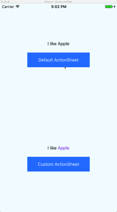
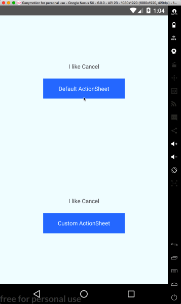
const CANCEL_INDEX = 0const DESTRUCTIVE_INDEX = 4const options = 'Cancel' 'Apple' component: <Text style= color: 'orange' fontSize: 24 >Banana</Text> height: 80 'Watermelon' component: <Text style= color: 'blueviolet' >Apple</Text> height: 40 const title = <Text style= color: 'crimson' fontSize: 18 >Which one do you like?</Text> state = selected: 1 thisactionSheet thisactionSheet = ref this { const selected = thisstate const selectedText = optionsselectedcomponent || optionsselected return <View style=styleswrapper> <Text style= marginBottom: 20 > I like selectedText </Text> <Text style=stylesbutton onPress=thisshowActionSheet> Custom ActionSheet </Text> <ActionSheet ref=thisgetActionSheetRef title=title message="custom message custom message custom message custom message custom message custom message " options=options cancelButtonIndex=CANCEL_INDEX destructiveButtonIndex=DESTRUCTIVE_INDEX onPress=thishandlePress /> </View> }Usage
const CANCEL_INDEX = 0const DESTRUCTIVE_INDEX = 4const options = 'Cancel' 'Apple' 'Banana' 'Watermelon' 'Durian' const title = 'Which one do you like?' Component state = selected: '' thisactionSheet thisactionSheet = ref this { return <View style=styleswrapper> <Text style=marginBottom: 20> I like optionsthisstateselected </Text> <Text style=stylesbutton onPress=thisshowActionSheet> Default ActionSheet </Text> <ActionSheet ref=thisgetActionSheetRef title=title message="custom message custom message custom message custom message custom message custom message " options=options cancelButtonIndex=CANCEL_INDEX destructiveButtonIndex=DESTRUCTIVE_INDEX onPress=thishandlePress /> </View> }Props
| Prop name | Desciption | Type | Default |
|---|---|---|---|
| title | PropTypes.string or PropTypes.element | ||
| message | PropTypes.string or PropTypes.element | ||
| options | PropTypes.arrayOf([ PropTypes.string, PropTypes.shape({ component: PropTypes.element, height: PropTypes.number }), ]) | ||
| tintColor | PropTypes.string | ||
| cancelButtonIndex | PropTypes.number | ||
| destructiveButtonIndex | PropTypes.number | ||
| onPress | PropTypes.func | (index) => {} | |
| styles | StyleSheet object with some keys from ./lib/styles |