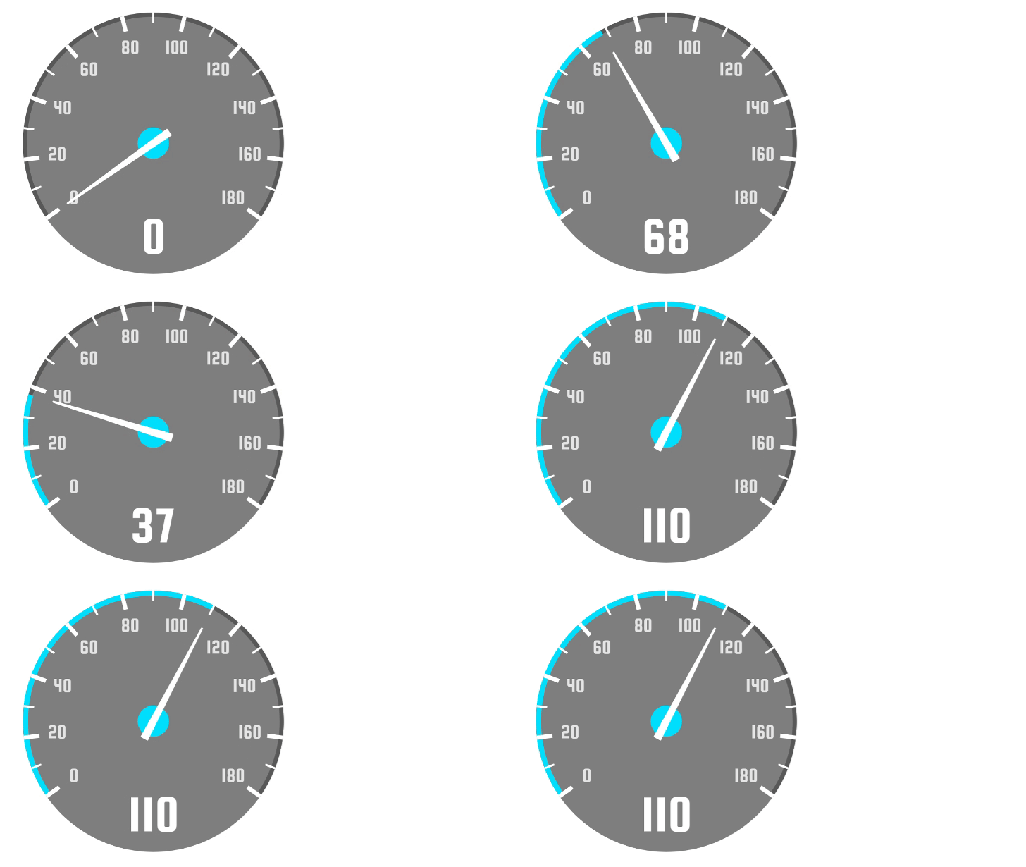
Cool Speedometer 😎
If you are tired of all those boring speedometers for react native, have a look at this one. This is different. This is cool.
Install it for free:
npm i react-native-cool-speedometerUsage
import Speedometer, {
  Background,
  Arc,
  Needle,
  Progress,
  Marks,
  Indicator,
} from 'react-native-cool-speedometer';

// a few lines later ...

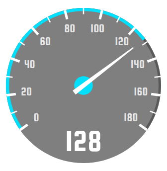
<Speedometer
  value={128}
  fontFamily='squada-one'
>
  <Background />
  <Arc/>
  <Needle/>
  <Progress/>
  <Marks/>
  <Indicator/>
</Speedometer>
That's it, you can play around changing some of the components inside <Speedometer>. Take in mind the order of them matters: <Background> is first because it is meant to be behind all other components.
sizing
By default, the size of the component is 250. You can resize it by passing a different width. You can also change the height, if you need a proportion other than 1:1.
Examples
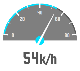
Playing with angle
<Speedometer
  value={54}
  max={80}
  angle={160}
  fontFamily='squada-one'
>
  <Background angle={180} />
  <Arc/>
  <Needle/>
  <Progress/>
  <Marks/>
  <Indicator>
    {(value, textProps) => (
      <Text
        {...textProps}
        fontSize={60}
        fill="#555"
        x={250 / 2}
        y={210}
        textAnchor="middle"
        fontFamily='squada-one'
      >
        {value}k/m
      </Text>
    )}
  </Indicator>
</Speedometer>
Rotated
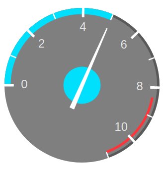
Changing rotation, step, the looking of <Needle/>, and adding <DangerPath/>:
<Speedometer
  value={5}
  max={11}
  rotation={-90}
  fontFamily='squada-one'
>
  <Background />
  <Arc arcWidth={4} />
  <Needle
    baseOffset={40}
    circleRadius={30}
  />
  <DangerPath/>
  <Progress arcWidth={10} />
  <Marks step={1} />
</Speedometer>
If speed is not your thing
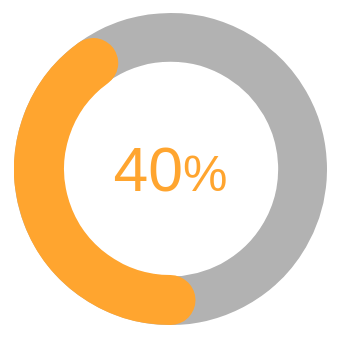
Circular progress
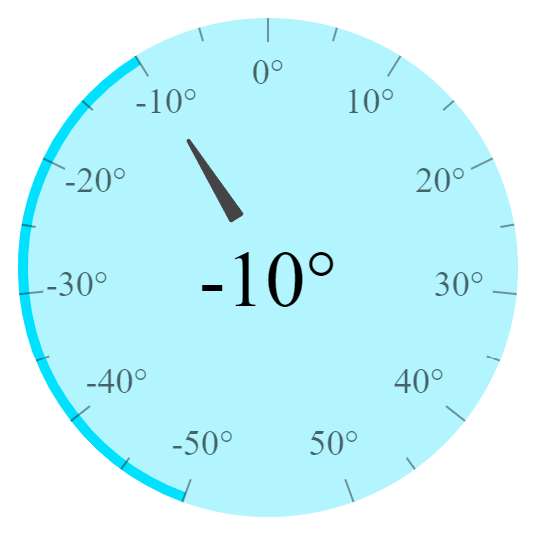
Thermostat
God mode
When I said "more customization than you'll use", I meant it.
Custom marks
Pass a function as children to render your own marks. This function receives:
-
coordinates
Coordinates of the current line:{ x1, y1, x2, y2 }. Either pass them to a<Line>component, or use them to create whatever you like, as long as it is made of SVG. -
textProps
Coordinates and rotation for the text:{ x, y, transform }. It is recommended you apply this object to a<Text>element. -
value
The value of this mark.
import { G, Line } from 'react-native-svg'

// later ...
<Marks step={5}>
  {(mark, i) => (
    <G key={i}>
      <Line
        {...mark.coordinates}
        // any other prop here, except x1, y1, x2, and y2
      />
      {(i % 2 == 0) && (
        // only show the number if the mark is even
        <Text
          {...mark.textProps}
          // any other prop here, except x, y, and transform
        >
          {mark.value}
        </Text>
      )}
    </G>
  )}
</Marks>
Custom needle
Pass a function as children to make a custom needle. It will rotate automatically.
<Speedometer width={width}>
  <Needle>
    {() => {
      // you might need the center of the circle
      // to place the needle correctly
      const center = width / 2

      return (
        // some magic SVG here
      )
    }}
  </Needle>
</Speedometer>
Custom indicator
Pass a function as children to make a custom indicator. You can use this to place the indicator in the center of the circle:
<Speedometer width={width}>
  <Indicator>
    {(value, textProps) => (
      <Text
        {...textProps} // textProps has the "transform" property only
        fontSize={40}
        x={width / 2}
        y={width / 2 + 10}
        textAnchor="middle"
        alignmentBaseline="middle"
      >
        {value}
      </Text>
    )}
  </Indicator>
</Speedometer>
SpeedometerContext
You can achieve virtually anything you need by using the context:
import {
  SpeedometerContext
} from './react-native-cool-speedometer'
import { G, Line } from 'react-native-svg'
import { useContext } from 'react'

const MyCustomSVG = () => {

  const {
    currentFillAngle,
    radius,
    rotation,
    min,
    max,
    angle,
    lineCap,
    accentColor,
    fontFamily,
    value,
  } = useContext(SpeedometerContext);

  return (
    <Line
      rotation={rotation}
      // more magic here
    />
  )
}

const App = () => {

  return (
    <Speedometer>
      <Background />
      <Needle />
      <MyCustomSVG />
    </Speedometer>
  )
}
Just SVG
It is possible to wrap any component inside a <G> tag and add more vectors:
<Speedometer>
  <G opacity={0.4}>
    <Needle/>
  </G>
  <Line />
  <Polygon />
</Speedometer>
Properties
| Prop | Default | Type | Description |
|---|---|---|---|
| width | 250 | number | Width of the component |
| height | same as width | number | Height of the component |
| angle | 250 | number | Angle of the speedometer in degrees |
| rotation | number | By default, the rotation is computed with the given angle to keep the marks symmetrical. If you want to change the rotation (like this example) take in mind that "0" is at the top of the circle. |
|
| value | 0 | number | Current value of the speedometer, this is what you typically change dynamically |
| min | 0 | number | Minimum value, can be a negative number |
| max | 180 | number | Max value |
| lineCap | 'butt' | string | Line terminations, can be butt, line, or square
|
| accentColor | '#00e0ff' | string | Accent color. Used by default for the progress bar, and the circle of the needle. |
| fontFamily | 'helvetica' | string | Font to use in the indicator and the marks. You need to configure in your project the font you want to use. |
Background
| Prop | Default | Type | Description |
|---|---|---|---|
| angle | 360 | number | A lower angle will result in a shorter circle |
| color | 'black' | string | Color of background |
| opacity | 0.5 | number | Opacity of background |
And any other Path prop
Arc
| Prop | Default | Type | Description |
|---|---|---|---|
| color | 'black | Color of the arc behind the progress | |
| opacity | 0.3 | Opacity of the arc behind the progress | |
| arcWidth | 4 | number | Width of the arc behind the progress |
| lineCap |
lineCap defined in <Speedometer>, or butt
|
string | Line terminations, can be butt, line, or square
|
And any other Path prop
Needle
| Prop | Default | Type | Description |
|---|---|---|---|
| offset | 25 | number | Distance from the border of the circle. A higher number will make the needle shorter. |
| baseWidth | 6 | number | Width of the base of the needle |
| baseOffset | 18 | number | Distance of the base from the center of the circle |
| color | 'white' | string | Color of the needle |
| circleRadius | 15 | number | Radius of the circle at the base of the needle |
| circleColor | Same as global accentColor
|
string | Color of the circle at the base of the needle |
DangerPath
| Prop | Default | Type | Description |
|---|---|---|---|
| color | '#FF3333' | string | Color of the danger path |
| angle | 50 | number | Angle of the danger path, from the right |
| arcWidth | 4 | string | Width of the danger path |
| lineCap | same as global lineCap
|
string | Line terminations, can be butt, line, or square
|
| offset | 6 | number | Distance from the border of the circle |
And any other Path prop
Progress
| Prop | Default | Type | Description |
|---|---|---|---|
| color | Same as global accentColor
|
string | Color of the progress bar |
| arcWidth | 5 | number | Width of the progress bar |
| lineCap | Same as global lineCap
|
string | Line terminations, can be butt, line, or square
|
And any other Path prop
Marks
| Prop | Default | Type | Description |
|---|---|---|---|
| step | 10 | number | Times max will be divided in, to show the line marks |
| lineCap | 'butt' | string | Line terminations, can be butt, line, or square
|
| lineColor | 'white' | string | Color of lines |
| lineOpacity | 1 | number | Opacity of lines |
| numbersRadius | 17 | number | Distance from the border of the circle |
| fontSize | 18 | number | Font size of the numbers |
| lineSize | 12 | number | Large of the lines |
Indicator
| Prop | Default | Type | Description |
|---|---|---|---|
| suffix | string | Text after the value | |
| fontSize | 45 | number | Font size of the indicator |
| color | 'white' | string | Text color of the indicator |
| fontFamily | Same as global fontFamily
|
number | Font family of the indicator |
| textAnchor | 'middle' | string | Alignment of the indicator, can be end, middle, or start
|
Any other Text property (Text is from 'react-native-svg', not 'react-native')

