react-native-checkbox-selection
A customizables ListView that allows you to select multiple and single rows.
Install
Using NPM
npm install react-native-checkbox-selectionUsing Yarn
yarn add react-native-checkbox-selectionExample
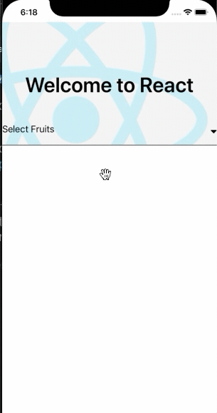
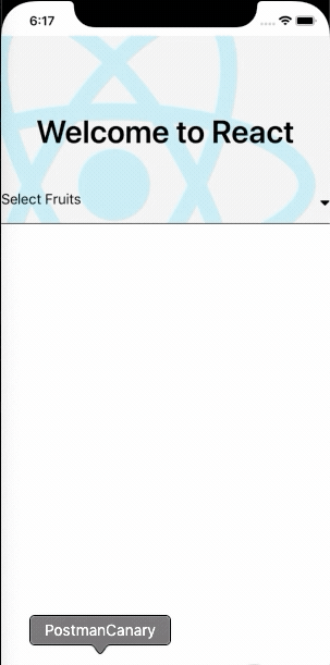
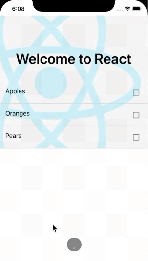
| Single Select at a time | Select With Title | Select Without Title |
|---|---|---|
 |
 |
 |
Usage
;;; const fruits = "Apples" "Oranges" "Pears";// --- OR ---// const fruits = [// { label: 'Apples', value: 'appls' },// { label: 'Oranges', value: 'orngs' },// { label: 'Pears', value: 'pears' }// ] state = selectedFruits: ; { // selectedFruits is array of { label, value } this; }; { return <View> <MultiSelect data=fruits onSelectedItemsChange=onSelectionsChange selectedItems=thisstateselectedFruits enableTitle title="Select Fruits" /> </View> ; };Properties
| Prop | Default | Type | Description |
|---|---|---|---|
| data | [] |
array |
All items available in the list (array of string or { label, value }) |
| selectedItems | [] |
array |
The currently selected items (array of string or { label, value }) |
| onSelectedItemsChange | - | func |
Callback called when a user selects or de-selects an item, passed (selections) |
| checkboxSource | image | object |
Image source for the checkbox (unchecked). |
| selectedCheckboxSource | image | object |
Image source for the checkbox (checked). |
| disableAutoClose | false |
bool |
Disable Automatic Closing funcation |
| iconDisabled | false |
bool |
Disable caret icon |
| enableTitle | false |
bool |
enable title for component |
| icon | caret-down |
string |
change caret icon |
| containerStyle | {} |
object |
Style for the container label. |
| styleTextDropdown | {} |
object |
Style for the dropdown text. |
License
© Suraj Sanwal