React Native Checkbox Field
React Native Checkbox Field is a configurable React Native component which works on both iOS and Android with minimal dependencies.
Installation
npm install --save react-native-checkbox-field
Usage
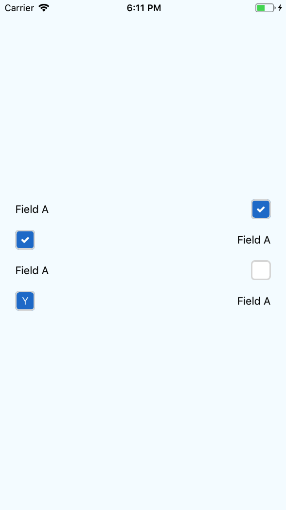
; // Field with label; // Checkbox only;;;; state = selected: false ; { this; }; { const selected = thisstate; // Only onSelect prop is required return <CheckboxField onSelect=thisselectCheckbox selected=selected label="Accept terms and conditions" labelSide="right" > <Icon name="check" color="#fff" /> </CheckboxField> }Props
CheckboxField
label(String)null- The label positioned next to the checkboxlabelStyle(Object) - The style of the text label
{
  flex: 1
}
containerStyle(Object) - The style of the container surrounding the label and checkbox
{
  flex: 1,
  flexDirection: 'row',
  padding: 20,
  alignItems: 'center'
}
labelSide(enum('left', 'right'))left- The side the label will be positioned with the checkbox.
Checkbox
onSelect(Function)null- The function that is run when the checkbox is selectedselected(Boolean)false- The value representing the selected statedisabled(Boolean)false- Whether the checkbox can receive user interactionsdisabledColor(String)null- The background color when the checkbox is disabledchildren(React.Component)null- The component within the checkboxdefaultColor(String)#fff- The default color of the checkbox backgroundselectedColor(String)#247fd2- The selected color of the checkbox backgroundcheckboxStyle(Object)
{
  borderWidth: 2,
  borderColor: '#ddd',
  borderRadius: 5
}