The React-Native-Buttons
react native button based on pure JavaScript with good expansibility.
Main
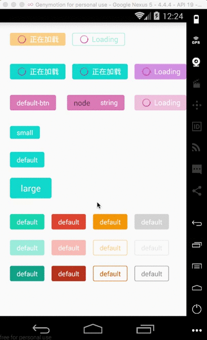
- This component provide 5 theme color for user to chose.
- This component provide 2 type of button for user to chose.
- This component provide the function that user can define their own theme color, we can help them to calculate the disabled color, active color and so on. Also they can define the disabled color and active color by themselves if they like.
- This component provide the ripple effect of the button. And due to lower Android API which do not have this effect, we use highlight as alternative in the consideration of performance.
- This component provide you add as more other components as you can into the button(eg: icon).
Example
- API >= 21
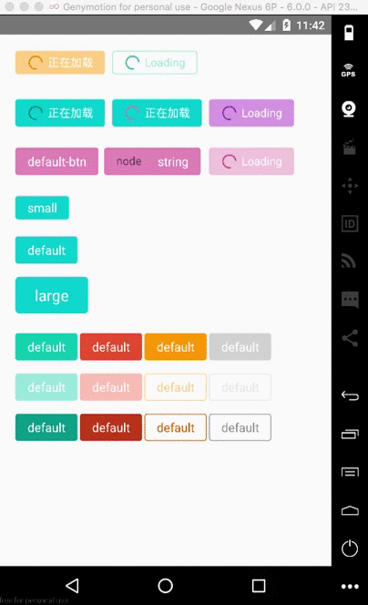
- API < 21
How to install
npm install react-native-buttons --save
Properties
| Prop | Default | Type | Description |
|---|---|---|---|
| type | 'surface' | string |
Specify the type of the button, you can chose form 'surface' and 'ghost' |
| size | 'default' | string |
Specify the size of the button, you can chose from 'small', 'default', 'large' |
| theme | 'default' | string | color type |
Specify the theme color, you can chose from 'orange', 'blue', 'red', 'gray', 'default'. Or you can define your own color by use the colort type(eg: 'gba(221,106,167,0.8)', '#BA55D3' and so on) |
| isLoading | false | bool |
Specify the button is on loading status. In this status, the button is disabled |
| loadingTitle | 'Loading' | string |
Specify the text of loading status. |
| loadingColor | - | color type |
Specify the loading color, if you do not specify this color, we can calculate it for you based on the theme color |
| selfStyle | - | style type |
Specify button's style by yourself |
| disableColor | - | color type |
Specify the disabled color, if you do not specify this color, we can calculate it for you based on the theme color |
| active | false | bool |
Specify the active status of the button |
| disabled | false | bool |
Specify the disable status of the button |
| activeColor | - | color type |
Specify the active color, if you do not specify this color, we can calculate it for you based on the theme color |
Method
see the react native document of TouchableWithoutFeedback. All methods supported by TouchableWithoutFeedback can be used here.
Usage
- you can see and run the example in the app/index.js.
;;; { console; } { return <View style=marginLeft: 20 marginTop: 20> <Button type="surface" size="small" theme="orange" loadingTitle="正在加载" isLoading=true onPress=this_onPressButton>Small</Button> <Button selfStyle=marginLeft: 120 type="ghost" size="small" theme="blue" isLoading=true onPress=this_onPressButton>Default</Button> </View> ; } ;