react-native-another-toast
 React Native Toast done in JS for better compatibility and customizability.
Installation
npm install --save react-native-another-toast
Usage
{ return <Toast text='Toast text' showToast=true /> ) }Examples
//Simple toast that fades at the top via the state change { superprops thisonClose = thisonClose thisshowToast = thisshowToast } state = showToast: false { this } { this } { return <View style= flex: 1 width: Dimensionswidth justifyContent: 'center' > <TouchableHighlight onPress=thisshowToast> <View style= paddingVertical: 8 paddingHorizontal: 15 backgroundColor: '#3b3b3b' > <Text style= color: '#fff' textAlign: 'center' >Press Me</Text> </View> </TouchableHighlight> <Toast text='Toast text' position='top' animationType='fade' onClose=thisonClose showToast=thisstateshowToast /> </View> }
//Toast with image that slides from the side via refs { superprops thisshowToast = thisshowToast } { thistoast } { return <View style= flex: 1 width: Dimensionswidth justifyContent: 'center' > <TouchableHighlight onPress=thisshowToast> <View style= paddingVertical: 8 paddingHorizontal: 15 backgroundColor: '#3b3b3b' > <Text style= color: '#fff' textAlign: 'center' >Press Me</Text> </View> </TouchableHighlight> <Toast content= <View style= flexDirection: 'row' alignItems: 'center' > <Image style= width: 50 height: 50 source= uri: 'https://facebook.github.io/react/img/logo_og.png' /> <Text style= color: '#fff' paddingHorizontal: 10 >Complex toast</Text> </View> slide='horizontal' ref= { thistoast = c } /> </View> }Props
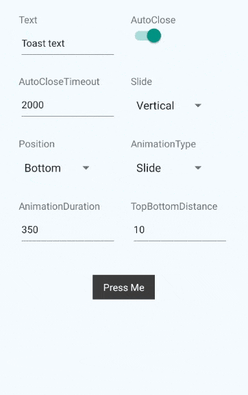
content- (React.Component)null- Component inside the toast. Replaces thetext.text- (String)Toast- text that will be shown in the toast, ifcontentis null.textStyle- (Object) - Styles for the text element.toastStyle- (Object) - Styles for the toast element.underlayColor- (String)#515151- Color of the underlay for TouchableHighlight element of the toast. Recommended to be slightly lighter or darker than main background.onToastTap- (Function)null- Will be called on the tap on the toast element. By default (if null) will call internal function that will close the toast. If provided - internal function will not be called.autoClose- (Boolean)true- Decides if we should close the toast automatically after timeout.autoCloseTimeout- (Number)2000- Timeout for autoClose.onClose- (Function) - Will be called after the toast close animation.showToast- (Boolean)false- If true - toast will be shown. Please note, that you should revert this to false if you want to show the toast again(You probably want to use onClose event for this).slide- (String: [vertical, horizontal])vertical- Decides how animation will occur forslideanimation type.position- (String: [top, bottom])bottom- Position of the toast on screen.topBottomDistance- (Number)10- Gap between the edge of the screen and the toast(either from the bottom, or from the top, depend on theposition).animationType- (String: [slide, fade])slide- Decides on the animation type.animationDuration- (Number)350- Animation duration.
Methods
showToast- Will show the toast.
thistoastcloseToast- Will close the toast.
thistoastDemo
git clone https://github.com/ywein/react-native-another-toast.gitcd react-native-another-toast/examples/toast && npm install- iOS
- Open
./examples/toast/ios/toast.xcodeprojectin xcode command+r(in xcode)
- Open
- Android
- Run android simulator / plug in your android device
- Run
react-native run-androidin terminal
TODO
The following is left to be done:
- Different Touchable components per platform.
- Customizable animation function.