React Native Advanced Ripple
Material design touch ripple with advanced functionality for react native.
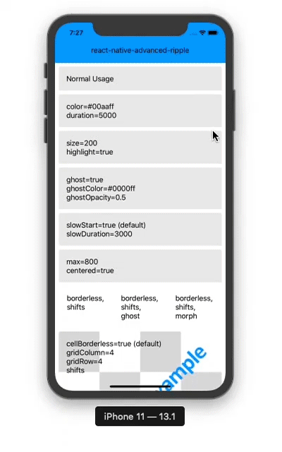
Features
- Pure JS, lightweight, works on Android, iOS and Web
- Can replace TouchableNativeFeedback for iOS and Web
- Has the option to use ripple in a grid of targets efficiently
- Ripple center shifting, ghosting and morphing options
- Foreground and background ripples
- Ability to configure options globally
Installation
npm install react-native-advanced-ripple
Usage
{ return <View> <Ripple onPress=thisonPress> <Text>Hello</Text> </Ripple> </View> } API
Ripple
Component props and default values
color: 'rgb(0, 0, 0)' Ripple color
opacity: 0.30 Ripple opacity
duration: 320 Ripple duration in ms
size: 0 Ripple size restriction. Value of 0 means no restriction
containerBorderRadius: 0 Ripple container border radius
centered: false Ripple should start from center
sequential: false Ripple should start in sequence
fades: true Ripple fades out
disabled: false Ripple component should ignore touches
max: 360 Max size of ripple in dp
cellSize: 0 Cell size in dp for containing ripple animation
cellWidth: 0 Grid size width in dp for containing ripple animation
cellHeight: 0 Grid size height in dp for containing ripple animation
gridColumn: 0 Grid size width in dp for containing ripple animation
gridRow: 0 Grid size height in dp for containing ripple animation
cellBorderless: true Grid containing ripple animation in grid cell
cellBorderRadius: 0 Grid cell border radius in dp
cancelTolerance: 8 Gesture tolerance in dp before cancelling ripple
cancelDuration: 0 Cancelling ripple animation duration
cancelAnimated: false Cancelling ripple with animation
shifts: false Ripple shifts in
highlight: false Ripple ghosting on press-in, ignoring ghostDelay
ghost: false Ripple ghosting in
ghostRestriction: false Ripple ghosting size restricted to ripple size
ghostSize: 0 Ripple ghost size Value of 0 means no restriction
ghostColor: 'rgb(0, 0, 0)' Ripple ghost color
ghostFades: true Ripple ghost fades in
ghostOpacity: 0.10 Ripple ghost opacity
ghostDuration: 440 Ripple ghost fade-in duration in ms (=slowDuration-ghostDelay)
ghostDelay: 200 Ripple ghost timeout in ms
ghostUseForeground: true Render ripple ghost on foreground
slowStart: true Ripple slowly starting while hold down
slowDuration: 640 Ripple while hold down duration
morph: false Ripple morphing into rectangular shape afrer reaching full size
morphBorderRadius: 0 Ripple morphing rectangle border radius
morphDuration: 320 Ripple morphing duration
borderless: false Rripple overflows from container
useForeground: true Render ripple on foreground
background: {} TouchableNativeFeedback background option
containerStyle: {} container styles which is useful to set margin, etc.
onGridPress: (e, data) => {} Grid cell press callback. data is a {row,column} object
onGridLongPress: (e, data) => {} Grid cell long press callback. data is a {row,column} object
onRippleAnimation: (animation, callback) => animation.start(callback) Animation start callback. The provided function must call animation.start(callback)
Static methods
config(opts:Object) sets default props for Ripple globally. opts is a key-value pairs object containing prop values
canUseNativeForeground():Boolean placeholder for TouchableNativeFeedback replacement. Always returns true.
SelectableBackground(rippleRadius:Number):Object placeholder for TouchableNativeFeedback replacement. Works as intended
SelectableBackgroundBorderless(rippleRadius:Number):Object placeholder for TouchableNativeFeedback replacement. Works as intended
Ripple(color:String, borderless:Boolean, rippleRadius:Number):Object placeholder for TouchableNativeFeedback replacement. Works as intended
Prop aliases
These props make it a drop-in replacement for react-native-material-ripple. The aliases override original props.
// original properties --> aliascolor --> rippleColoropacity --> rippleOpacityduration --> rippleDurationsize --> rippleSizecontainerBorderRadius --> rippleContainerBorderRadiuscentered --> rippleCenteredsequential --> rippleSequentialfades --> rippleFadesLicense
The MIT License (MIT)
Copyright (c) 2020 Md. Naeemur Rahman (https://naeemur.github.io)
Permission is hereby granted, free of charge, to any person obtaining a copy of this software and associated documentation files (the "Software"), to deal in the Software without restriction, including without limitation the rights to use, copy, modify, merge, publish, distribute, sublicense, and/or sell copies of the Software, and to permit persons to whom the Software is furnished to do so, subject to the following conditions:
The above copyright notice and this permission notice shall be included in all copies or substantial portions of the Software.
THE SOFTWARE IS PROVIDED "AS IS", WITHOUT WARRANTY OF ANY KIND, EXPRESS OR IMPLIED, INCLUDING BUT NOT LIMITED TO THE WARRANTIES OF MERCHANTABILITY, FITNESS FOR A PARTICULAR PURPOSE AND NONINFRINGEMENT. IN NO EVENT SHALL THE AUTHORS OR COPYRIGHT HOLDERS BE LIABLE FOR ANY CLAIM, DAMAGES OR OTHER LIABILITY, WHETHER IN AN ACTION OF CONTRACT, TORT OR OTHERWISE, ARISING FROM, OUT OF OR IN CONNECTION WITH THE SOFTWARE OR THE USE OR OTHER DEALINGS IN THE SOFTWARE.