react-native-action-bar
An Android-like action bar for react-native
For react-native v0.39+
⚠️ Breaking change for versions < 2.*
The component has been redone so it hasn't much in common.
Check that README for versions lower than 2.*
Example
| iOS | Android |
|---|---|
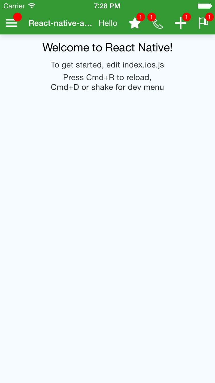 |
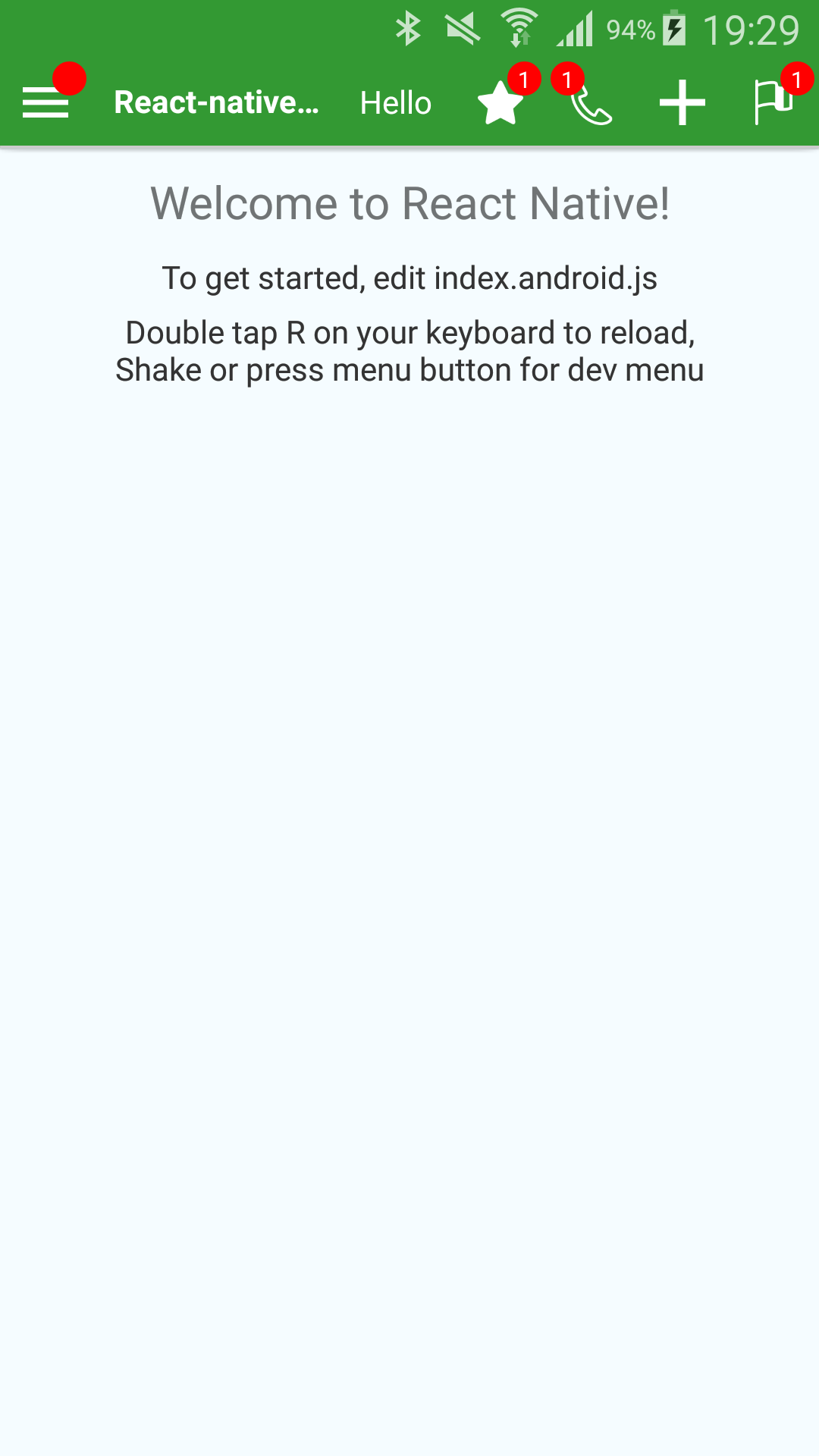 |
<ActionBar containerStyle=stylesbar title='React-native-action-bar Example' rightText='Hello' leftIconName='menu' leftBadge='' onLeftPress= console onTitlePress= console rightIcons= name: 'star' badge: '1' console name: 'phone' badge: '1' console isBadgeLeft: true name: 'plus' console name: 'flag' badge: '1' console image: // To use a custom image badge: '1' console />Are you looking for React-native's ToolbarAndroid?
To allow more customization, I do not use ToolbarAndroid, however, this might be what you are looking for instead of my package.
react-native-action-bar is here to provide a similar top screen bar but that looks the same on Android and iOS.
Properties
| Property Name | Type | Comment |
|---|---|---|
| allowFontScaling | React.PropTypes.bool | If you want to allow font scaling on the title and the right text (false by default) |
| backgroundColor | React.PropTypes.string | The background color of the Bar |
| badgeColor | Badge.propTypes.backgroundColor | The color of all badges |
| badgeTextColor | Badge.propTypes.color | The color of the text of the badges |
| containerStyle | ViewPropTypes.style | Style of the container of the bar (has the backgroundColor) |
| disableShadows | React.PropTypes.bool | If you want the ActionBar to drop a shadow or not (The default is false) |
| disableStatusBarHandling | React.PropTypes.bool | If you want the ActionBar to set the color/style of the StatusBar (The default is false) |
| elevation | React.PropTypes.number | On Android, to 'control' the Shadow dropped by the bar (default is 2) |
| iconContainerStyle | ViewPropTypes.style | See the Icon component (applies to all Icons (left and right) |
| iconImageStyle | Image.propTypes.style | See the Icon component (applies to all Icons (left and right) |
| isLeftBadgeLeft | React.PropTypes.bool | Position of the badge on the left Icon |
| leftBadge | Badge.propTypes.content | Text of the badge on the left Icon ('' is a valid value, it will display an empty badge. undefined is needed to not have the badge displayed) |
| leftIconContainerStyle | Icon.propTypes.containerStyle | See the Icon component |
| leftIconImage | Icon.propTypes.source | An image to use as Icon (require()). Don't use remote images ({ uri: ... }) as it will have bad performance, but I guess you can |
| leftIconImageStyle | Icon.propTypes.imageStyle | See the Icon component |
| leftIconName | Icon.propTypes.name | The name of one of the predefined Icons (see List of predefined Icons) |
| leftTouchableChildStyle | ViewPropTypes.style | The style of the View inside the TouchableWithoutFeedback element for the left Icon |
| leftZoneContentContainerStyle | ViewPropTypes.style | The style of the View around the TouchableWithoutFeedback element for the left Icon |
| onLeftPress | React.PropTypes.func | The function to execute onPress for the left Icon |
| onRightTextPress | React.PropTypes.func | The function to execute onPress for the Text that you can display on the right of the Title |
| onTitlePress | React.PropTypes.func | The function to execute onPress for the Title |
| renderLeftSide | React.PropTypes.func | A function to override the rendering of the part left of the Title |
| renderRightSide | React.PropTypes.func | A function to override the rendering of the part right of the Title |
| rightIconContainerStyle | Icon.propTypes.containerStyle | See the Icon component |
| rightIconImageStyle | Icon.propTypes.imageStyle | See the Icon component |
| rightIcons | React.PropTypes.arrayOf( React.PropTypes.shape({ ...Icon.propTypes, badge: Badge.propTypes.content, onPress: React.PropTypes.func.isRequired, }), ) |
See below |
| rightText | React.PropTypes.string | The text to display on the right |
| rightTextStyle | Text.propTypes.style | Style of the text to display on the right |
| rightTouchableChildStyle | ViewPropTypes.style | The style of the View inside the TouchableWithoutFeedback element for all the Icons on the right |
| rightZoneContentContainerStyle | ViewPropTypes.style | The style of the View around all the Icons + Text on the right |
| throttleDelay | React.PropTypes.number | The delay to throttle the presses on the Icons (The default is 750ms) |
| title | React.PropTypes.string | The Text of the Title |
| titleContainerStyle | ViewPropTypes.style | The style of the View containing the Text element for the Title |
| titleStyle | Text.propTypes.style | The style of the Text element for the Title |
rightIcons elements example
{
    name: 'phone',
    badge: '1',
    onPress: () => console.log('Right Phone !'),
    isBadgeLeft: true,
}
Predefined Icons
Right now the following Icons are defined:
 back
back flag
flag loading
 location
 menu
menu phone
phone plus
plus star
star star-outline
Example
See an implementation example in the Example folder