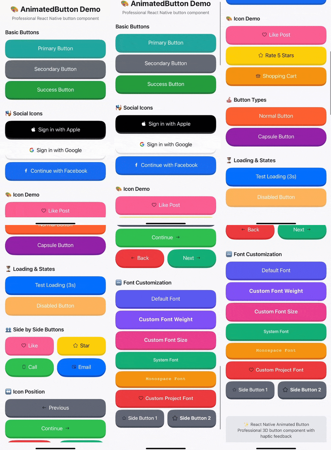
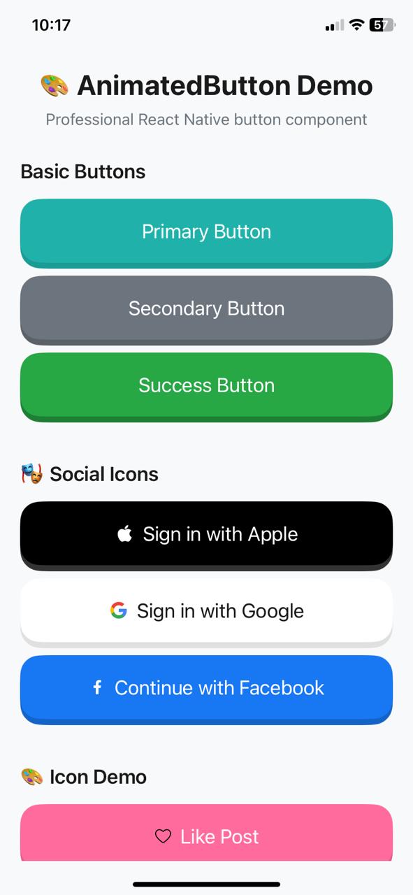
A beautiful React Native animated button component with Duolingo-style 3D press animation and haptic feedback. Perfect for creating engaging, interactive buttons that feel great to press. Written in TypeScript with full type definitions.
👆 Scan QR code with Expo Go to test on your device!
- ✨ Duolingo-style 3D press animation - Smooth button press effect with shadow that feels like the popular language learning app
- 🎯 Spring animations - Natural, responsive press animations with configurable physics
- 📳 Haptic feedback - Tactile response on button press (Light/Medium/Heavy)
- 🎨 Customizable design - Colors, fonts, and styles
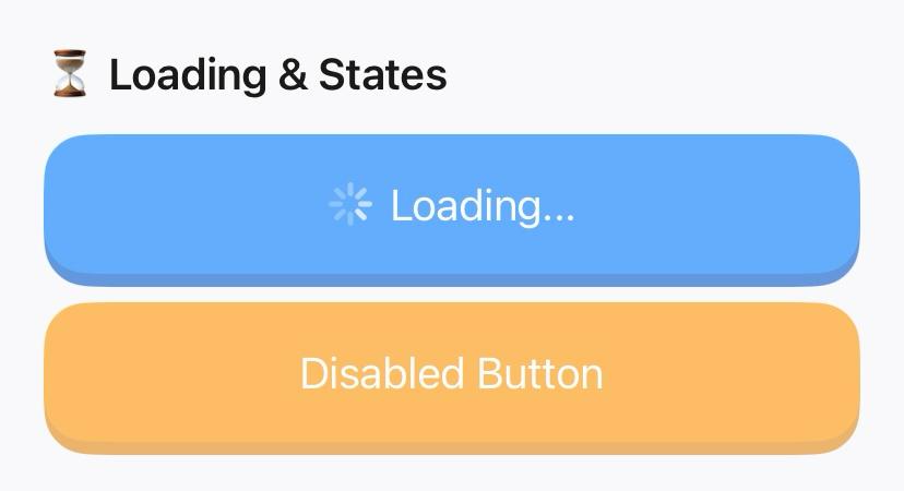
- 🔄 Loading states - Built-in loading indicator with optional text
- 🎯 Icon support - Built-in icons + comprehensive SVG icon library
↔️ Icon positioning - Left or right icon placement for better UX- 🌍 RTL language support - Automatic right-to-left language detection
- 📱 Responsive design - Adapts to different screen sizes and orientations
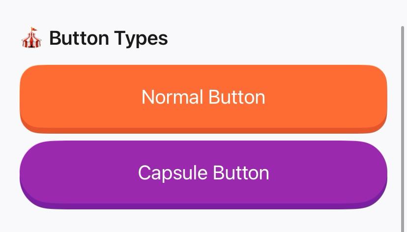
- 🎪 Button types - Normal and capsule shapes
- ♿ Enhanced accessibility - Labels, hints, hitSlop, and proper states
- 🔒 Press lock mechanism - Prevents accidental double-presses
- 📘 TypeScript - Full type definitions included
- 🎨 50+ SVG Icons - Social, payment, arrows, actions, common UI icons
Install the package along with its required dependencies:
npm install react-native-3d-animated-buttons react-native-svg expo-hapticsThat's it! Everything you need in one command to create Duolingo-style interactive buttons.
import { AnimatedButton } from 'react-native-3d-animated-buttons';

<AnimatedButton
  title="Continue"
  onPress={() => {}}
  icon="apple"
  type="capsule"
  backgroundColor="#20B2AA"
  shadowColor="#1A9B94"
/>import React from 'react';
import { View } from 'react-native';
import { AnimatedButton } from 'react-native-3d-animated-buttons';
const App = () => {
return (
<View style={{ flex: 1, justifyContent: 'center', padding: 20 }}>
<AnimatedButton
title="Press Me"
onPress={() => console.log('Button pressed!')}
/>
</View>
);
};
export default App;import { AnimatedButton } from 'react-native-3d-animated-buttons';
<AnimatedButton
title="Sign in with Apple"
onPress={() => handleAppleSignIn()}
backgroundColor="#000000"
shadowColor="#333333"
textColor="#FFFFFF"
hapticStyle="Medium"
icon="apple"
type="capsule"
loading={isLoading}
loadingText="Signing in..."
disabled={false}
fullWidth={true}
minHeight={60}
testID="apple-signin-button"
accessibilityLabel="Sign in with Apple account"
accessibilityHint="Double tap to sign in with your Apple ID"
onLongPress={() => showHelp()}
hitSlop={{ top: 10, bottom: 10, left: 10, right: 10 }}
style={{ marginBottom: 20 }}
textStyle={{ fontSize: 16, fontWeight: 'bold' }}
/>| Prop | Type | Default | Description |
|---|---|---|---|
title |
string | Required | Button text |
onPress |
function | Required | Press handler function |
backgroundColor |
ColorValue | '#20B2AA' |
Main button background color |
shadowColor |
ColorValue | '#1A9B94' |
Shadow layer background color |
textColor |
ColorValue | '#FFFFFF' |
Button text color |
style |
StyleProp | {} |
Additional styles for button container |
textStyle |
StyleProp | {} |
Additional styles for button text |
disabled |
boolean | false |
Whether button is disabled |
hapticStyle |
HapticStyle | 'Heavy' |
Haptic feedback style: 'Light', 'Medium', 'Heavy'
|
icon |
IconType | null |
Built-in icon type: 'apple', 'google', 'phone', 'facebook', or null
|
customIcon |
IconComponent | null |
Custom SVG icon component (highest priority) |
customIconSvg |
string | null |
Custom SVG icon as string markup |
iconSize |
number | 24 |
Icon size (width and height in pixels) |
iconPosition |
IconPosition | 'left' |
Icon position: 'left' or 'right' (auto-swaps for RTL) |
loading |
boolean | false |
Whether to show loading indicator |
loadingText |
string | null |
Text to show when loading (optional) |
type |
ButtonType | 'normal' |
Button type: 'normal' or 'capsule'
|
fullWidth |
boolean | true |
Whether button should take full width |
minHeight |
number | 52 |
Minimum height of the button |
testID |
string | undefined |
Test identifier for testing frameworks |
accessibilityLabel |
string | title |
Accessibility label for screen readers |
accessibilityHint |
string | undefined |
Accessibility hint (auto-sets to 'In progress' when loading) |
onLongPress |
function | undefined |
Long press handler function |
hitSlop |
Insets | undefined |
Touch target expansion for better accessibility |
disableAnimations |
boolean | false |
Disable animations for accessibility (reduced motion) |
// Normal button
<AnimatedButton
  title="Normal Button"
  onPress={() => {}}
  type="normal"
/>

// Capsule button
<AnimatedButton
  title="Capsule Button"
  onPress={() => {}}
  type="capsule"
/>// Apple Sign In
<AnimatedButton
title="Sign in with Apple"
onPress={() => {}}
icon="apple"
backgroundColor="#000000"
shadowColor="#333333"
/>
// Google Sign In
<AnimatedButton
title="Sign in with Google"
onPress={() => {}}
icon="google"
backgroundColor="#FFFFFF"
shadowColor="#E0E0E0"
textColor="#1A1A1A"
/>
// Facebook Sign In
<AnimatedButton
title="Continue with Facebook"
onPress={() => {}}
icon="facebook"
backgroundColor="#1877F2"
shadowColor="#1464C7"
/>
// Phone Sign In
<AnimatedButton
title="Sign in with Phone"
onPress={() => {}}
icon="phone"
backgroundColor="#34C759"
shadowColor="#2AA946"
/>// Method 1: Custom React Component (Recommended)
import MyCustomIcon from './icons/MyCustomIcon';
<AnimatedButton
title="Custom Icon Button"
onPress={() => {}}
customIcon={MyCustomIcon}
iconSize={24}
backgroundColor="#FF6B9D"
shadowColor="#E55A87"
/>
// Method 2: SVG String
<AnimatedButton
title="SVG String Icon"
onPress={() => {}}
customIconSvg={`<svg width="24" height="24" viewBox="0 0 24 24" fill="none">
<path d="M12 2l3.09 6.26L22 9.27l-5 4.87 1.18 6.88L12 17.77l-6.18 3.25L7 14.14 2 9.27l6.91-1.01L12 2z" fill="currentColor"/>
</svg>`}
iconSize={20}
backgroundColor="#FFD700"
shadowColor="#E6C200"
/>
// Method 3: Icon Priority (customIcon > customIconSvg > icon)
<AnimatedButton
title="Priority Example"
onPress={() => {}}
icon="apple" // Ignored (lowest priority)
customIcon={HeartIcon} // Used (highest priority)
/>
// Method 4: Icon Positioning for Better UX
<AnimatedButton
title="Previous"
onPress={() => {}}
customIconSvg={arrowLeftSvg}
iconPosition="left" // Arrow on left (default)
/>
<AnimatedButton
title="Continue"
onPress={() => {}}
customIconSvg={arrowRightSvg}
iconPosition="right" // Arrow on right (better UX!)
/><AnimatedButton
title="Submit"
onPress={() => {}}
loading={isSubmitting}
loadingText="Submitting..."
disabled={isSubmitting}
/><AnimatedButton
title="Custom Button"
onPress={() => {}}
backgroundColor="#FF6B6B"
shadowColor="#E55555"
textColor="#FFFFFF"
style={{
marginHorizontal: 20,
marginBottom: 10
}}
textStyle={{
fontSize: 18,
fontWeight: '600'
}}
/><AnimatedButton
title="Custom Font Button"
onPress={() => {}}
backgroundColor="#FF6B35"
shadowColor="#E55529"
textStyle={{
fontFamily: Platform.OS === 'ios' ? 'YourCustomFont-Bold' : 'your_custom_font_bold',
fontSize: 18,
fontWeight: '600',
letterSpacing: 0.5,
}}
/>
<AnimatedButton
title="System Font"
onPress={() => {}}
textStyle={{
fontFamily: Platform.OS === 'ios' ? 'System' : 'Roboto',
fontSize: 16,
fontWeight: '500',
}}
/>// Import icons from the comprehensive library
import { AnimatedButton, icons } from 'react-native-3d-animated-buttons';
// Social media icons
<AnimatedButton
title="Sign in with Apple"
onPress={() => {}}
customIconSvg={icons.appleV1}
iconSize={20}
backgroundColor="#000000"
/>
// Payment icons
<AnimatedButton
title="Add to Cart"
onPress={() => {}}
customIconSvg={icons.cartV1}
iconSize={18}
backgroundColor="#FF6B35"
/>
// Arrow icons with positioning
<AnimatedButton
title="Continue"
onPress={() => {}}
customIconSvg={icons.arrowRightV1}
iconPosition="right"
backgroundColor="#34C759"
/>
// Common UI icons
<AnimatedButton
title="Like Post"
onPress={() => {}}
customIconSvg={icons.heartV1}
iconSize={16}
backgroundColor="#FF6B9D"
/>The component uses spring-based animations for a natural, responsive feel that mimics the satisfying button press experience found in apps like Duolingo:
// Custom spring configuration (built-in)
<AnimatedButton
  title="Spring Button"
  onPress={() => {}}
  // Uses: stiffness: 300, damping: 20, mass: 0.4
/>Automatically detects and adapts to right-to-left languages:
// Icon automatically swaps to right side in RTL languages
<AnimatedButton
  title="Continue"
  icon="arrow-right"
  // iconPosition not specified - auto-detects RTL
/>Enhanced accessibility with proper labels, hints, and touch targets:
<AnimatedButton
  title="Accessible Button"
  onPress={() => {}}
  accessibilityLabel="Primary action button"
  accessibilityHint="Double tap to perform the main action"
  hitSlop={{ top: 10, bottom: 10, left: 10, right: 10 }}
  testID="primary-button"
/>

// Reduced motion support for accessibility
<AnimatedButton
  title="Static Button"
  onPress={() => {}}
  disableAnimations={true} // No animations for users who prefer reduced motion
/>Prevents accidental double-presses with configurable timing:
<AnimatedButton
  title="Protected Button"
  onPress={() => handleExpensiveOperation()}
  // Automatically prevents rapid double-presses
/>Respects user accessibility preferences by allowing animation disabling:
<AnimatedButton
  title="Accessible Button"
  onPress={() => {}}
  disableAnimations={true} // Respects user's reduced motion preference
/>The component uses Expo Haptics for tactile feedback. You can customize the intensity:
-
'Light'- Subtle feedback -
'Medium'- Moderate feedback -
'Heavy'- Strong feedback (default)
<AnimatedButton
  title="Light Haptic"
  onPress={() => {}}
  hapticStyle="Light"
/>This package is written in TypeScript and includes full type definitions. You'll get excellent IntelliSense support and type safety:
import { AnimatedButton, AnimatedButtonProps, IconType, HapticStyle, ButtonType, IconPosition } from 'react-native-3d-animated-buttons';

// All props are fully typed
const MyButton: React.FC = () => {
  const handlePress = (): void => {
    console.log('Button pressed!');
  };

  return (
    <AnimatedButton
      title="Typed Button"
      onPress={handlePress}
      hapticStyle="Medium" // Autocomplete available: 'Light' | 'Medium' | 'Heavy'
      icon="apple" // Autocomplete available: 'apple' | 'google' | 'phone' | 'facebook'
      type="capsule" // Autocomplete available: 'normal' | 'capsule'
      iconPosition="right" // Autocomplete available: 'left' | 'right'
    />
  );
};This package includes a comprehensive test app demonstrating all features:
cd test-app
npm install
npx expo start
The test app showcases:
- ✅ All button features - Basic, social, icons, types, loading
- ✅ Icon positioning - Left/right placement examples
- ✅ Font customization - Typography styling options
- ✅ Side-by-side layouts - Responsive button pairing
- ✅ Professional architecture - Clean, modular code structure
Perfect for understanding how to integrate the component in your project!
The component automatically adapts to different screen sizes and orientations using a responsive scaling system based on device dimensions. It responds to orientation changes in real-time for optimal user experience, ensuring your Duolingo-style buttons look great on any device.
- React.memo - Prevents unnecessary re-renders
- useCallback - Stable event handler references
- useMemo - Optimized computed values
- useWindowDimensions - Efficient orientation change handling
- Press lock - Prevents rapid double-presses
- Duolingo-inspired UX - Smooth, satisfying button interactions that users love
MIT
Pull requests are welcome! Please make sure to update tests as appropriate.
If you like this component, please give it a ⭐ on GitHub!


