
Requires react >= 16.8.0
This package makes use of react-image-cropper
Run the following command:
npm install react-multiple-image-input
import React, { useState } from 'react';
import MultiImageInput from 'react-multiple-image-input';

function App() {
  const crop = {
    unit: '%',
    aspect: 4 / 3,
    width: '100'
  };

  const [images, setImages] = useState({});

  return (
    <MultiImageInput
      images={images}
      setImages={setImages}
      cropConfig={{ crop, ruleOfThirds: true }}
    />
  );
}

export default App;| Property | Type | Default | Description |
|---|---|---|---|
| images | Object (required) | A state variable for holding the images | |
| setImages | function (required) | A function that updates the images state | |
| max | number | 3 |
Max number of images allowed |
| allowCrop | bool | true |
Set to false to disable cropping |
| cropConfig | Object | specifies cropping dimensions and limits | |
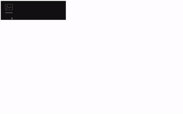
| theme | Object or String | dark |
Can be a simple string that specifies light or dark, or an object with your custom configurations |
| handleError | function | A function for handling errors from this component |
This is an object that houses the Base64 URLs to all the selected images. Each image has a key that starts from index 0 and is incremental as more images are added. It should be a state variable so that react-multiple-image-input can update it. Example:
{
  0: image1,
  1: image2,
  3: image3
}A function for updating the images state. This can be easily acheived with react's useState hook.
const [images, setImages] = useState({});This specifies the maximum number of images you want this component to hold. It is set to 3 by default.
<MultiImageInput
  max={3}
  images={setImages}
  setImages={setImages}
  cropConfig={{ crop }}
/>A boolean attribute for enabling/disabling cropping. It is true by default, set it to false if you don't want cropping.
This sets the dimensions for cropping. You can pass in dimension props accepted by react-image-cropper into this object. A list of these props include
- crop
All crop params are initially optional.
* While you can initially omit the crop object, any subsequent change will need to be saved and passed into the component.
crop: {
  unit: 'px', // default, can be 'px' or '%'
  x: 130,
  y: 50,
  width: 200,
  height: 200
}

<MultiImageInput  cropConfig={{crop}} />
If you want a fixed aspect you can either omit width and height and pass aspect to the cropConfig:
cropConfig = {crop: {}, aspect: 16 / 9};Or specify one or both of the dimensions:
cropConfig = {crop: {width: 100}, aspect: 16 / 9};If you specify just one of the dimensions, the other will be calculated for you.
crop: {
  unit: '%',
  width: 50,
  height: 50,
}
unit is optional and defaults to pixels px. It can also be percent %. In the above example we make a crop that is 50% of the rendered image size. Since the values are a percentage of the image, it will only be a square if the image is also a square.
- minWidth
A minimum crop width, in pixels. Default value is 300
<MultiImageInput cropConfig={{ minWidth: 300 }} />- minHeight
A minimum crop height, in pixels.
<MultiImageInput cropConfig={{ minHeight: 200 }} />- maxWidth
A maximum crop width, in pixels. Default value is 800
<MultiImageInput cropConfig={{ maxWidth: 200 }} />- maxHeight
A maximum crop height, in pixels.
<MultiImageInput cropConfig={{ maxHeight: 800 }} />- keepSelection
If true is passed then selection can't be disabled if the user clicks outside the selection area.
- disabled
If true then the user cannot resize or draw a new crop.
- locked
If true then the user cannot create or resize a crop, but can still drag the existing crop around.
- style
Inline styles object to be passed to the image wrapper element.
- imageStyle
Inline styles object to be passed to the image element.
- onImageError(event)
This event is called if the image had an error loading.
- onDragStart(event)
A callback which happens when a user starts dragging or resizing. It is convenient to manipulate elements outside this component.
- onDragEnd(event)
A callback which happens when a user releases the cursor or touch after dragging or resizing.
- crossorigin
Allows setting the crossorigin attribute on the image.
- renderSelectionAddon(state)
Render a custom element in crop selection.
- ruleOfThirds
Show rule of thirds lines in the cropped area. Defaults to false.
- circularCrop
Show the crop area as a circle. If your aspect is not 1 (a square) then the circle will be warped into an oval shape. Defaults to false.
You can customize the look and feel of the component to suit your app better. This prop can either be a string that specifies dark or light theme or an object to customize various parts of the component. The value of this prop is dark by default. As a string you can simply have;
<MultiImageInput theme="dark" />or
<MultiImageInput theme="light" />An object value will have to take the following properties
- outlineColor
This will set the color of the borders and svg image icon
- background
This will set the background color of the component
- textColor
This sets the color of any text in the component
- buttonColor
This sets the color of any buttons in the component
- modalColor
This sets the background color of the modal component
<MultiImageInput
  theme={{
    background: '#ffffff',
    outlineColor: '#111111',
    textColor: 'rgba(255,255,255,0.6)',
    buttonColor: '#ff0e1f',
    modalColor: '#ffffff
  }}
/>You can pass in a function that will take takes the error message(string) as a parameter and handle it in your own component
const handleError = (e) => console.log(e)

<MultiImageInput handleError={handleError} />