react-loading-signal


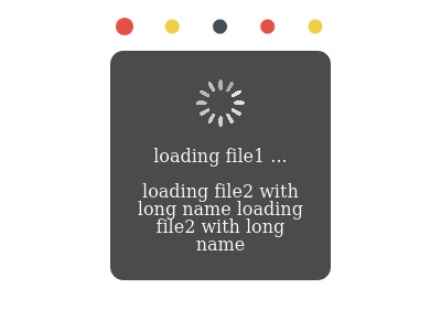
A React loading indicator displayed globally or locally or both, which interoperate with each other.


Features
-
Configurate global loading signal once for all (usually in ajax layer), and add any local loading signals anywhere, which could intercept global one, or not based on your needs.
-
Simple extendability to supply custom themes.
-
Support React 15.
Install
npm install react-loading-signal
Import
Take GlobalLoadingas example
es module
import { GlobalLoading } from 'react-loading-signal';
commonjs module
const GlobalLoading = require('react-loading-signal').GlobalLoading;
bundled version
import { GlobalLoading } from 'react-loading-signal/bundle';
or
const GlobalLoading = require('react-loading-signal/bundle').GlobalLoading;
or in global scope:
const GlobalLoading = LoadingSignal.GlobalLoading;
bundled minified version
Substitute 'bundle' with 'bundle.min'.
Usage
// ajax layer
import { GlobalLoading, LocalLoading } from 'react-loading-signal';
const gLoading = new GlobalLoading();

// to change the global loading signal style, create a new one:
// new GlobalLoading(theme, true, true);

function request(url) {
  const idLoading = gLoading.open();

  // pass idLoading to LocalLoading, take redux for example:
  // dispatch({ type: url, loading: idLoading })

  fetch(url)
    .then(function(response) {
      return response.json();
    }, () => {})
    .then(function() {
      gLoading.close(idLoading);
    });
}

// local loading signal
<LocalLoading active={idLoading} />
Themes
Builtin themes
- Spinning
- Blobs
- Circling
- Progress
import { Themes } from 'react-loading-signal';
const { Spinning, Blobs, Circling, Progress } = Themes;
Customize theme
Any valid React Component can be used as a theme. It will receive any props that's passed to LocalLoading.
Styles
In bundled version, Classes are all prepended with LoadingSignal__. Details please refer to /styles/LoadingSignal.css. (src/styles/LoadingSignal.css in source code.)
API
Table of Contents
GlobalLoading
This class is singleton internally, But could be created more than once. Exactly that is the only correct way to change the global loading signal styles on the fly.
Parameters
themeReact.ComponentType<any> Customized theme. (optional, defaultSpinning)maskedbool Whether to display overlay below. (optional, defaultfalse)closablebool Whether the signal can be closed by clicking the mask. (optional, defaultfalse)
open
Open global loading signal
Parameters
msgReact.Node? Message to show. (React.Node: anything React can render.)
Returns Indicator An identifier for this signal, ignoring its internal structure.
close
Close a signal
Parameters
idLoadingIndicator The identifier returned by open().
Returns void
getInstance
[static] Retrieve the GlobalLoading singleton instance.
Returns instance
Exported flow types
GlobalLoading & LocalLoading
-
Indicatoropaque - WhatGlobalLoaing.open()returns, it's accepted byGlobalLoaing.close()andLoadingProps.active. -
ActiveIndicator | bool - The type ofLoadingProps.active. -
LoadingProps- Props ofLocalLoadingactiveActive - Flag its visibility. WhenIndicatoris passed, the global one will not shown. Passtrueto leave global alone.maskedboolean - Flag its mask visibility. (optional, defaultfalse)messageNode - Content to display. (optional, defaultundefined)buttonHTMLElement - Button to be disabled, both a property and a class nameddisabledare set. (optional, defaultfalse)containerHTMLElement | false - Container where its placed. When not provided, parentNode is implied. If set tofalse, no signal will be shown, other functions still work. (optional, defaultundefined)themeReact.ComponentType<*> - The Component defining its actual visual outlook. You can pass any props toLocalLoadingwhich will be relayed to this component. (optional, defaultBlobs)
import { type Indicator, type Active, type LoadingProps } from 'react-loading-signal';
Progress Theme
-
Caption(number) => string Handler to generate progressing caption string. -
ProgressPropsProps ofProgressComponent.- message number The decimal number indicating current progress. The max is 1.
- caption Caption see above.
import { Themes } from 'react-loading-signal';
const { Progress } = Themes;
const Props: Themes.ProgressProps = {...};
// or
import { Progress, ProgressProps } from 'react-loading-signal/themes';
// or
import { Progress, type ProgressProps } from 'react-loading-signal/themes/progress';
Development
- To test when developing, run the demo:
npm start
- E2e tests are run against PhantomJS v2.1.1, if you adopt other versions or tools, the snapshots shipped maybe invalidated, run this command to update:
npm run test:e2e--updateSnapshots
License
MIT.