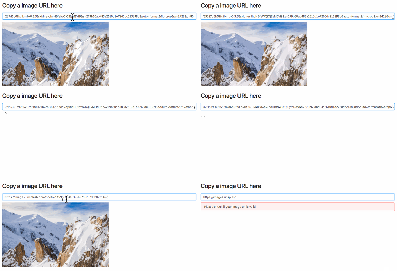
react-loading-image 


A react image loader component

Installation
$ npm install --save react-loading-imageUsage
Component { superprops; thisstate = value: null ; } { this; } { const value = thisstate; return <div> <h1>Copy a image URL here</h1> <input onChange=thisonChange/> <p> value: value </p> <div> value && <ImageLoader src=value loading= <div>Loading...</div> error= <div>Error</div> /> </div> </div> ; }Advanced
You might want to customized such as <div/> as your final view, instead of <img/> tags, you can use image prop to replace any React element as you wish!
For example, using styled-components:
; const PreviewImg = styleddiv` background-image: url(); width: 100%; height: 300px; background-size: contain; background-repeat: no-repeat;`; Component ... { const value = thisprops; return <div> <ImageLoader src=value image= <PreviewImg ...props/> // change to your customized component loading= <div>Loading...</div> error= <div>Error</div> /> </div> ; }Props
| Name | Type | Default | Description |
|---|---|---|---|
| src | string | null | Image URL |
| style | style Object | null | Pass style object to set image's style |
| className | string | null | Set image's className |
| onLoad | (img: Image) => void | null | This function will be called when image is loaded |
| onError | (err: Event) => void | null | This function will be called when image is failed |
| loading | () => React.Element<*> | null | Return a React element that will show when image is loading |
| error | () => React.Element<*> | null | Return a React element that will show when image is crashed |
| image | ({src: string, width: number, height: number}) => React.Element<*> | null | Final result will render to this customized React element, if you don't assign this props default image will render into <img src={src} width={width} height={height}/> |
Start example server
npm start
generate demo
npm run gh-pagesLicense
MIT © chilijung