A bootstrap-style react component for checkbox list
This is a simple react component that takes metadata, translates it into a checkbox list, and provides selected values when the user changes the selection. That's all it does.
install
npm install react-list-checkbox
Usage
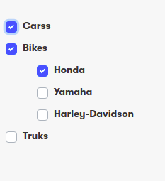
const data =
[{
     "id":"1",
     "label":"cars",
     "completed":false,
     "level":[]
  },

  {
     "id":"2",
     "label":"bikes",
     "completed":false,
     "level":[
      {
        "id":"2-0",
        "label":"Honda",
        "completed":false,
        "level":[]
     },
        {
           "id":"2-1",
           "label":"Harly",
           "completed":false,
           "level":[]
        }

  },
  {
     "id":"3",
     "label":"truks",
     "completed":false,
     "level":[

     ]
  }
]

 <CheckBoxList options = {data}> </CheckBoxList>
Contributing
Pull requests are welcome. For major changes, please open an issue first to discuss what you would like to change.