
Welcome to DataTableReact, your ultimate solution for integrating jQuery DataTable-like functionality into React components! With DataTableReact, effortlessly enhance your React applications with dynamic and responsive data tables. Harness a rich array of customizable options, empowering you to efficiently manage and visualize data within your projects. Seamlessly integrate DataTableReact into your workflow for streamlined data presentation and enhanced user experience.
$ npm install --save react-jquery-data-table
$ yarn add react-jquery-data-table

// For DataTable
$ import {
  DataTable,
} from "react-jquery-data-table";

// For PageNation
$ import {
  PageNation,
} from "react-jquery-data-table";
- Dynamic Data Rendering: Render dynamic data tables with ease, supporting a variety of data sources and formats.
- Customizable Columns: Define and customize columns to suit your data presentation needs, including sorting, filtering, and formatting options.
- Pagination: Enable pagination to efficiently navigate through large datasets, with customizable page sizes and page indicators.
- Search and Filtering: Implement search and filtering functionality to quickly locate and narrow down specific data entries.
- Responsive Design: Ensure optimal viewing experience across devices with responsive design that adapts to different screen sizes.
- Integration with React Applications: Seamlessly integrate DataTableReact into your existing React applications without any hassle.
- Extensible and Configurable: Configure DataTableReact to meet your specific requirements and extend its functionality with ease.
- Performance Optimization: Optimize performance for large datasets with efficient rendering and data handling mechanisms.
- Theming and Styling: Customize the look and feel of your data tables with flexible theming and styling options.
- Cross-Browser Compatibility: Support a wide range of modern browsers for consistent behavior and performance.
import React, { useEffect, useState } from "react";
import { DataTable } from "react-jquery-data-table";
import "bootstrap/dist/css/bootstrap.min.css";
import { GetCountries } from "react-country-state-city";
export default function App() {
const [countries, setCountries] = useState([]);
useEffect(() => {
GetCountries().then((res) => {
setCountries(res);
});
}, []);
return (
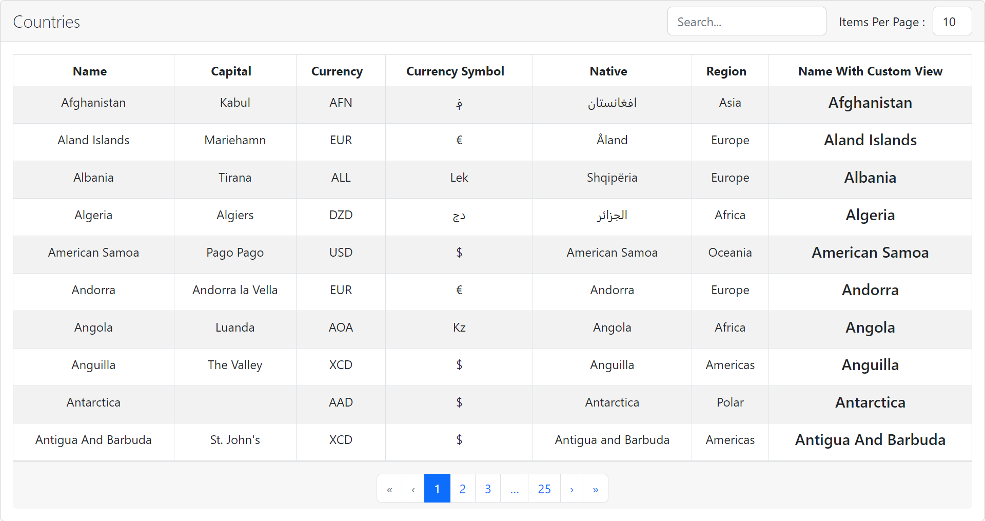
<DataTable
title="Countries"
data={countries}
heads={[
{ name: "Name", fieldname: "name" },
{ name: "Capital", fieldname: "capital" },
{ name: "Currency", fieldname: "currency" },
{ name: "Currency Symbol", fieldname: "currency_symbol" },
{ name: "Native", fieldname: "native" },
{ name: "Region", fieldname: "region" },
{
name: "Name With Custom View",
fieldname: "",
view: (item) => <h5>{item.name}</h5>,
},
]}
/>
);
}
Properties used to customise the rendering:
| Name | Type | Description | |
|---|---|---|---|
| title | string | The title for the table | |
| heads | HeadProps | Head text for the table head and field name to fetched from data and display in | |
| data | Array | Data records for the table | |
| currentPage | number |
optional Current page in pagination |
|
| itemsperpage | number |
optional The number of items you want per page default is 10. |
|
| hasItemsPerPageDropdown | boolean |
optional Items per page change dropdown are displayed when true and not displayed when false. default is true. |
|
| hasPagination | boolean |
optional Bottom pagination buttons are displayed when true and not displayed when false. default is true. |
|
| searchEnabled | boolean |
optional Search box are displayed when true and not displayed when false. default is true. |
The same country select properties and additionally
| Name | Type | Description | |
|---|---|---|---|
| name | string |
required Title of the table head |
|
| fieldname | string |
required Which field of object need to be displayed from data array to |
|
| view | FC |
optional Custom component to display fieldname |
import React, { useState } from "react";
import "./app.css";
import { PageNation } from "react-jquery-data-table";
import "bootstrap/dist/css/bootstrap.min.css";
export default function App() {
  const [currentPage, setCurrentPage] = useState(1);
  return (
    <PageNation
      currentPage={currentPage}
      totalPages={100}
      onPageChange={(_pageno) => setCurrentPage(_pageno)}
      className="justify-content-center mb-0 mt-2"
    />
  );
}
Properties used to customise the rendering:
| Name | Type | Description |
|---|---|---|
| currentPage | number |
required The current active page number being displayed. |
| totalPages | number |
required The total number of pages available for pagination. |
| onPageChange | function | Function that gets called when the user requests a page change, typically used to update the current page number in the component. |
| className | string | Custom CSS class applied to the pagination component, allowing for styling adjustments. |
A demo is worth a thousand words
Show your ❤️ and support by giving a ⭐. Any suggestions are welcome! venkatmcajj@gmail.com
Licensed under MIT