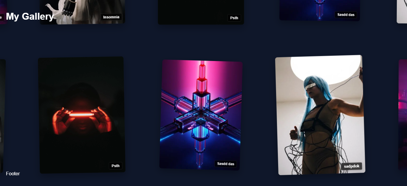
A beautiful infinite wraparound gallery React component that supports both images and videos with smooth animations and interactions.
Check out the live demo to see the component in action!
npm install react-infinite-galleryOr:
yarn add react-infinite-gallery- 🔄 Infinite scrolling with smooth loading
- 📱 Fully responsive grid layout
- 🎯 Lazy loading of images for better performance
- ⚙️ Highly customizable grid settings
- 🎨 Clean and modern design
- 🚀 Lightweight and optimized for performance
- 🎨 Clean and modern design
- 🚀 Lightweight and optimized for performance
import React from 'react';
import InfiniteGallery from 'react-infinite-gallery';
import 'react-infinite-gallery/dist/InfiniteGallery.css';

const itemsData = [
  {
    id: 1,
    type: 'image',
    content: 'https://example.com/image1.jpg',
    badgeText: 'Sample',
    color: '#EF5350',  // Optional: custom color
    rotation: 2,       // Optional: custom rotation
    scale: 1.1         // Optional: custom scale
  },
  {
    id: 2,
    type: 'video',
    content: 'https://example.com/video1.mp4',
    badgeText: 'Video',
    color: '#42A5F5'   // Optional: custom color
  },
  // Add more items as needed
];

function App() {
  return (
    <InfiniteGallery
      itemsData={itemsData}
      cardWidth={280}
      cardHeight={380}
      headerContent={<h1>Infinite Gallery</h1>}
      footerContent={<p>Gallery Footer</p>}
      galleryAnimate={true}
      badgeClass="custom-badge"
      stackInDuration={1500}
      stackOutDuration={1000}
      playButtonProps={{
        className: 'custom-play-btn',
        style: { backgroundColor: 'rgba(0,0,0,0.5)' },
        children: '▶'
      }}
      expandButtonProps={{
        className: 'custom-expand-btn',
        style: { backgroundColor: 'rgba(0,0,0,0.5)' }
      }}
      infoButton={<button>ℹ️</button>}
    />
  );
}| Prop | Type | Default | Description |
|---|---|---|---|
itemsData |
Array | [] |
Array of items to display. Each item should have: id, type ('image' or 'video'), content (URL), and optional badgeText, color, rotation, and scale
|
cardWidth |
number | 280 |
Width of each card in pixels |
cardHeight |
number | 380 |
Height of each card in pixels |
headerContent |
ReactNode | null |
Content to display at the top of the gallery |
footerContent |
ReactNode | null |
Content to display at the bottom of the gallery |
galleryAnimate |
boolean | true |
Whether to show the initial animation |
badgeClass |
string | '' |
Custom CSS class for badges |
stackInDuration |
number | 1500 |
Duration of stack-in animation in milliseconds |
stackOutDuration |
number | 1000 |
Duration of stack-out animation in milliseconds |
playButtonProps |
object | {} |
Props for customizing the video play button |
expandButtonProps |
object | {} |
Props for customizing the expand button |
infoButton |
ReactNode | null |
Custom info button component |
Each item in the itemsData array should have the following structure:
interface GalleryItem {
  id: number | string;          // Unique identifier
  type: 'image' | 'video';      // Type of content
  content: string;              // URL of the content
  badgeText?: string;           // Optional badge text
  color?: string;               // Optional custom color
  rotation?: number;            // Optional rotation in degrees
  scale?: number;               // Optional scale factor
}The component comes with default styles but can be customized using CSS classes:
-
.ig-gallery- Main gallery container -
.ig-card- Individual card container -
.ig-badge- Badge element -
.ig-play-btn- Video play button -
.ig-expand-btn- Expand button -
.ig-info-panel- Info panel
- A minimum of 20 images is required for optimal performance and user experience
- Supported image formats: jpg, png, webp
- For best performance, use appropriately sized and optimized images
- Make sure to import the CSS file as shown in the usage example
Check out the usage-example.jsx file in the repository for a complete implementation example.
MIT
