


Makes using Fine Uploader in a React app simple. Drop-in high-level components for a turn-key UI. Use small focused components to build a more custom UI.
This is currently an unstable in-progress project. Breaking changes may occur at any time without notice until the version has reached 1.0. Please see the "first stable release" project for 1.0 goals.
Docs
Overview
React Fine Uploader makes using Fine Uploader and all of its unique features very simple in a React-based project. Thie library provides useful resources that can be divided into three sections:
Individual focused components (like <Thumbnail> and <ProgressBar>).
These allow you to easily build a highly customizable and powerful UI for your upload widget, backed by Fine Uploader's core feature set. Most of these components are unstyled (i.e. ready to be styled by you). Focused component-specific stylesheets may be provided at a later date.
Higher-order components (like <Gallery>)
These combine many focused components that provide style (which can be adjusted via your own stylesheet) and enhanced UI-specific features. These components are essentially "turn-key", which means that you can get a fully functional upload widget up and running in your project with a few lines of code. Keep in mind that you of course still need a server to handle the requests sent by Fine Uploader and to server up the JavaScript and CSS files.
Wrapper classes
These wrap a Fine Uploader instance for use in React Fine Uploader. They provide additional features such as the ability to dynamically register multiple event/callback listeners. All individual and higher-order/focused components require you to pass a constructed wrapper class instance.
Quick Reference
- Installing
- Wrapper Classes
- Azure - upload files directly to Azure storage
- S3 - upload files to directly to an Amazon Simple Storage Service (S3) bucket. Your server must sign requests using a private key.
- Traditional - upload files to a server you created and control.
- High-level Components
- Low-level Components
Installing
0.1.0 is the first version of react-fine-uploader published on npm. Two dependencies that you will need to install yourself: an A+/Promise spec compliant polyfill (for IE11) and React (which is a peer dependency). Simply npm install react-fine-uploader and see the documentation for your specific integration instructions (based on your needs).
Wrapper Classes
Azure
This enables you to upload to Azure directly. Your server must provide signature and done endpoints.
constructor({ options })
When creating a new instance of the Azure endpoint wrapper class, pass in an object that mirrors the format of the Fine Uploader Azure Core options object. This options property is entirely optional.
const uploader = options: signature: endpoint: '/upload/signature' uploadSuccess: endpoint: '/upload/done' on(eventName, handlerFunction)
Register a new callback/event handler. The eventName can be formatted with or without the 'on' prefix. If you do use the 'on', prefix, be sure to follow lower-camel-case exactly ('onSubmit', not 'onsubmit'). If a handler has already been registered for this event, yours will be added to the "pipeline" for this event. If a previously registered handler for this event fails for some reason or returns false, you handler will not be called. Your handler function may return a Promise if it is listed as an event type that supports promissory/thenable return values.
uploaderoff(eventName, handlerFunction)
Unregister a previously registered callback/event handler. Same rules for eventName as the on method apply here. The handlerFunction must be the exact handlerFunction passed to the on method when you initially registered said function.
const completeHandler = { // handle completed upload}) uploader // ...lateruploaderoptions
The options property you used when constructing a new instance, sans any callbacks.
methods
Use this property to access any core API methods exposed by Fine Uploader Azure.
uploadermethodsS3
Use the traditional endpoint wrapper class if you would like to upload files directly to an Amazon Simple Storage Service (S3 bucket). Your server must be able to sign requests sent by Fine Uploader. If you enable the delete file feature, your server must handle these as well. You can read more about S3 server requests in the documentation. The S3 uploading workflow is documented on the S3 feature page. Some examples servers can be found in the server-examples repository.
constructor({ options })
When creating a new instance of the S3 endpoint wrapper class, pass in an object that mirrors the format of the Fine Uploader S3 Core options object. You may also include a callbacks property to include any initial core callback handlers that you might need. This options property is entirely optional though 😆.
const uploader = options: request: endpoint: "http://fineuploadertest.s3.amazonaws.com" accessKey: "AKIAIXVR6TANOGNBGANQ" signature: endpoint: "/vendor/fineuploader/php-s3-server/endpoint.php" on(eventName, handlerFunction)
Register a new callback/event handler. The eventName can be formatted with or without the 'on' prefix. If you do use the 'on', prefix, be sure to follow lower-camel-case exactly ('onSubmit', not 'onsubmit'). If a handler has already been registered for this event, yours will be added to the "pipeline" for this event. If a previously registered handler for this event fails for some reason or returns false, you handler will not be called. Your handler function may return a Promise if it is listed as an event type that supports promissory/thenable return values.
uploaderoff(eventName, handlerFunction)
Unregister a previously registered callback/event handler. Same rules for eventName as the on method apply here. The handlerFunction must be the exact handlerFunction passed to the on method when you initially registered said function.
const completeHandler = { // handle completed upload}) uploader // ...lateruploaderoptions
The options property you used when constructing a new instance, sans any callbacks.
methods
Use this property to access any core API methods exposed by Fine Uploader S3.
uploadermethodsuploadermethodsTraditional
Use the traditional endpoint wrapper class if you would like to upload files to a server you control. Your server must handle all requests sent by Fine Uploader, such as upload, delete file (optional), and chunking success (optional). You can read more about traditional server requests in the documentation. Some examples servers can be found in the server-examples repository.
constructor({ options })
When creating a new instance of the traditional endpoint wrapper class, pass in an object that mirrors the format of the Fine Uploader Core options object. You may also include a callbacks property to include any initial core callback handlers that you might need. This options property is entirely optional.
const uploader = options: request: endpoint: 'my/upload/endpoint' callbacks: { // handle completed upload } on(eventName, handlerFunction)
Register a new callback/event handler. The eventName can be formatted with or without the 'on' prefix. If you do use the 'on', prefix, be sure to follow lower-camel-case exactly ('onSubmit', not 'onsubmit'). If a handler has already been registered for this event, yours will be added to the "pipeline" for this event. If a previously registered handler for this event fails for some reason or returns false, you handler will not be called. Your handler function may return a Promise iff it is listed as an event type that supports promissory/thenable return values.
uploaderoff(eventName, handlerFunction)
Unregister a previously registered callback/event handler. Same rules for eventName as the on method apply here. The handlerFunction must be the exact handlerFunction passed to the on method when you initially registered said function.
const completeHandler = { // handle completed upload}) uploader // ...lateruploaderoptions
The options property you used when constructing a new instance, sans any callbacks.
methods
Use this property to access any core API methods exposed by Fine Uploader.
uploadermethodsuploadermethodsHigh-level Components
<Gallery />
Similar to the Fine Uploader UI gallery template, the <Gallery /> component lays out an uploader using all of the available low-level components. Appealing styles are provided, which can be easily overriden in your own style sheet.
In the <Gallery /> component, each file is rendered as a "card". CSS transitions are used to fade a card in when a file is submitted and then fade it out again when the file is either canceled during uploading or deleted after uploading. By default, a file input element is rendered and styled to allow access to the file chooser. And, if supported by the device, a drop zone is rendered as well.
Properties
The only required property is uploader, which must be a Fine Uploader wrapper class instance. But you can pass any property supported by any low-level component through <Gallery /> by following this simple convention: {lowerCamelCaseComponentName}-{propertyName}: {value}. For example, if you want to specify custom child elements for the <FileInput /> element, you would initialize the component like so:
const fileInputChildren = <span>Choose files</span> { return <Gallery fileInput-children= fileInputChildren uploader= uploader /> }And if you wanted to instead change the rendered text for the <Status /> element when the file uploads successfully, you would initialize your component like this:
const statusTextOverride = upload_successful: 'Success!' { return <Gallery status-text= text: statusTextOverride uploader= uploader /> }Note that you can also disable some components by passing a disabled property. Currently, this is limited to the <FileInput /> component and the <Dropzone /> component. For example, if you wanted to prevent file dropping, your code would look similar to this:
{ return <Gallery dropzone-disabled= true uploader= uploader /> }Finally, you may disable the add/remove file animations by setting the animationsDisabled property to true.
A simple example
For example, if you render a <Gallery /> component using the following code:
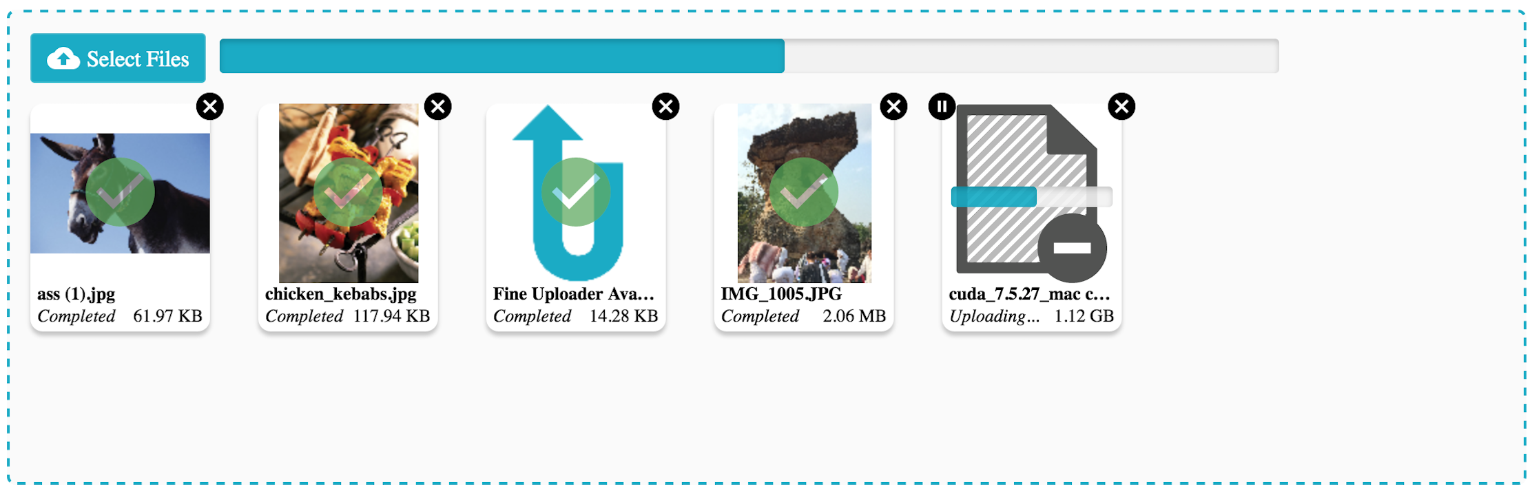
const uploader = options: chunking: enabled: true deleteFile: enabled: true endpoint: '/uploads' request: endpoint: '/uploads' retry: enableAuto: true { return <Gallery uploader= uploader /> } ...you will see this initial UI on page load:

After setting up a server to handle the upload and delete requests, and dropping a few files, you will see a modern-looking upload user interface with your files represented like so:
Low-level Components
<CancelButton />
The <CancelButton /> component allows you to easily render a useable cancel button for a submitted file. An file can be "canceled" at any time, except after it has uploaded successfully, and before it has passed validation (and of course after it has already been canceled).
By default, the <CancelButton /> will be rendered and clickable only when the associated file is eligible for cancelation. Otherwise, the component will not render a button. In other words, once, for example, the associated file has been canceled or has uploaded successfully, the button will essentially disappear. You can change this behavior by setting appropriate options.
Properties
-
children- (child elements/components of<CancelButton>. Use this for any text of graphics that you would like to display inside the rendered button. If the component is childless, the button will be rendered with a simple text node of "Cancel". -
id- The Fine Uploader ID of the submitted file. (required) -
onlyRenderIfCancelable- Defaults totrue. If set tofalse, the element will be rendered as a disabled button if the associated file is not cancelable. -
uploader- A Fine Uploader wrapper class. (required)
The example below will include a cancel button for each submitted file along with a <Thumbnail />, and will ensure the elements representing a file are removed if the file is canceled.
const uploader = options: request: endpoint: 'my/upload/endpoint' { super thisstate = submittedFiles: } { uploader } { return <div> thisstatesubmittedFiles } const isFileGone = { return 'canceled' 'deleted' >= 0}You may pass any standard <button> attributes (or any standard element attributes, such as data- attributes) to the <CancelButton /> as well. These attributes will be attached to the underlying <button> element.
<DeleteButton />
The <DeleteButton /> component allows you to easily render a useable delete button for an uploaded file. An file can be deleted from the server if the option has been enabled and if the file has already uploaded successfully.
By default, the <DeleteButton /> will be rendered and clickable only when the associated file is eligible for deletion. Otherwise, the component will not render a button. In other words, once, for example, the associated file has been deleted, or while it is still uploading, the button will not be visible. You can change this behavior by setting appropriate options.
Properties
-
children- (child elements/components of<DeleteButton>. Use this for any text of graphics that you would like to display inside the rendered button. If the component is childless, the button will be rendered with a simple text node of "Delete". -
id- The Fine Uploader ID of the submitted file. (required) -
onlyRenderIfDeletable- Defaults totrue. If set tofalse, the element will be rendered as a disabled button if the associated file is not deletable. -
uploader- A Fine Uploader wrapper class. (required)
The example below will include a delete button for each submitted file along with a <Thumbnail />, and will ensure the elements representing a file are removed if the file is deleted.
const uploader = options: deleteFile: enabled: true endpoint: 'my/delete/endpoint' request: endpoint: 'my/upload/endpoint' { super thisstate = submittedFiles: } { uploader } { return <div> thisstatesubmittedFiles } const isFileGone = { return 'canceled' 'deleted' >= 0}You may pass any standard <button> attributes (or any standard element attributes, such as data- attributes) to the <DeleteButton /> as well. These attributes will be attached to the underlying <button> element.
<Dropzone />
This component provides an element that will accept dropped files or directories to be passed on to an underlying Fine Uploader instance. By default, the rendered component itself will accept these files, but you can also register another element in the DOM (such as document.body) to receive dropped files instead.
Properties
-
dropActiveClassName- Directly maps to theclasses.dropActive propertyon Fine Uploader's standalone drag-and-drop module. -
element- The DOM element to register as a drop zone. If omitted, the rendered<Dropzone />element will become the drop zone. -
multiple- Directly maps to theallowMultipleItemsproperty on Fine Uploader's standalone drag-and-drop module. -
onDropError- Directly maps to thecallbacks.dropErroroption on Fine Uploader's standalone drag-and-drop module. React Fine Uploader will log any errors when the underlying DnD instance invokes thedropErrorcallback, but you can specify additional behavior as well. -
onProcesssingDroppedFiles- Directly maps to thecallbacks.processingDroppedFilesoption on Fine Uploader's standalone drag-and-drop module. -
onProcessingDroppedFilesComplete- Directly maps to thecallbacks.processingDroppedFilesCompleteoption on Fine Uploader's standalone drag-and-drop module. React Fine Uploader will send all files to the underlying Fine Uploader instance when this callback is invoked, but you may specify additional logic as well. -
uploader- The only required option - a Fine Uploader wrapper class.
A very simple but completely functional and effective use of the <Dropzone /> component can be seen below. This will render an element on the page that accepts files (all supported browsers) or even directories (Chrome & Opera only) and then submits them to Fine Uploader:
const uploader = options: request: endpoint: 'my/upload/endpoint' const dropzone = <Dropzone style= border: '1px dotted' height: 200 width: 200 uploader= uploader > <span>Drop Files Here</span> </Dropzone> ReactDOM<FileInput />
The <FileInput /> component allows you to easily render and style an <input type="file"> element and connect it to a Fine Uploader instance. When any files are selected via the file chooser dialog, they will be submitted directly to the associated Fine Uploder instance.
Properties
-
text- An object that holds properties used to render text for the two possible button states. If you pass amultipleboolean attribute, then thetext.selectFilesvalue will be rendered (which defaults to "Select Files"). If you do not pass amultipleboolean attribute, then thetext.selectFilevalue will be rendered instead (which defaults to "Select a File"). This property is ignored if you pass child elements (children). -
uploader- A Fine Uploader wrapper class. (required)
For example, suppose you wanted to create a file input button with an upload icon and some text that allows the user to select multiple files, but excludes everything but images in the chooser dialog (where supported). When files are selected by the user, they should be submitted directly to a Fine Uploader traditional endpoint handler:
Note: This assumes you have the Ionicons CSS file loaded on your page, and that you have an element on your page with an ID of "content".
const uploader = options: request: endpoint: 'my/upload/endpoint' const fileInput = <FileInput multiple accept='image/*' uploader= uploader > <span class="icon ion-upload">Choose Files</span> </FileInput> ReactDOMYou may pass any standard <input type="file"> attributes to the <FileInput /> component.
<Filename />
The <Filename /> component renders the initial name of the associated file and updates when the file's name is changed through the API.
Properties
-
id- The Fine Uploader ID of the submitted file. (required) -
uploader- A Fine Uploader wrapper class. (required)
Suppose you wanted to render a filename for each file as new files are submitted to Fine Uploader. Your React component may look like this:
Note: This assumes you have additional components or code to allow files to actually be submitted to Fine Uploader.
const uploader = options: request: endpoint: 'my/upload/endpoint' { super thisstate = submittedFiles: } { uploader } { return <div> thisstatesubmittedFiles </div> }<Filesize />
The <Filesize /> component renders the size of a specific file, formatted based on the a set of customizable rules.
It also accounts for scaled images, which do not have a file size available until upload time.
The internal logic of this component uses the IEEE definition when determining whether to display the size as kilobytes, megabytes, gigabytes, or terabytes. For example, 1100 bytes is represented, by default, as "1.10 KB".
Properties
-
id- The Fine Uploader ID of the submitted file. (required) -
units- An object containing printable text for each size unit. The size unit keys includebyte,kilobyte,megabyte,gigabyte, andterabyte. The default text values for these units areB,KB,MB,GB, andTB(respectively). -
uploader- A Fine Uploader wrapper class. (required)
Suppose you wanted to render a file size for each file as new files are submitted to Fine Uploader. Your React component may look like this:
Note: This assumes you have additional components or code to allow files to actually be submitted to Fine Uploader.
const uploader = options: request: endpoint: 'my/upload/endpoint' { super thisstate = submittedFiles: } { uploader } { return <div> thisstatesubmittedFiles </div> }If you wanted to display units as "bytes", "kilobytes", etc (instead of the default text), your FileSize
component would look like this instead:
const customUnits = byte: 'bytes' kilobyte: 'kilobytes' megabyte: 'megabytes' gigabyte: 'gigabytes' terabyte: 'terabytes' <Filesize id= id units= customUnits uploader= uploader /><PauseResumeButton />
The <PauseResumeButton /> component allows you to easily render a useable pause/resume button for a submitted file. An file can be "paused" manually when the upload is in progress after at least one chunk has uploaded successfully. A paused upload can then be resumed by pressing the same button.
When a file can be paused, the word "Pause" will appear in the button if no pauseChildren property has been specified. When it can be resumed, the button will be changed to "Resume" if no resumeChildren property has been defined. The former case will pause the upload on click, and the latter will resume. If the file cannot be paused or resumed, by default, the button will not be rendered.
Properties
-
id- The Fine Uploader ID of the submitted file. (required) -
onlyRenderIfEnabled- Defaults totrue. If set tofalse, the element will be rendered as a disabled button if the associated file is both not pausable and not resumable. -
pauseChildren- (child elements/components of<RetryButton>. Use this for any text of graphics that you would like to display inside the rendered pause button. If the component is childless, the button will be rendered with a simple text node of "Pause". -
resumeChildren- (child elements/components of<RetryButton>. Use this for any text of graphics that you would like to display inside the rendered resume button. If the component is childless, the button will be rendered with a simple text node of "Resume". -
uploader- A Fine Uploader wrapper class. (required)
The example below will include a pause/resume button for each submitted file along with a <Thumbnail />.
const uploader = options: request: endpoint: 'my/upload/endpoint' { super thisstate = submittedFiles: } { uploader } { return <div> thisstatesubmittedFiles }You may pass any standard <button> attributes (or any standard element attributes, such as data- attributes) to the <PauseResumeButton /> as well. These attributes will be attached to the underlying <button> element.
<ProgressBar />
The ProgressBar component allows for a per-file or a total progress bar to be rendered and automatically updated by the underlying upload wrapper instance. This covers the per-file and total progress bar elements found in Fine Uploader UI. This progress bar itself is made up of a container element and a child element that marks the file progress.
Properties
-
id- If this is a per-file progress bar, specify the ID of the file to monitor. For a total progress bar, omit this property. -
hideBeforeStart- Defaults totrue, which ensures the progress bar is not visible until the associated file has started uploading. For total progress bars, this stays hidden until at least one file has started uploading. -
hideOnComplete- Defaults totrue, which ensures the progress bar is no longer visible once the associated file has completed uploading. For total progress bars, the bar is hidden once all files have completed uploading. -
uploader- The only required option - a Fine Uploader wrapper class.
Consider embedding a per-file <ProgressBar />, such as <ProgressBar id={ 3 } uploader={ uploader } />, alongside
a <Thumbnail /> component for the same file. A total progress bar - <ProgressBar uploader={ uploader } /> - should probably be included before the container element that holds all file
<Thumbnail /> elements, such as at the top of a <Dropzone />.
<RetryButton />
The <RetryButton /> component allows you to easily render a useable retry button for a submitted file. An file can be "retried" manually after all auto retries have been exhausted on an upload failed and if the server has not forbidden retries in the upload response.
By default, the <RetryButton /> will be rendered and clickable only when the associated file is eligible to be manually retried. Otherwise, the component will not render a button. In other words, once, for example, the associated file has been canceled or has uploaded successfully, the button will essentially disappear. You can change this behavior by setting appropriate options
Properties
-
children- (child elements/components of<RetryButton>. Use this for any text of graphics that you would like to display inside the rendered button. If the component is childless, the button will be rendered with a simple text node of "Retry". -
id- The Fine Uploader ID of the submitted file. (required) -
onlyRenderIfRetryable- Defaults totrue. If set tofalse, the element will be rendered as a disabled button if the associated file is not retryable. -
uploader- A Fine Uploader wrapper class. (required)
The example below will include a retry button for each submitted file along with a <Thumbnail />.
const uploader = options: request: endpoint: 'my/upload/endpoint' { super thisstate = submittedFiles: } { uploader } { return <div> thisstatesubmittedFiles }You may pass any standard <button> attributes (or any standard element attributes, such as data- attributes) to the <RetryButton /> as well. These attributes will be attached to the underlying <button> element.
<Status />
The <Status /> component renders the current status of a file in a format appropriate for display. You may also override one or more default display values.
Properties
-
id- The Fine Uploader ID of the submitted file. (required) -
text- An object containing a map of status keys to display values. You may override one or more of these entries. Each entry with default values is listed below.deleting- 'Deleting...'paused- 'Paused'queued- 'Queued'retrying_upload- 'Retrying...'submitting- 'Submitting...'uploading- 'Uploading...'upload_failed- 'Failed'upload_successful- 'Completed'
-
uploader- A Fine Uploader wrapper class. (required)
Below, the current status of each file is rendered underneath its thumbnail. As the status changes, so does the rendered text. The display value for the upload_success status has also been overridden to display as "Success!"
Note: This assumes you have additional components or code to allow files to actually be submitted to Fine Uploader.
const uploader = options: request: endpoint: 'my/upload/endpoint' { super thisstate = submittedFiles: } { uploader } { return <div> thisstatesubmittedFiles<Thumbnail />
The <Thumbnail /> component allows you to easily render Fine Uploader generated thumbnail previews for a specific submitted file. While the thumbnail generation is in progress, a SVG "waiting" graphic will render. Of the thumbnail generation succeeds, the "waiting" graphic will be removed from the DOM and replaced with a <canvas> element containing the thumbnail preview. If thumbnail generation fails, a "not available" SVG graphic will be rendered instead.
Properties
-
id- The Fine Uploader ID of the submitted file. (required) -
maxSize- Maps directly to themaxSizeparameter of the Fine UploaderdrawThumbnailAPI method. If not supplied a default value is used, which is exported as a named constant. -
notAvailablePlaceholder- A custom element to display if the thumbnail is not available. -
uploader- A Fine Uploader wrapper class. (required) -
waitingPlaceholder- A custom element to display while waiting for the thumbnail.
Suppose you wanted to render a thumbnail for each file as new files are submitted to Fine Uploader. Your React component may look like this:
Note: This assumes you have additional components or code to allow files to actually be submitted to Fine Uploader.
const uploader = options: request: endpoint: 'my/upload/endpoint' { super thisstate = submittedFiles: } { uploader } { return <div> thisstatesubmittedFiles </div> }