react-drip-form-material-ui


Material-UI component set for react-drip-form.
https://tsuyoshiwada.github.io/react-drip-form-material-ui/
Table Of Contents
DEMO
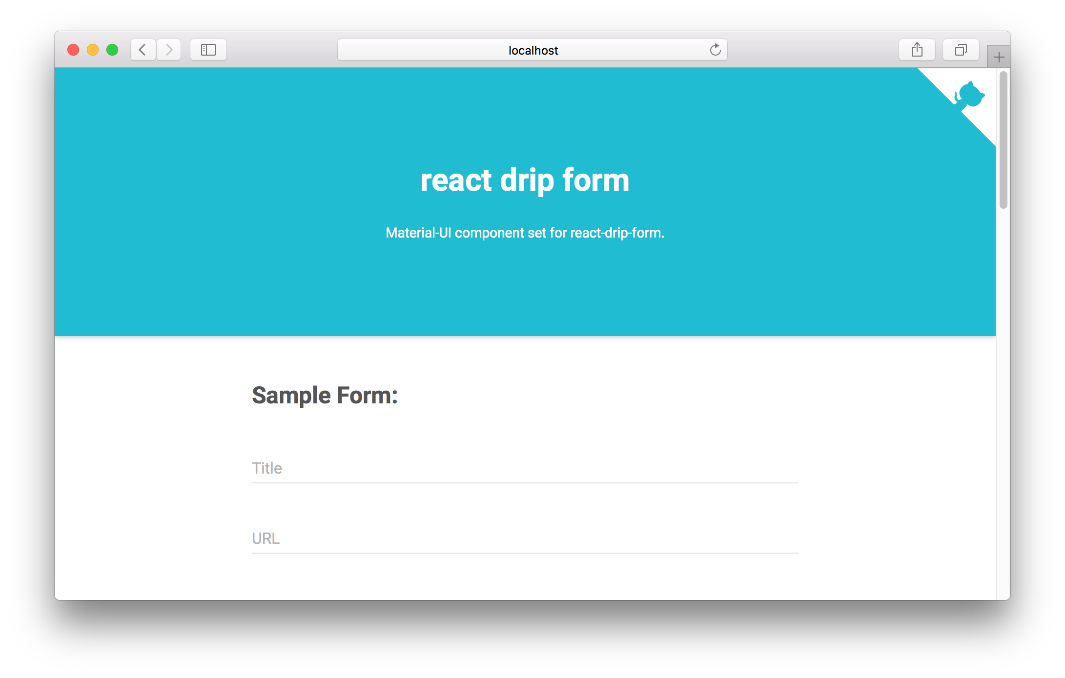
See Live Demo.
Getting Started
Installation
react-drip-form must also be installed.
$ npm install --save react-drip-form$ npm install --save react-drip-form-material-uiUsage
;;;;; /* form options */ <form onSubmit=handlersonSubmit> /* TextField */ <TextField name="title" label="Title" floatingLabelText="Title" hintText="Enter title" /> /* TextField (multi line) */ <TextField name="description" label="Description" multiLine rows=4 rowsMax=10 floatingLabelText="Description" hintText="Enter a description" /> /* Select field */ <SelectField name="library" label="Library" floatingLabelText="Library" > <MenuItem value="react" primaryText="React" /> <MenuItem value="angular" primaryText="Angular" /> <MenuItem value="vue" primaryText="Vue" /> </SelectField> /* Checkbox with FieldGroup field */ <FieldGroup multiple name="category" label="Category" > <Checkbox value="cat1" labelText="Category 1" /> <Checkbox value="cat2" labelText="Category 2" /> <Checkbox value="cat3" labelText="Category 3" /> </FieldGroup> /* Radio with FieldGroup field (default value = 'private') */ <FieldGroup name="status" label="Status" value="private" > <RadioButton value="private" labelText="Private" /> <RadioButton value="public" labelText="Public" /> <RadioButton value="draft" labelText="Draft" /> </FieldGroup> /* Date Picker */ <DatePicker name="releaseDate" label="Release Date" floatingLabelText="Release Date" hintText="Select release date" /> /* Time Picker */ <TimePicker name="releaseTime" label="Release Time" floatingLabelText="Release Time" hintText="Select release time" /> /* Slider */ <Slider name="rating" label="Rating" min=0 max=100 step=1 /> /* Toggle */ <Toggle name="confirm" value="yes" label="Confirm" labelText="I agree to the Terms of Use" labelPosition="right" /> <RaisedButton primary label="Submit" onClick=handlersonSubmit /> </form>;For actual use, demo/components/SampleForm.js source code may be helpful!
API
Almost the Material-UI API can be used as it is except that name prop is mandatory.
I will explain the differences from the Material-UI API here.
shouldDisplayError
This function accepts the properties of the field and makes a decision whether to display an error.
If you want to display an error you need to return true.
By default the following code is used.
!!metaerror && metadirty && metatouchedChange label to labelText
In react-drip-form, label is a property with special meaning.
Therefore, rename the label attribute that can be specified with <Toggle /> etc. to labelText.
<Toggle name="confirm" value="yes" label="Confirm" labelText="I agree to the Terms of Use" labelPosition="right"/>errorLabelStyle
The following components control error labels by react-drip-form-material-ui.
You must use errorLabelStyle to customize the style of error labels.
<Checkbox /><DatePicker /><FieldGroup /><RadioButton /><Slider /><TimePicker /><Toggle />
<DatePicker name="releaseDate" errorLabelStyle= // your custom style color: 'hotpink' />Related projects
Contribute
- Fork it!
- Create your feature branch: git checkout -b my-new-feature
- Commit your changes: git commit -am 'Add some feature'
- Push to the branch: git push origin my-new-feature
- Submit a pull request :D
Bugs, feature requests and comments are more than welcome in the issues.