react-date-range-calendar
React Calendar to pick the range between two dates and easily customizable.
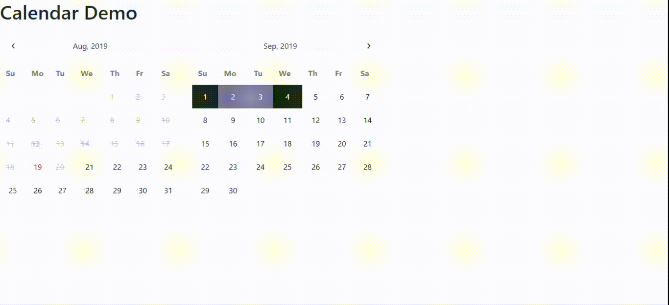
Example
Here is the working calendar example.
Live Demo
Click to Edit Code ON codesandbox.io
Click to watch working Calendar Demo
Instalation & Configuration
npm install --save react-date-range-calendar
and after installation , Import this package where you want to use the calendar...
import Calendar from "react-date-range-calendar";
Use it in this way...
<Fragment> <Calendar /> </Fragment>Support :
All major browsers are supported , If you want to run it on IE 9,10,11 . For that you will have to add polyfills for all the things like foreach, closest, es7-object-polyfill and react-app-polyfill
Functional Guide
| Property Name | Description | Type | Short Example |
|---|---|---|---|
| onSelect | This method is called, when user selects the end date, here validDateRange parameter gives the array of available dates and removes the disabled dates from the range |
function | <Calendar onSelect= {(startDate, endDate,validDateRange) => { // do whatever you want to do }} /> |
| onChange | This method is called, when user selects the start date or end date mean in both cases | function | <Calendar onChange = {(selectedDate) => {console.log('selected date',selectedDate); }} /> |
| selectedRange | date range that will be by default selected, should be of type Array e.g.[startDate,endDate] | Array | <Calendar selectedRange= {["2019-03-03","2019-03-07"]} /> |
| disabledDates | disable the dates those get returned by this method in the array format | function | <Calendar disabledDates= {() => { return ["2019-03-01","2019-03-02","2019-03-08"] } } /> |
| disablePrevDates | disable the previous dates, by default it's value is false | boolen | <Calendar disabledPrevDates= {true} /> |
Style Guide
| Property Name | Description | Type | Short Example |
|---|---|---|---|
| leftArrowCss | This sets the css in 'string' format for left calendar Arrow icon, write css just like normal css you write with some extra things like if you want to put Hover Effect you could implement that just by writing this way &:hover{ // your css when you hover over it } |
string | <Calendar leftArrowCss = "background: white; &:hover { background: green; }" /> |
| rightArrowCss | This sets the css in 'string' format for right calendar Arrow icon, write css just like normal css you write usually with hover effect similar to leftArrowCss Prop | string | <Calendar rightArrowCss = "background: white; &:hover { background: green; }" /> |
| leftMonthYearCss | This sets the css in 'string' format for left calendar's Month and Year text, write normal css with hover effect if needed similar to above string type css props | string | <Calendar leftMonthYearCss = "font-size:14px; }" /> |
| rightMonthYearCss | This sets the css in 'string' format for right calendar's Month and Year text, write normal css with hover effect if needed similar to above string type css props | string | <Calendar rightMonthYearCss = "font-size:14px; }" /> |
| leftCalHeaderCss | This sets the css in 'string' format for left calendar's header, write normal css similar to above string type css props | string | <Calendar leftCalHeaderCss = "background:red; }" /> |
| rightCalHeaderCss | This sets the css in 'string' format for right calendar's header, write normal css similar to above string type css props | string | <Calendar rightCalHeaderCss = "background:red; }" /> |
| thCss | This sets the css in 'string' format for both calendar's day headings, write normal css similar to above string type css props | string | <Calendar thCss = "background:red; }" /> |
| globalCss | This sets the css in 'string' format that could get applied on both of the calendars globally, write normal css similar to above string type css props but with functionality to perform any css operation on any point or element of the calendar. Remember! This global css will not be applied on td elements. For that look at cssObj props |
string | <Calendar globalCss = "*{ font-size: 14px } tr{ background: blue; }" /> |
| tdCssObj | This sets the css in 'object' format for both calendar's date tds, write javascript style css , <DOMElement>.style, you can write any of the javascript style property to style the element |
object | <Calendar tdCssObj = {{backgroundColor:'white',fontSize: '14px'}} /> |
| onHoverTdCssObj | This sets the css in 'object' format for both calendar's date tds those get hovered, write javascript style css , <DOMElement>.style, you can write any of the javascript style property to style the element |
object | <Calendar onHoverTdCssObj = {{backgroundColor:'yellow',fontSize: '14px',color:'brown'}} /> |
| inRangedTdCssObj | This sets the css in 'object' format for both calendar's date tds those comes in range after start date, write javascript style css , <DOMElement>.style, you can write any of the javascript style property to style the element |
object | <Calendar inRangedTdCssObj = {{backgroundColor:'green',fontSize: '14px',color:'white'}} /> |
| startDateTdCssObj | This sets the css in 'object' format for both calendar's date td that is the start date, write javascript style css , <DOMElement>.style, you can write any of the javascript style property to style the element |
object | <Calendar startDateTdCssObj = {{backgroundColor:'grey',fontSize: '14px',color:'black'}} /> |
| endDateTdCssObj | This sets the css in 'object' format for both calendar's date td that is the end date, write javascript style css , <DOMElement>.style, you can write any of the javascript style property to style the element |
object | <Calendar endDateTdCssObj = {{backgroundColor:'grey',fontSize: '14px',color:'black'}} /> |
| disabledDatesTdCssObj | This sets the css in 'object' format for both calendar's date td that is the end date, write javascript style css , <DOMElement>.style, you can write any of the javascript style property to style the element |
object | <Calendar disabledDatesTdCssObj = {{backgroundColor:'red',fontSize: '14px',color:'black',opacity:'0.2'}} /> |
Info :
Disabled dates will not be highlighted even if they get selected , by the selectedRange prop of the component.
Contributing
Pull requests are welcome