easy customizable emojibox component for react applications created by vito.mohagheghian

npm install react-customizable-emojibox

or

yarn add react-customizable-emojiboximport React, { useState, useRef } from 'react'
import EmojiBox from 'react-customizable-emojibox'
import 'react-customizable-emojibox/dist/index.css'
const Example = () => {
const [emoji, setEmoji] = useState(false)
const emojiHandler = () => {
setEmoji((prevValue) => !prevValue)
}
const inputRef = useRef(null)
const EmojiClickedHandler = (char) => {
inputRef.current.value += char
}
return (
<div>
<input type='text' placeholder='type a messege' ref={inputRef} />
<div className='emoji-container'>
<button onClick={emojiHandler} className='emoji_button'>
emoji
</button>
<EmojiBox
visibility={emoji}
setVisibility={setEmoji}
EmojiClickedHandler={EmojiClickedHandler}
/>
</div>
</div>
)
}
export default Example| Name | Type | Default Value | Required? | Description |
|---|---|---|---|---|
| className | className | undefined |
No | Help you to customize it easily. |
| theme | Object |
GlassTheme | No | some predesigned themes which I explained in next part |
| visibility | Boolean |
false | Yes | state that manage package display |
| setVisibility | Function |
undefined | Yes | function of visibility useState |
| EmojiClickedHandler | Function |
undefined | Yes | run on clicking emoji |
| style | Object |
undefined | No | like regular style |
First, you have to import you intended theme from package.
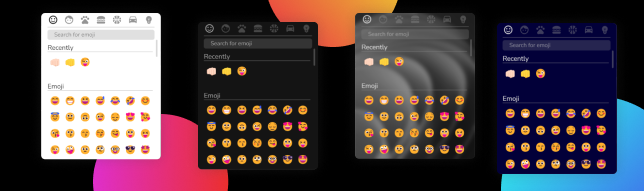
import { DarkTheme } from 'react-customizable-emojibox'themes you import are: DarkTheme - LightTheme - GlassTheme - MaterialTheme
after that you just have set theme prop with the value of imported theme.
for make package responsive you have use className prop which is like regular className, and with @media make it resposive.
use className prop and use transform: transalte(X%, Y%) in your css file.
yes, as its name you can customize it, or email me to make new theme.
MIT © vito-mohagheghian