
A fully customizable React rating component supporting stars, hearts, and custom icons with various precisions.
Install using npm or yarn:
npm install react-custom-rating-componentOr
yarn add react-custom-rating-componentThis package was created to offer a highly customizable and declarative rating component with support for different shapes, precise ratings, and custom icons.
Check out the interactive playground showcasing different use cases:
import { Rating } from 'react-custom-rating-component'

const App = () => {
  return (
    <div style={{ display: 'flex', justifyContent: 'center', alignItems: 'center', margin: '40px 20px' }}>
      <Rating
        defaultValue={2.5}
        size='30px'
        spacing='10px'
        activeColor='red'
        onChange={(newRating) => console.log('New Rating:', newRating)}
        onHover={(hoveredRating) => console.log('Hovered Rating:', hoveredRating)}
      />
    </div>
  )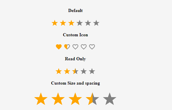
}- Customizable icons (stars, hearts, or custom SVGs)
- Supports precise ratings (0.1 - 1 increments)
- Read-only mode
- Custom colors and sizes
- Hover effects with tooltips
| Prop | Type | Default | Description |
|---|---|---|---|
defaultValue |
number | 0 | The default rating value. |
precision |
0.1 - 1 | 1 | The increment step for rating selection. |
count |
number | 5 | The number of rating icons displayed. |
shape |
'star' | 'heart' | 'custom' | 'star' | Defines the shape of rating icons. |
onChange |
function | - | Callback when rating value changes. |
onHover |
function | - | Callback when rating is hovered. |
readOnly |
boolean | false | Disables user interaction. |
size |
string | '24px' | Defines the size of rating icons. |
spacing |
string | '5px' | Defines the space between rating icons. |
activeColor |
string | 'orange' | Color for active rating icons. |
defaultColor |
string | 'gray' | Color for inactive rating icons. |
titleArray |
string[] | - | Custom tooltips for each rating level. |
showTitle |
boolean | false | Enables tooltips on hover. |
emptyIcon |
function | - | Returns custom SVG component for empty icon. |
fillIcon |
function | - | Returns custom SVG component for filled icon. |
import { Rating, IconStylesProps } from 'react-custom-rating-component'

const CircleIcon = ({ iconStyles, defaultColor, isFilled }: IconStylesProps & { isFilled?: boolean }) => (
  <svg viewBox='0 0 24 24' style={iconStyles} fill={isFilled ? 'currentColor' : defaultColor}>
    <circle cx='12' cy='12' r='10' />
  </svg>
)

const App = () => (
  <Rating
    count={5}
    defaultValue={3.5}
    precision={0.5}
    shape='custom'
    emptyIcon={(props) => <CircleIcon {...props} isFilled={false} />}
    fillIcon={(props) => <CircleIcon {...props} isFilled />}
  />
)<Rating defaultValue={4} readOnly /><Rating defaultValue={4} activeColor='red' defaultColor='purple' /><Rating defaultValue={3} showTitle titleArray={['Poor', 'Fair', 'Good', 'Better', 'Excellent']} />If you encounter any issues or have feature requests, raise them on GitHub:
Thank you for using React Custom Rating Component!