
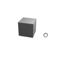
Let your users view your product or 3D renders using mouse/touch or set it to autoplay!
See it in action in storybook
·
Report Bug
·
Request Feature
Table of Contents
There are a few javascript product viewers out there but none could deliver what I needed. A React component written in Typescript and free! With a lot of customization you can quickly setup this component. All you need is a set of images that represents an animation you would like your users to explore. Either through user-interaction or setting it to autoplay! Point the component to your image folder, set the name, count and image type and you are ready!
It can be controlled either using mouse or touch!
Main features:
- React component
- Uses Typescript
- Free
- Simple
WARNING: This project is not yet available for download using NPM , the following test is merely a stub. Will be updated when the component is ready to be used.
React In order to use the component you need a React project. This was built and tested with 17.0.2 but other versions should work.
Make sure you have a react project - otherwise use: .
npx create-react-app my-app --template typescript- Download through npm
npm add react-360-product-viewer- Add the component to your page, change the properties to fit your need. For all options see storybook
<React360Viewer
  imagesBaseUrl="./imageSeries/"
  imagesCount={YOUR_IMAGE_SERIES_COUNT_HERE}
  imagesFiletype="png"
  mouseDragSpeed={20}
/>TODO: Add descriptions of all parameters For more example and a playground please refer to storybook
| Parameter | Type | Default | Description | Example |
|---|---|---|---|---|
| imagesCount | number | none | Set the number of images in your sequence | 35 |
| imageBaseUrl | string | none | Set URL from the base of your homepage | ./imageSeries/ |
| imagesFileTyp | string | none | Image type (anything that can be rendered in an img tag) | png |
| imageFilenamePrefix | string | none | Add a prefix before the image number | shoe (if entire image filename is shoe2.png) |
| imageInitialIndex | number | 0 | Which imagenumber to show on component load | 10 |
| mouseDragSPeed | number | 20 | How fast to change images when pointer moves | 20 |
| autoplaySpeed | number | 10 | How fast to change images when autoplay is active | 10 |
| reverse | boolean | false | Reverse the order of images displayed. Applicable for both pointer as well as autoplay | false |
| autoplay | boolean | false | Should the images automatically change on component load | false |
| autoplayTarget | number | none | The autoplay will stop on given image index | 15 |
| width | number | 150 | With of the image | 150 |
| height | number | 150 | Height of the image | 150 |
| zeroPad | ZeroPadRange (number 0 to 9) | 0 | Num zeros to prepend to your image number (if you set 1, your image numbers will be 01, 02..., 09, 10, 11) | 1 |
| showRotationIconOnStartup | boolean | false | If true, a small icon representing a rotation which should inform the user that the component can be rotated. | false |
| shouldNotifyEvents | boolean | false | If true the component will notify on some events. This can be a lot of event so use with caution. | false |
| notifyOnPointerDown | function | not set | Pass your own function that takes x, y as arguments. Will be called when mouse or touch is pressed. | - |
| notifyOnPointerUp | function | not set | Pass your own function that takes x, y as arguments . Will be called when mouse or touch is released. | - |
| notifyOnPointerMoved | function | not set | Pass your own function that takes x, y as arguments . Will be called any time the mouse or touch is moved if being pressed down. |
- [x] Add rotate icon
- [x] Start image index
- [ ] Set autoplay to look x number of times
- [x] Release for NPM
- [x] Document API
- [ ] Allow for external URI:s as imagesources
- [ ] Example on how to layout images
- [ ] Add inertia
- [ ] Supply events
- [ ] Autoplay finished
- [ ] Image changed
- [x] User key Down
- [x] User key release
- [x] User movement
See the open issues for a full list of proposed features (and known issues).
Contributions are what make the open source community such an amazing place to learn, inspire, and create. Any contributions you make are greatly appreciated.
If you have a suggestion that would make this better, please fork the repo and create a pull request. You can also simply open an issue with the tag "enhancement". Don't forget to give the project a star! Thanks again!
- Fork the Project
- Create your Feature Branch (
git checkout -b feature/AmazingFeature) - Commit your Changes (
git commit -m 'Add some AmazingFeature') - Push to the Branch (
git push origin feature/AmazingFeature) - Open a Pull Request
Distributed under the MIT License. See LICENSE.txt for more information.