
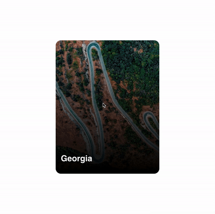
re-cardswipe is a react component library emulating the UI card swipe as seen on applications such as tinder, this library provides the state track for each card, controls for physics of animation, dynamic trigger, and other feature's.
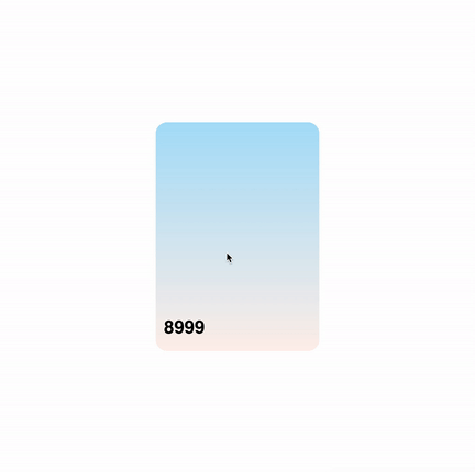
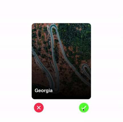
| Basic | Its Over 9000 | Using Trigger |
|---|---|---|
 |
 |
 |
 |
|
|
npm install re-cardswipe --saveimport React from "react";
import ReContainer, { ReCard } from "re-cardswipe";
const App = () => {
const foo = [1, 2, 3, 4, 5]
const parentStyle = {
position:"relative",
width:"100%",
height:"100vh"
}
// NOTE: it is important to enclose <ReContainer/> component inside a parent div, being an absolute container it will inherit the parent dimensions (width & height).
return(
<div style={parentStyle}>
<ReContainer>
{foo.map((value, index) => {
return (
<ReCard key={index}>
{value}
</ReCard>
);
})
}
</ReContainer>
</div>
)
}<ReContainer>
| Prop | Description | Type | Default Value | Expected Values |
|---|---|---|---|---|
| mass | Provide the mass for animation. | float | 0.7 | 0.1 - 1 |
| damping | Provide the damping for animation. | float | 0.8 | 0.1 - 2 |
| onSwipe | Callback function, executed when the card has been swiped. Takes 2 params direction- left or right & metaData-data of the swiped card |
func(direction:string,metadata:object) | - | - |
| trigger | Shows Accept and Reject button when true | boolean | false | - |
| max | Maximum number of Card component being rendered. For better performance it has been set to 3. | int | 3 | 3 - 10 |
<ReCard>
| Prop | Description | Type | Default Value |
|---|---|---|---|
| width | Provide the width of the child component | int | 300 |
| height | Provide the height of the child component | int | 400 |
| metaData | object recieved in onSwipe() the callback function, store any form of data related to the specific card |
object | {} |
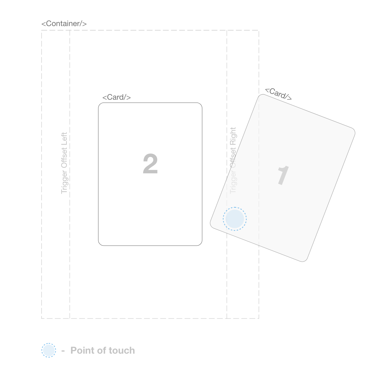
It consist of two components <ReContainer/> and the <ReCard/>, the <ReContainer/> component is used to keep track of each card component
being swipped left and right. By default the <ReContainer/> component only
render's 3 cards component for better animation and performace. Each
<Card/> component has to be provided with a callback function which is
used to return the state of the card when swiped towards left or swiped
towards right.
The <ReContainer> assign's the offset which is by default set to 10% of <ReContainer> width, this offset will be used to check if the point of contact with a <Card/> component is under the offset area which will trigger the swipe mechanism.
In source folder:
npm run lib:watch
npm link
In project:
npm link re-cardswipeFor running test's:
npm run test:watchMIT License
Copyright (c) 2019 Yugam Dhuriya
Permission is hereby granted, free of charge, to any person obtaining a copy of this software and associated documentation files (the "Software"), to deal in the Software without restriction, including without limitation the rights to use, copy, modify, merge, publish, distribute, sublicense, and/or sell copies of the Software, and to permit persons to whom the Software is furnished to do so, subject to the following conditions:
The above copyright notice and this permission notice shall be included in all copies or substantial portions of the Software.
THE SOFTWARE IS PROVIDED "AS IS", WITHOUT WARRANTY OF ANY KIND, EXPRESS OR IMPLIED, INCLUDING BUT NOT LIMITED TO THE WARRANTIES OF MERCHANTABILITY, FITNESS FOR A PARTICULAR PURPOSE AND NONINFRINGEMENT. IN NO EVENT SHALL THE AUTHORS OR COPYRIGHT HOLDERS BE LIABLE FOR ANY CLAIM, DAMAGES OR OTHER LIABILITY, WHETHER IN AN ACTION OF CONTRACT, TORT OR OTHERWISE, ARISING FROM, OUT OF OR IN CONNECTION WITH THE SOFTWARE OR THE USE OR OTHER DEALINGS IN THE SOFTWARE