query-builder-ts
TypeScript icon, indicating that this package has built-in type declarations

1.1.2 • Public • Published

React Query Builder TS

Highly dynamic React Query Builder Component written in typescript.

Credits

This Typescript Query builder component is heavily inspired by sapientglobalmarkets' Query Builder:

Getting Started

Overview

npm install react-querybuilder-ts --save

Demo

To run a demo of the react-querybuilder being used, clone the project and run yarn install in both the root and example folders.

  • In the root directory yarn install and yarn start
  • wait until the root directory finishes compiling
  • In the example directory yarn installand yarn start
  • Open brower and go to http://localhost:1234/

OR

See live demo

Usage

Minimal Default Example

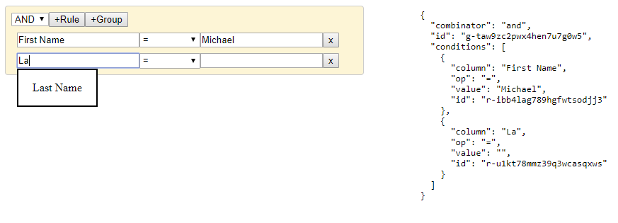
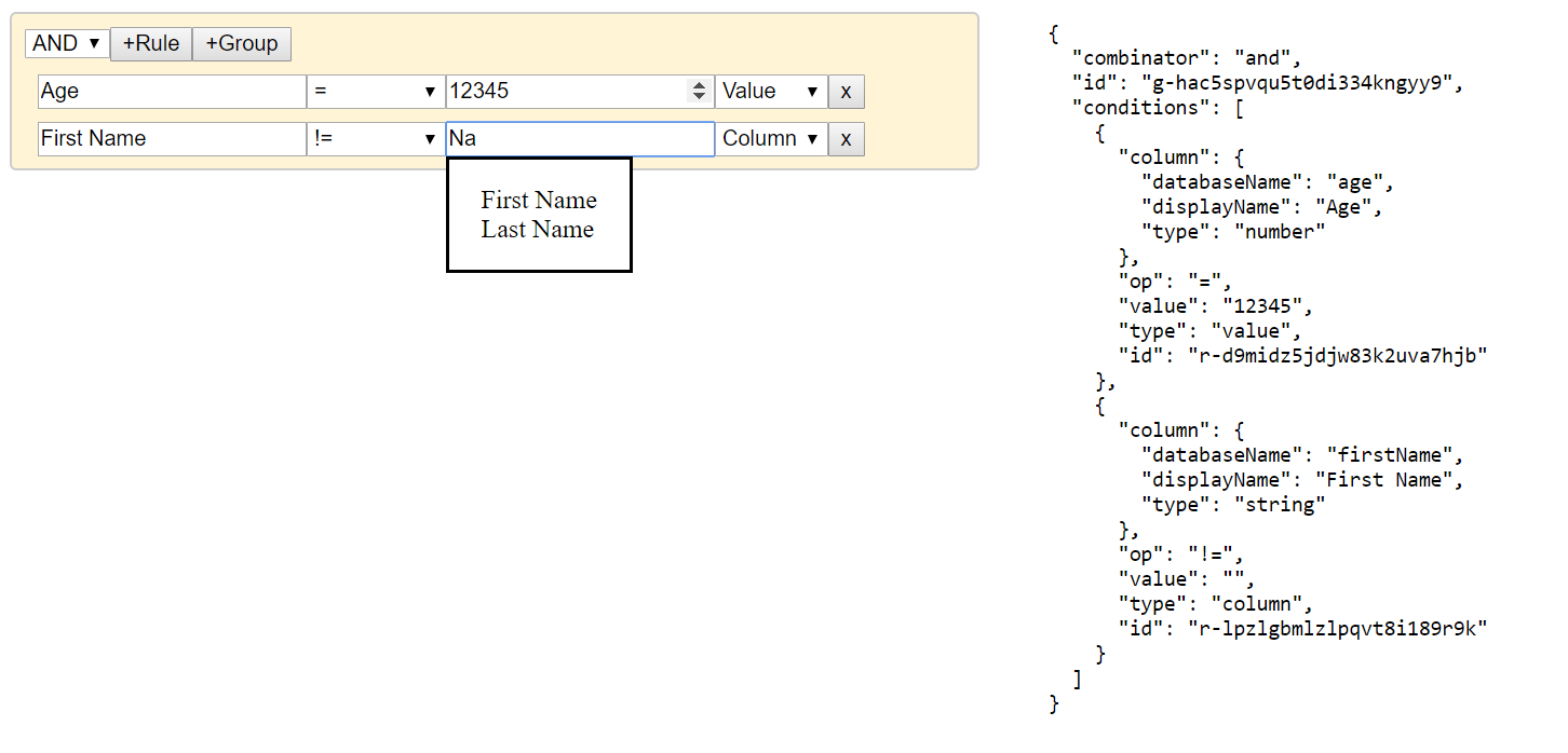
import QueryBuilder from 'react-querybuilder-ts';
 
const App = () => {
  const columns = [
    { name: 'firstName', label: 'First Name' },
    { name: 'lastName', label: 'Last Name' },
  ];
 
  const handleOnQueryChange = (query) => {
    console.log(query);
  };
 
  return <QueryBuilder columns={columns} onQueryChange={handleOnQueryChange} />;
};
 
ReactDOM.render(<App />, document.getElementById('root'));

Advanced Customization Example

  • Custom elements will override the default elements. You may import Defaults for default elements, such as Defaults.RULE.OPERATOR and among others.

  • Columns may be provided directly to the ValueComboBox and ValueDropDown elements' props as options and can be of any array type. You may also utilize the isColumn flag for components that will inherit the columns prop passed to the QueryBuilder.

  • The props mapInput and mapOutput allow for the transformation of the values passed in and out, respectively. condition allows the user to hide components.

  • The name attribute for the elements is required. It corresponds to the key name in the query condition and for actions (see below for reserved names).

  • The component corresponds to the component that will render. These are available as imports. The default export is a React Component QueryBuilder with default component controls ValueComboBox, ValueInput, ValueDropDown and ActionButton. Users are not restricted to the default provided components. Types are also exposed for Typescript users.

import QueryBuilder, {
  ControlProps,
  Defaults,
  RuleGroupCondition,
  ValueComboBox,
  ValueDropDown,
  ValueInput,
} from 'react-querybuilder-ts';
 
const App = () => {
  const columns = [
    { databaseName: 'firstName', displayName: 'First Name', type: 'string' },
    { databaseName: 'lastName', displayName: 'Last Name', type: 'string' },
    { databaseName: 'address', displayName: 'Address', type: 'string' },
    { databaseName: 'age', displayName: 'Age', type: 'number' },
  ];
 
  const handleOnQueryChange = (query) => {
    console.log(query);
  };
 
  return (
    <QueryBuilder
      onQueryChange={setQuery}
      columns={columns}
      rules={[
        {
          component: ValueComboBox,
          name: 'column',
          isColumn: true,
          props: {
            className: {
              input: '',
              dropdownContainer: 'filteredOptionsContainer',
              container: 'comboBoxContainer',
              ul: 'filteredOptionsList',
              li: 'filteredOptionsItem',
            },
            defaultValue: {},
            mapInput: (value: any, props: any): string =>
              value.displayName || '',
            mapOutput: (value: string, props: any): any =>
              columns.find((c: any) => c.displayName === value) || '',
          },
        },
        Defaults.RULE.OPERATOR,
        {
          component: ValueInput,
          name: 'value',
          props: {
            className: '',
            label: 'Value',
            defaultValue: '',
            inputType: (value: any, props: any): string =>
              props.parentProps.rule.column.type,
            condition: ({ parentProps }: ControlProps): boolean =>
              (parentProps as any).rule.op !== 'null' &&
              (parentProps as any).rule.op !== 'notNull' &&
              (parentProps as any).rule.type !== 'column',
          },
        },
        {
          component: ValueComboBox,
          name: 'value',
          props: {
            className: {
              input: '',
              dropdownContainer: 'filteredOptionsContainer',
              container: 'comboBoxContainer',
              ul: 'filteredOptionsList',
              li: 'filteredOptionsItem',
            },
            defaultValue: '',
            options: columns,
            condition: ({ parentProps }: ControlProps): boolean =>
              (parentProps as any).rule.op !== 'null' &&
              (parentProps as any).rule.op !== 'notNull' &&
              (parentProps as any).rule.type === 'column',
            mapInput: (value: any, props: any): string =>
              value.displayName || '',
            mapOutput: (value: string, props: any): any =>
              columns.find((c: any) => c.displayName === value) || value,
          },
        },
        {
          component: ValueDropDown,
          name: 'type',
          props: {
            defaultValue: 'value',
            options: [
              { name: 'column', label: 'Column' },
              { name: 'value', label: 'Value' },
            ],
            className: 'dropdown',
            condition: ({ parentProps }: ControlProps): boolean =>
              (parentProps as any).rule.op !== 'null' &&
              (parentProps as any).rule.op !== 'notNull',
          },
        },
        Defaults.RULE.REMOVE,
      ]}
    />
  );
};
 
ReactDOM.render(<App />, document.getElementById('root'));

Output: Custom

Default Rule Group Elements

[
  {
    component: ValueDropDown,
    name: 'combinator',
    props: {
      className: '',
      options: [
        { name: 'and', label: 'AND' },
        { name: 'or', label: 'OR' },
      ],
      defaultValue: '=',
    },
  },
  {
    component: ActionButton,
    name: ControlActions.ADD_RULE, // 'ADD_RULE'
    props: {
      className: '',
      label: '+Rule',
    },
  },
  {
    component: ActionButton,
    name: ControlActions.ADD_GROUP, // 'ADD_GROUP'
    props: {
      className: '',
      label: '+Group',
    },
  },
  {
    component: ActionButton,
    name: ControlActions.REMOVE_GROUP, // 'REMOVE_GROUP'
    props: {
      className: '',
      label: 'X',
      condition: ({ parentProps }: ControlProps): boolean =>
        (parentProps as RuleGroupProps).level > 0,
    },
  },
];

Required: Actions elements with the expected names shown are required for proper functionality

Reserved Names:

  • id
  • combinator
  • conditions
  • ADD_RULE
  • ADD_GROUP
  • REMOVE_GROUP

Default Rule Elements

[
  {
    component: ValueComboBox,
    name: 'column',
    props: {
      className: '',
      defaultValue: '',
    },
  },
  {
    component: ValueDropDown,
    name: 'op',
    props: {
      className: '',
      defaultValue: '=',
      options: [
        { name: 'null', label: 'Is Null' },
        { name: 'notNull', label: 'Is Not Null' },
        { name: 'in', label: 'In' },
        { name: 'notIn', label: 'Not In' },
        { name: '=', label: '=' },
        { name: '!=', label: '!=' },
        { name: '<', label: '<' },
        { name: '>', label: '>' },
        { name: '<=', label: '<=' },
        { name: '>=', label: '>=' },
      ],
    },
  },
  {
    component: ValueInput,
    name: 'value',
    props: {
      label: 'Value',
      className: '',
      defaultValue: '',
      condition: ({ parentProps }: ControlProps): boolean =>
        (parentProps as RuleProps).rule.op !== 'null' &&
        (parentProps as RuleProps).rule.op !== 'notNull',
    },
  },
  {
    component: ActionButton,
    name: ControlActions.REMOVE_RULE, // 'REMOVE_RULE'
    props: {
      label: 'x',
      className: '',
    },
  },
];

Required: Actions elements with the expected names shown are required for proper functionality

Reserved Names: id, REMOVE_RULE

Build your own Element

  // classname info types for the code below
  type MultiTypeCallback<T> = T | (...arg: any[]) => T;
 
  interface MultiTypeClassNameObject {
    [element: string]: MultiTypeCallback<string | string[]>;
  }
 
  type ControlElementClassNames = MultiTypeClassNameObject | MultiTypeCallback<string | string[]>;
  {
    componentReact.FunctionComponent<any> | React.ComponentClass<any>;
    // Reserved: 'conditions', 'combinator', 'id',  'ADD_GROUP', 'ADD_RULE', 'REMOVE_GROUP', 'REMOVE_RULE'
    name: string;
    props: {
      // Wrapped OnChange callback for internal state updates. Must be invoked on element state changes for proper functionality
      onChange: (args: any) => void;
      // Rule and RuleGroup component's props
      parentPropsRuleGroupProps | RuleProps;
      // Value corresponding to the query's key name and value
      value?: any;
    }
  }

Modify Overall Query Builder ClassNames

  {
    queryBuilder?: MultiTypeClassName;
 
    ruleGroup?: MultiTypeClassName;
    ruleGroupRow?: MultiTypeClassName;
 
    ruleRow?: MultiTypeClassName;
  }

Things You Should Know

  • All the css classes and styling are very basic and minimal. This library assumes you'll apply your own styling to fit your application.

Package Sidebar

Install

npm i query-builder-ts

Weekly Downloads

0

Version

1.1.2

License

MIT

Unpacked Size

288 kB

Total Files

56

Last publish

Collaborators

  • the-speck