Quarkify
An awesome lightweight React UI Component library
Explore the docs »
View Demo
·
Report Bug
·
Request Feature
Table of Contents
About The Project


There are many great UI libraries for react available but almost all of them are highly customizable and full of boilerplate code, so we decided to create our own lightweight React Component library and you should give it a try.
Here's why:
- Your time will be spent doing actual work instead of creating simple components.
- You will not worry about consistency across your components.
- Each component is implemented with accessibility in mind. 😄
You may also suggest changes by forking this repo and creating a pull request or opening an issue with the tag.
Built With
Getting Started
To get a local copy up and running follow these simple example steps.
Installation
- To add quarkify library to your project
- Simply run one of the commands below in your project directory.
npm install quarkify@latest --saveor
yarn add quarkify - To install storybook locally
- Clone the repo
git clone https://github.com/Trendyol/quarkify.git- Install NPM packages
npm installOr alternatively Yarn
yarn install- Run tests
npm run test
yarn run test- Run storybook
npm start
yarn start
Usage
To preview the live demo and see usages of the components please refer to our demo
Examples
We have several examples on our document. Here is the first one to get you started:
import Button from "quarkify/components/button"

function App() {
  return (
    <div className="App">
      <Button variant={"primary"} >Hello World</Button>
    </div>
  );
}
This will render Button component with primary variant:

As you can see, to import components into your project, you need to specify the path as
"quarkify/components/{component-name}"
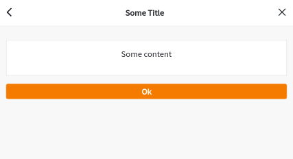
Furthermore, to use Modal component:
import Button from "quarkify/components/button"
import Modal from "quarkify/components/modal";

let show = false;

function handleChange() {
  show = !show
}

function closeModal() {
  show = false
}

function App() {
  return (
    <div className="App">
      <Button onClick={handleChange}>Toggle Me</Button>
      <Modal show={show} animation={"slideInUp"}>
        <Modal.Header
          onClose={closeModal}
          leftIcon={"back-button"}
          leftIconOnClick={closeModal}
        >
          Some Title
        </Modal.Header>
        <Modal.Content>
          <p>Some content</p>
        </Modal.Content>
        <Modal.Actions>
          <Button onClick={closeModal} fluid>
            Ok
          </Button>
        </Modal.Actions>
      </Modal>
    </div>
  );
}
When button is toggled, it will render the modal as it is seen below:
For more examples, please refer to the documentation
Contributing
Any contributions you make are greatly appreciated.
- Fork the Project
- Create your Feature Branch (
git checkout -b feature/AmazingFeature) - Commit your Changes (
git commit -m 'Add some AmazingFeature') - Push to the Branch (
git push origin feature/AmazingFeature) - Open a Pull Request
Please don't forget to check our commit message styles as we want to have consistency across our commit logs.
License
Distributed under the MIT License. See LICENSE for more information.