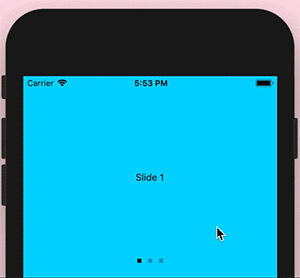
Promo Slider
React Native slider component with dismiss functionality. Demo 👉Expo Snack.
Install
npm i promo-slider -S
or,
yarn add promo-slider
Usage
Props:
| Property | Description | isRequired |
|---|---|---|
slides |
An array of slide components | yes |
onClose |
Callback which would be called after clicking on the close button on the last slide (e.g. remembering slider dismissal to async storage) | no |
dotColor |
The active color of progress dot, by default it is #000 (inactive color has the same color, but 25% opaque) |
no |
progressStyles |
Override progress dots positioning. By default, progress dots are placed at the bottom of the component | no |
withoutClose |
A boolean which indicates weather close button should be shown on the last slide | no |
; <PromoSlider onClose= console || this dotColor="#000" progressStyles= bottom: 10 withoutClose=false slides=<SlideOneComponent> <SlideTwoComponent> <SlideThreeComponent> />TODO
- Provide previous/back actions
- Improve style override for progress component
- Add tests